FabCon is coming to Atlanta
Join us at FabCon Atlanta from March 16 - 20, 2026, for the ultimate Fabric, Power BI, AI and SQL community-led event. Save $200 with code FABCOMM.
Register now!- Power BI forums
- Get Help with Power BI
- Desktop
- Service
- Report Server
- Power Query
- Mobile Apps
- Developer
- DAX Commands and Tips
- Custom Visuals Development Discussion
- Health and Life Sciences
- Power BI Spanish forums
- Translated Spanish Desktop
- Training and Consulting
- Instructor Led Training
- Dashboard in a Day for Women, by Women
- Galleries
- Data Stories Gallery
- Themes Gallery
- Contests Gallery
- QuickViz Gallery
- Quick Measures Gallery
- Visual Calculations Gallery
- Notebook Gallery
- Translytical Task Flow Gallery
- TMDL Gallery
- R Script Showcase
- Webinars and Video Gallery
- Ideas
- Custom Visuals Ideas (read-only)
- Issues
- Issues
- Events
- Upcoming Events
The Power BI Data Visualization World Championships is back! Get ahead of the game and start preparing now! Learn more
- Power BI forums
- Forums
- Get Help with Power BI
- Custom Visuals Development Discussion
- Re: Create a Heat Map with a matrix with multiple ...
- Subscribe to RSS Feed
- Mark Topic as New
- Mark Topic as Read
- Float this Topic for Current User
- Bookmark
- Subscribe
- Printer Friendly Page
- Mark as New
- Bookmark
- Subscribe
- Mute
- Subscribe to RSS Feed
- Permalink
- Report Inappropriate Content
Create a Heat Map with a matrix with multiple variables (or comma separated values in one parameter)
Hi all, I need help with creating a heat map using the Matrix visual (if there is a better one, I'm happy to download it but I have a desktop version only). This is very simple to do in Excel but I can't quite work out how to do this in Power BI. The data is confidential so I can't add it here. But I will use a simple analogy to describe what it looks like and what I am trying to achieve. Thank you.
I have a list of ~80 students (column A) from 10 schools (column B), 10 columns, with names of classes. There may be a "1" or blank value in the Class Name columns against each student (students can be enrolled in at least one class. I also have a column with a comma-separated list of classes that each student is enrolled in (non-zero value in the previous ten columns). I need to create a heat map as a matrix with school names as rows and classes as column names and the number of students from each school enrolled in these classes as values. I want the heat map to show the highest interest in class choices.
Two ways I approached it, each with limitations I couldn't solve:
A) If I put all ten class columns as values, I can create conditional formatting within each column but it is column specific and doesn't look across the entire data set.
B) If I use the summary column (with the comma-separated classes), it sees class combos as unique values and not as a list and therefore creates additional columns of class combos.
Could you please advise how to solve the issue in either A or B approach or suggest another approach? Thank you.
Solved! Go to Solution.
- Mark as New
- Bookmark
- Subscribe
- Mute
- Subscribe to RSS Feed
- Permalink
- Report Inappropriate Content
Hey @Anonymous. Let me know if the following will work.
Notes:
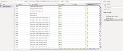
- The main piece of this is unpivoting the dataset into key-value pairs (see below screenshot).
The query in the red rectangle is the original dataset
The query in the blue rectangle is a reference query of the original and is unpivoted. This is the one that is used in the matrix.
The green rectangle contains the Attribute column (key) and the Value column
The purple rectangle contains the Attribute Sort column. This field is necessary to sort the Attributes across the top of the matrix. See here for more info on sorting a column by another column.
- I created a font color measure that makes the font color of the cell black if the count is less than or equal to the median total, and white if it is greater than the median total
- The cell background color for the values is just a regular gradient conditional format
You can download the .pbix here
If this is enough to get you going, please consider kudoing this reply and choosing it as the solution. Otherwise, let me know if you need additional tweaks.
Madison Giammaria
Proud to be a Super User 😄
Do you frequently use Deneb to provide insights to your stakeholders? Have you considered sponsoring this free and open source custom visual? More info here!
- Mark as New
- Bookmark
- Subscribe
- Mute
- Subscribe to RSS Feed
- Permalink
- Report Inappropriate Content
The heatmap screenshot is great. Any chance you could copy the data and headers into this formatter (left side) and then paste the JSON output here?
Madison Giammaria
Proud to be a Super User 😄
Do you frequently use Deneb to provide insights to your stakeholders? Have you considered sponsoring this free and open source custom visual? More info here!
- Mark as New
- Bookmark
- Subscribe
- Mute
- Subscribe to RSS Feed
- Permalink
- Report Inappropriate Content
I copied the top ten rows of data and headings only due to the character limit here.
Thank you
- Mark as New
- Bookmark
- Subscribe
- Mute
- Subscribe to RSS Feed
- Permalink
- Report Inappropriate Content
Hey @Anonymous. Let me know if the following will work.
Notes:
- The main piece of this is unpivoting the dataset into key-value pairs (see below screenshot).
The query in the red rectangle is the original dataset
The query in the blue rectangle is a reference query of the original and is unpivoted. This is the one that is used in the matrix.
The green rectangle contains the Attribute column (key) and the Value column
The purple rectangle contains the Attribute Sort column. This field is necessary to sort the Attributes across the top of the matrix. See here for more info on sorting a column by another column.
- I created a font color measure that makes the font color of the cell black if the count is less than or equal to the median total, and white if it is greater than the median total
- The cell background color for the values is just a regular gradient conditional format
You can download the .pbix here
If this is enough to get you going, please consider kudoing this reply and choosing it as the solution. Otherwise, let me know if you need additional tweaks.
Madison Giammaria
Proud to be a Super User 😄
Do you frequently use Deneb to provide insights to your stakeholders? Have you considered sponsoring this free and open source custom visual? More info here!
- Mark as New
- Bookmark
- Subscribe
- Mute
- Subscribe to RSS Feed
- Permalink
- Report Inappropriate Content
This is great, thank you so much! This worked!
- Mark as New
- Bookmark
- Subscribe
- Mute
- Subscribe to RSS Feed
- Permalink
- Report Inappropriate Content
[
{
"School": "School_J",
"Student Name ": "Student 1",
"Class_1": "1",
"Class_2": "",
"Class_3": "",
"Class_4": "",
"Class_5": "",
"Class_6": "",
"Class_7": "",
"Class_8": "",
"Class_9": "",
"Class_10": "",
"Class_11": "",
"Class_12": "",
"Class_13": "",
"Class_14": "",
"Class_15": "",
"List of classes": "Class_1"
},
{
"School": "School_TP",
"Student Name ": "Student 10",
"Class_1": "",
"Class_2": "",
"Class_3": "",
"Class_4": "",
"Class_5": "",
"Class_6": "",
"Class_7": "",
"Class_8": "1",
"Class_9": "",
"Class_10": "1",
"Class_11": "",
"Class_12": "",
"Class_13": "",
"Class_14": "",
"Class_15": "",
"List of classes": "Class_8, Class_10"
},
{
"School": "School_S",
"Student Name ": "Student 11",
"Class_1": "",
"Class_2": "",
"Class_3": "",
"Class_4": "",
"Class_5": "",
"Class_6": "",
"Class_7": "",
"Class_8": "",
"Class_9": "",
"Class_10": "",
"Class_11": "1",
"Class_12": "",
"Class_13": "",
"Class_14": "",
"Class_15": "",
"List of classes": "Class_11"
},
{
"School": "School_S",
"Student Name ": "Student 12",
"Class_1": "",
"Class_2": "",
"Class_3": "",
"Class_4": "",
"Class_5": "",
"Class_6": "",
"Class_7": "",
"Class_8": "",
"Class_9": "",
"Class_10": "",
"Class_11": "",
"Class_12": "1",
"Class_13": "",
"Class_14": "",
"Class_15": "",
"List of classes": "Class_12"
},
{
"School": "School_J",
"Student Name ": "Student 13",
"Class_1": "",
"Class_2": "",
"Class_3": "",
"Class_4": "",
"Class_5": "",
"Class_6": "",
"Class_7": "",
"Class_8": "",
"Class_9": "",
"Class_10": "",
"Class_11": "",
"Class_12": "",
"Class_13": "1",
"Class_14": "",
"Class_15": "",
"List of classes": "Class_13"
},
{
"School": "School_J",
"Student Name ": "Student 14",
"Class_1": "",
"Class_2": "",
"Class_3": "",
"Class_4": "",
"Class_5": "",
"Class_6": "",
"Class_7": "",
"Class_8": "",
"Class_9": "",
"Class_10": "",
"Class_11": "",
"Class_12": "",
"Class_13": "",
"Class_14": "1",
"Class_15": "",
"List of classes": "Class_14"
},
{
"School": "School_J",
"Student Name ": "Student 15",
"Class_1": "",
"Class_2": "",
"Class_3": "",
"Class_4": "",
"Class_5": "",
"Class_6": "",
"Class_7": "",
"Class_8": "",
"Class_9": "",
"Class_10": "",
"Class_11": "",
"Class_12": "",
"Class_13": "",
"Class_14": "",
"Class_15": "1",
"List of classes": "Class_15"
},
{
"School": "School_J",
"Student Name ": "Student 16",
"Class_1": "",
"Class_2": "",
"Class_3": "",
"Class_4": "",
"Class_5": "1",
"Class_6": "",
"Class_7": "",
"Class_8": "",
"Class_9": "",
"Class_10": "",
"Class_11": "",
"Class_12": "",
"Class_13": "",
"Class_14": "",
"Class_15": "",
"List of classes": "Class_5"
},
{
"School": "School_S",
"Student Name ": "Student 17",
"Class_1": "",
"Class_2": "",
"Class_3": "1",
"Class_4": "",
"Class_5": "",
"Class_6": "",
"Class_7": "",
"Class_8": "",
"Class_9": "",
"Class_10": "1",
"Class_11": "",
"Class_12": "",
"Class_13": "",
"Class_14": "",
"Class_15": "",
"List of classes": "Class_3, Class_10"
},
{
"School": "School_S",
"Student Name ": "Student 18",
"Class_1": "1",
"Class_2": "",
"Class_3": "",
"Class_4": "",
"Class_5": "1",
"Class_6": "",
"Class_7": "",
"Class_8": "",
"Class_9": "",
"Class_10": "",
"Class_11": "",
"Class_12": "",
"Class_13": "",
"Class_14": "",
"Class_15": "",
"List of classes": "Class_1, Class_5"
},
{
"School": ""
}
]
- Mark as New
- Bookmark
- Subscribe
- Mute
- Subscribe to RSS Feed
- Permalink
- Report Inappropriate Content
Hey @Anonymous,. Using your analogy data could you add a screenshot of what the viz looks like in Excel? I'd be happy to try and assist, and this screenshot would help me better understand your requirements.
Madison Giammaria
Proud to be a Super User 😄
Do you frequently use Deneb to provide insights to your stakeholders? Have you considered sponsoring this free and open source custom visual? More info here!
- Mark as New
- Bookmark
- Subscribe
- Mute
- Subscribe to RSS Feed
- Permalink
- Report Inappropriate Content
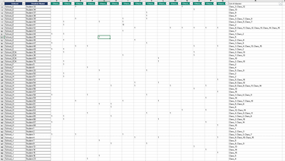
Hi thank you, I can't seem to be able to add a sample datasheet here, but here's a snapshot of the final table I want to get:
And date looks like this:
Hope the screenshots are not too small. Thank you.
Helpful resources

Power BI Dataviz World Championships
The Power BI Data Visualization World Championships is back! Get ahead of the game and start preparing now!

| User | Count |
|---|---|
| 7 | |
| 5 | |
| 2 | |
| 2 | |
| 2 |


