FabCon is coming to Atlanta
Join us at FabCon Atlanta from March 16 - 20, 2026, for the ultimate Fabric, Power BI, AI and SQL community-led event. Save $200 with code FABCOMM.
Register now!- Power BI forums
- Get Help with Power BI
- Desktop
- Service
- Report Server
- Power Query
- Mobile Apps
- Developer
- DAX Commands and Tips
- Custom Visuals Development Discussion
- Health and Life Sciences
- Power BI Spanish forums
- Translated Spanish Desktop
- Training and Consulting
- Instructor Led Training
- Dashboard in a Day for Women, by Women
- Galleries
- Data Stories Gallery
- Themes Gallery
- Contests Gallery
- QuickViz Gallery
- Quick Measures Gallery
- Visual Calculations Gallery
- Notebook Gallery
- Translytical Task Flow Gallery
- TMDL Gallery
- R Script Showcase
- Webinars and Video Gallery
- Ideas
- Custom Visuals Ideas (read-only)
- Issues
- Issues
- Events
- Upcoming Events
The Power BI Data Visualization World Championships is back! Get ahead of the game and start preparing now! Learn more
- Power BI forums
- Forums
- Get Help with Power BI
- Custom Visuals Development Discussion
- Charticulator line chart not working properly when...
- Subscribe to RSS Feed
- Mark Topic as New
- Mark Topic as Read
- Float this Topic for Current User
- Bookmark
- Subscribe
- Printer Friendly Page
- Mark as New
- Bookmark
- Subscribe
- Mute
- Subscribe to RSS Feed
- Permalink
- Report Inappropriate Content
Charticulator line chart not working properly when exported to Power Bi desktop.
hi all,
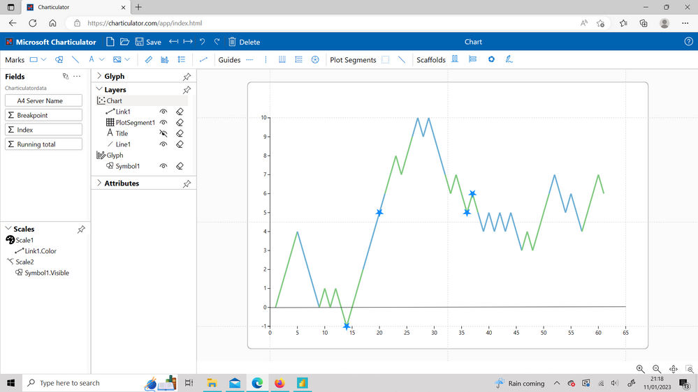
I am a complete beginner to charticulator, but with the help from a Curbal youtube video, I have been able to quickly create a line chart that meets my needs:
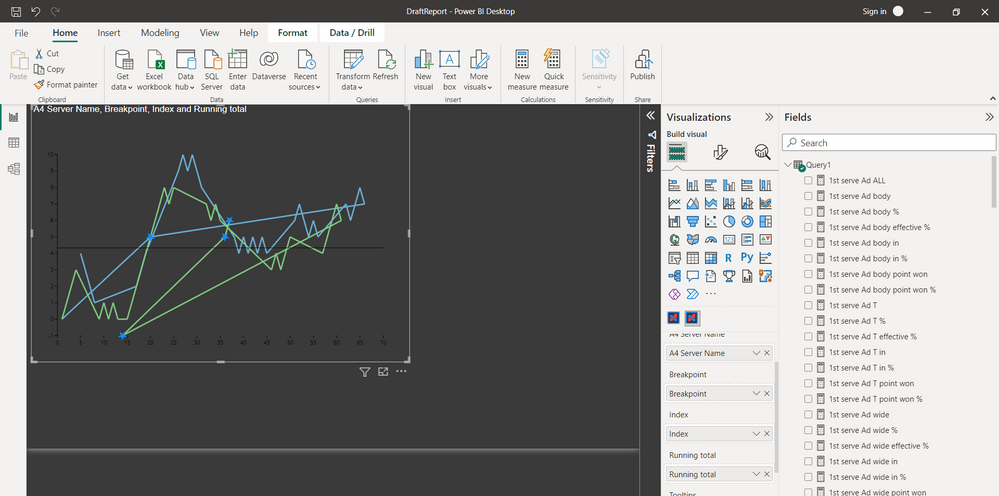
I have created this visual on charticulator website. I have exported the visual and saved it as as pbizviz. and then imported this to PBi desktop. I am prompted to drag and drop the appropriate fields (there is also a field 'Primary Key' which I am not sure what to do here), however the visual is completely wrong and different from what I have created online (data used is the same)
I have tried different summarizations of the fields and changed from numerical to categorical data within Charticulator, however the results are all wrong and nothing like what I have created.
Any help would be much appreciated.
Thanks,
Marc
- Mark as New
- Bookmark
- Subscribe
- Mute
- Subscribe to RSS Feed
- Permalink
- Report Inappropriate Content
I think Index indicates to Charticulator in which order to join the dots.
Would you be able to provide sample data?
- Mark as New
- Bookmark
- Subscribe
- Mute
- Subscribe to RSS Feed
- Permalink
- Report Inappropriate Content
Hi @lbendlin ,
Many thanks for your message. The index data was in order, however I managed to make the chart work by putting the "running total" data in to the Primary Key field.
Helpful resources

Power BI Dataviz World Championships
The Power BI Data Visualization World Championships is back! Get ahead of the game and start preparing now!

Power BI Monthly Update - November 2025
Check out the November 2025 Power BI update to learn about new features.

| User | Count |
|---|---|
| 2 | |
| 2 | |
| 1 | |
| 1 | |
| 1 |


