FabCon is coming to Atlanta
Join us at FabCon Atlanta from March 16 - 20, 2026, for the ultimate Fabric, Power BI, AI and SQL community-led event. Save $200 with code FABCOMM.
Register now!- Power BI forums
- Get Help with Power BI
- Desktop
- Service
- Report Server
- Power Query
- Mobile Apps
- Developer
- DAX Commands and Tips
- Custom Visuals Development Discussion
- Health and Life Sciences
- Power BI Spanish forums
- Translated Spanish Desktop
- Training and Consulting
- Instructor Led Training
- Dashboard in a Day for Women, by Women
- Galleries
- Data Stories Gallery
- Themes Gallery
- Contests Gallery
- QuickViz Gallery
- Quick Measures Gallery
- Visual Calculations Gallery
- Notebook Gallery
- Translytical Task Flow Gallery
- TMDL Gallery
- R Script Showcase
- Webinars and Video Gallery
- Ideas
- Custom Visuals Ideas (read-only)
- Issues
- Issues
- Events
- Upcoming Events
The Power BI Data Visualization World Championships is back! Get ahead of the game and start preparing now! Learn more
- Power BI forums
- Forums
- Get Help with Power BI
- Custom Visuals Development Discussion
- 100% stacked column chart - labels issue
- Subscribe to RSS Feed
- Mark Topic as New
- Mark Topic as Read
- Float this Topic for Current User
- Bookmark
- Subscribe
- Printer Friendly Page
- Mark as New
- Bookmark
- Subscribe
- Mute
- Subscribe to RSS Feed
- Permalink
- Report Inappropriate Content
100% stacked column chart - labels issue
Hi all,
I hope maybe you will be able to help me. Looked for solution here but haven't found it.
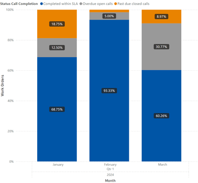
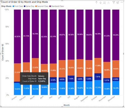
The issue I have is that I am creating 100% stacked column chart, and had to add labels - unfortunately sometimes these categories in legend get just few % (less than 5% like orange one below in the middle) and these labels are not visible. Tried different ways to fix this: made this as large as possible (these Month x-axis category could have more so we would have more columns there), turned on overflow text for labels, but cannot force them to be visible for all values, even 0.1% - for stacked chart I don't see option to move labels outside of the bars which might do the trick.
Have anyone had same issue or have an idea how to solve this? Here is the link to pbix with dummy data as I can't share real dataset for that. There same issue is shown as it does not display label for all the categories in legend
Appreciate any help 🙂
Thanks,
Piotr
- Mark as New
- Bookmark
- Subscribe
- Mute
- Subscribe to RSS Feed
- Permalink
- Report Inappropriate Content
It is what it is - there's no space for the label. Teach your users about hovering.
- Mark as New
- Bookmark
- Subscribe
- Mute
- Subscribe to RSS Feed
- Permalink
- Report Inappropriate Content
@lbendlin Thanks a lot for your reply!
Yeah so I think hovering is ok, I guess most users know that, it just does not look good in power point etc, where you capture an image. So we have to use workarounds and was thinking if there is more robust solution for that.
Helpful resources

Power BI Dataviz World Championships
The Power BI Data Visualization World Championships is back! Get ahead of the game and start preparing now!

| User | Count |
|---|---|
| 1 | |
| 1 | |
| 1 | |
| 1 | |
| 1 |


