Get Fabric certified for FREE!
Don't miss your chance to take the Fabric Data Engineer (DP-700) exam on us!
Learn moreThe FabCon + SQLCon recap series starts April 14th at 8am Pacific. If you’re tracking where AI is going inside Fabric, this first session is a can't miss. Register now
- Microsoft Fabric Community
- Fabric community blogs
- Power BI Community Blog
- Lineage View in Power BI
- Subscribe to RSS Feed
- Mark as New
- Mark as Read
- Bookmark
- Subscribe
- Printer Friendly Page
- Report Inappropriate Content
- Subscribe to RSS Feed
- Mark as New
- Mark as Read
- Bookmark
- Subscribe
- Printer Friendly Page
- Report Inappropriate Content
Have you ever asked these questions to yourself while working with multiple reports/dashboards using common datasets - “What if I modify this dataset?”, “Will this dataset modification impact any reports/dashboards?”, “Why report refresh failed?”, etc. If yes, then you are just one step away from answers to all these questions.
Power BI has a pretty good feature to show the lineage of all the reports that are published into Power BI workspace. I have not used this feature for some time but now have started using it as it gives a clear picture on the flow around a report/dashboard when published in Power BI workspace.
Today in this blog I will show few key advantages of this feature which can be beneficial for both the report developers and the report consumers, along with all the answers to the above questions.
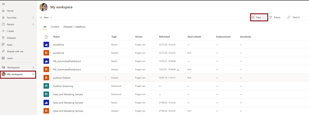
Whenever we login to Power BI Service and navigate to say, “My Workspace”, we end up with the following default view:
In the above screenshot, I have also highlighted the “View” option. When we try to click on the drop-down icon against it, it shows us an additional option for “Lineage”. See below:
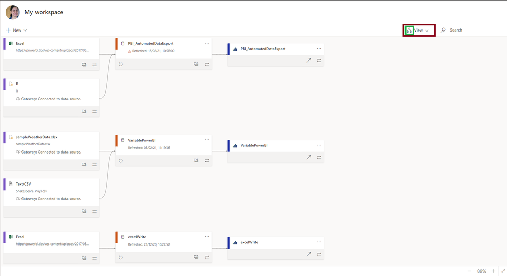
When we click on this ‘Lineage’ option, we end up with the following view with the little icon changed as well (identifying a flow view:
Pretty cool right!
Such a lovely way to visualise the entire lineage connected with a report!
Let us now see what all information we can see in this view:
- The sections highlighted in RED are the reports that are in this workspace.
- The sections highlighted in BLUE are the datasets that are populating these reports.
- The sections highlighted in GREEN shows the type of data-source connection that are used for the reports. These can be files (csv. Excel, etc.), web connections, etc. Along with this we can also see how this data-source refresh is setup in the workspace for the individual reports like using a gateway, etc.
Now let us just consider a single report lineage so that we can understand how this can help us:
- The report in the above screenshot uses a dataset which is the combination of two:
- Excel file which is a been coming from an online web source
- This dashboard uses a R script which is used to automatically generate the data extracts and to automate this a Power BI Gateway is used.
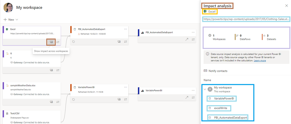
- When clicked on the small icon below this data source, it opens an ‘Impact Analysis’ window which shows the following information:
- It shows what kind of data source it is and its path as highlighted in the screenshot.
- It shows the number of workspaces where this data is used.
- It also shows how many datasets are created using this data source.
- It also shows all the reports in the workspace that use this data source as a dataset for reporting.
- The dataset part in the next step on the flow, shows the status on the data refresh. [Refreshed: 15/02/21, 10:58:00] It shows that there was an error with the data refresh therefore shows an error icon. On the same place we see also see a REFRESH button which can be used to refresh this dataset.
- When we further see there is a following option to check if there is an impact of this dataset somewhere else in this workspace.
- When we click on it, we see the following:
- As highlighted a new window appears on the right – Impact Analysis.
- It shows few metrics against this dataset:
- Number of workspaces it has been used in.
- Number of reports that use this dataset.
- Number of dashboards using this dataset. (the dataset is not pinned to a dashboard therefore shows 0 against this metric)
- Number of Views against this dashboard.
- The report part is the next and final step in the lineage which shows which report is populated using the dataset.
- The icon highlighted in RED contains a link which directly navigates the user to the report.
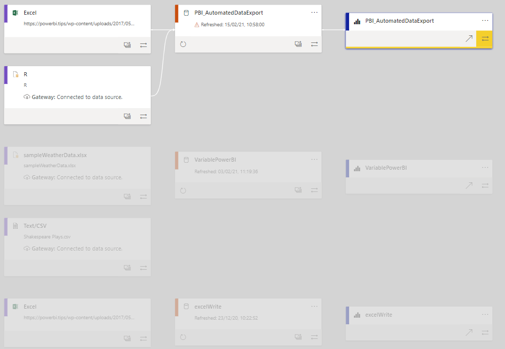
- The icon highlighted in GREEN is for seeing the lineage of this report. When clicked on it, the lineage for this report is highlighted, keeping other report’s lineages greyed-out/unhighlighted.
- The following screenshot shows the lineage for the reports that are pinned as a dashboard in the workspace:
- If we see the “Scoreboard” dataset, it has not got anything before it in the lineage, as it is an online real-time dataset.
- Next is the “Scoreboard” report using the above dataset in the lineage.
- The last in the lineage is the “Scoreboard” dashboard that has been pinned using the report.
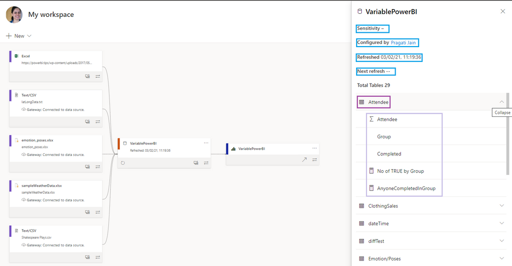
- Let us also see what all details can we see in the lineage of a report that is populated by the stand-along data-source like excel/csv files stored on a machine. See the screenshot below:
- When we click on the “Variable Power BI” dataset in the lineage, a new window opens on the right.
- The new window shows us that this dataset contains 29 tables in total. (not shown in this view as it needs scrolling down further)
- Further when we click on one of the tables, we can see that the table expands to show the columns/fields and calculated measures in it.
- Apart from this information, we also see the following:
- Sensitivity of the dataset (if set)
- Owner of the dataset – who has configured it.
- When was the dataset last refreshed.
- When is the next refresh scheduled on.
To conclude the blog, let us now summarise quickly the key points about the Power BI Lineage View:
- Lineage view gives us quick view on what all reports and datasets exist within a workspace.
- This view shows us which datasets are populating which all reports/dashboards.
- This view helps in judging the early impact of change in a dataset and how it will affect other reports and dashboards.
- Lineage flow also shows us what datasets are refreshed and if they are not then we can easily kick-off a quick data refresh from here.
- This area helps in a better management of reports from a central point of view.
- Troubleshooting report refresh failures is easy as this view shows an error identifier against any such failures.
So, this is my take on Lineage View in Power BI. What is yours?
Hope this article helps!
- Pragati
You must be a registered user to add a comment. If you've already registered, sign in. Otherwise, register and sign in.
- Migrating From Power Pivot For Excel Data to Power...
- Microsoft Fabric: A Complete Guide to Item-Level S...
- pbi-cli Gi Claude Code the Power BI Skills It Need...
- 5 Things I Wish I Knew Before Using Microsoft Powe...
- Power BI — Stop Writing Format Strings for Every M...
- 📢 Announcing the Fabric Semantic Link Developer E...
- How to Trigger a Report Refresh Programmatically i...
- The Future of Business Intelligence: AI and Copilo...
- From Normalized Tables to Business Insights: Using...
- 📢Announcing our first Data Factory & Data Integra...
-
 Rufyda
on:
📢 Announcing the Fabric Semantic Link Developer E...
-
 slindsay
on:
📢Announcing our first Data Factory & Data Integra...
-
bariscihan
 on:
Understanding Modern Data File Formats: Why Parque...
- iorantes on: Use Cases of Remote Power BI MCP Server
- Smartvpro10 on: What Is a Power BI MCP Server? (Explained for Begi...
- G_Sathish_Kumar on: Model Context Protocol (MCP) Explained - In Simple...
-
AhmedMamdoh
 on:
Understanding the Differences Between DAX UDF and ...
-
AmitDevkatte
 on:
Understanding Live Connection vs DirectQuery in Po...
-
NoosaInsight
 on:
🏆 Announcing the wildcard finalist of the Power B...
-
AmitDevkatte
 on:
The 'Why' of It All Edition
-
How to
778 -
Tips & Tricks
764 -
Events
194 -
Support insights
121 -
Opinion
111 -
DAX
66 -
Power BI
65 -
Power Query
62 -
Power BI Dev Camp
45 -
Roundup
40 -
Power BI Desktop
40 -
Dataflow
32 -
Featured User Group Leader
29 -
Data Protection
22 -
Power BI Embedded
20 -
Time Intelligence
19 -
Tips&Tricks
18 -
PowerBI REST API
12 -
Power BI Service
8 -
Power Query Tips & Tricks
8 -
finance
8 -
Direct Query
7 -
financial reporting
6 -
Data Analysis
6 -
Power Automate
6 -
Data Visualization
6 -
Python
6 -
Tips and Tricks
6 -
Power BI REST API
6 -
Auto ML
6 -
powerbi
5 -
service
5 -
Power BI PowerShell
5 -
Machine Learning
5 -
Income Statement
5 -
Dax studio
5 -
Power BI Goals
4 -
Desktop
4 -
PowerShell
4 -
Bookmarks
4 -
Line chart
4 -
Group By
4 -
community
4 -
RLS
4 -
Life Sciences
4 -
M language
4 -
Paginated Reports
4 -
External tool
4 -
Webinar
3 -
calendar
3 -
Gateways
3 -
R
3 -
M Query
3 -
R visual
3 -
CALCULATE
3 -
Reports
3 -
PowerApps
3 -
Data Science
3 -
Azure
3 -
Data model
3 -
Conditional Formatting
3 -
Visualisation
3 -
M code
3 -
Administration
3 -
Visuals
3 -
SQL Server 2017 Express Edition
3 -
R script
3 -
Aggregation
3 -
construct list
2 -
Formatting
2 -
Weekday Calendar
2 -
Support insights.
2 -
slicers
2 -
SAP
2 -
Power Platform
2 -
Workday
2 -
external tools
2 -
index
2 -
RANKX
2 -
Date
2 -
PBI Desktop
2 -
Date Dimension
2 -
Integer
2 -
Visualization
2 -
Power BI Challenge
2 -
Query Parameter
2 -
Tabular Editor
2 -
SharePoint
2 -
Power BI Installation and Updates
2 -
How Things Work
2 -
Transform data
2 -
Healthcare
2 -
rank
2 -
ladataweb
2 -
Troubleshooting
2 -
Date DIFF
2 -
Incremental Refresh
2 -
Power BI & Power Apps
2 -
Random numbers
2 -
Day of the Week
2 -
Number Ranges
2 -
Query Plans
2 -
Language M
2 -
Custom visual
2 -
VLOOKUP
2 -
pivot
2 -
calculated column
2 -
M
2 -
hierarchies
2 -
Power BI Anniversary
2 -
inexact
2 -
Date Comparison
2 -
Power BI Premium Per user
2 -
Split
2 -
Forecasting
2 -
REST API
2 -
Editor
2 -
Reverse
2 -
measure
2 -
Microsoft-flow
2 -
Paginated Report Builder
2 -
Working with Non Standatd Periods
2 -
powerbi.tips
2 -
Custom function
2 -
PUG
2 -
Custom Measures
2 -
Filtering
2 -
Python script
2 -
Nulls
2 -
DVW Analytics
2 -
Row and column conversion
2 -
Date duration
2 -
parameter
2 -
Industrial App Store
2 -
Week
2 -
Power BI Premium
1 -
On-premises data gateway
1 -
Binary
1 -
Power BI Connector for SAP
1 -
Sunday
1 -
User Data Functions
1 -
Slicer
1 -
Visual
1 -
forecast
1 -
Regression
1 -
CICD
1 -
Current Employees
1 -
date hierarchy
1 -
relationship
1 -
SIEMENS
1 -
Multiple Currency
1 -
range of values
1 -
activity log
1 -
Decimal
1 -
Charticulator Challenge
1 -
Field parameters
1 -
Workspace
1 -
Announcement
1 -
Features
1 -
domain
1 -
pbiviz
1 -
sport statistics
1 -
Intelligent Plant
1 -
Circular dependency
1 -
GE
1 -
Exchange rate
1 -
Dendrogram
1 -
Stacked Area Chart
1 -
union tables
1 -
Number
1 -
Start of Week
1 -
Tips& Tricks
1 -
deployment
1 -
ssrs traffic light indicators
1 -
SQL
1 -
trick
1 -
Scripts
1 -
Color Map
1 -
Industrial
1 -
Weekday
1 -
Working Date
1 -
Space Issue
1 -
Emerson
1 -
Date Table
1 -
Cluster Analysis
1 -
Business Analysis
1 -
Supporting Insight
1 -
rank value
1 -
Synapse
1 -
End of Week
1 -
Tips&Trick
1 -
Theme Colours
1 -
Text
1 -
Flow
1 -
Publish to Web
1 -
Extract
1 -
Topper Color On Map
1 -
Historians
1 -
context transition
1 -
Custom textbox
1 -
OPC
1 -
Zabbix
1 -
Label: DAX
1 -
Format DAX
1 -
Custom functions
1 -
accumulative
1 -
DAX&Power Query
1 -
Premium Per User
1 -
GENERATESERIES
1 -
Excel
1 -
Showcase
1 -
custom connector
1 -
Waterfall Chart
1 -
Power BI On-Premise Data Gateway
1 -
patch
1 -
Top Category Color
1 -
A&E data
1 -
Previous Order
1 -
Substring
1 -
Wonderware
1 -
Power M
1 -
CSV file
1 -
conditional accumulative
1 -
Matrix Subtotal
1 -
Check
1 -
null value
1 -
Report Server
1 -
Audit Logs
1 -
analytics pane
1 -
step by step
1 -
Top Brand Color on Map
1 -
Tutorial
1 -
Previous Date
1 -
XMLA End point
1 -
color reference
1 -
Date Time
1 -
Marker
1 -
Lineage
1 -
Fill Function
1 -
LOOKUPVALUE()
1 -
Tips &Tricks
1 -
Plotly package
1 -
Show and Tell
1 -
Cumulative Totals
1 -
Report Theme
1 -
Bookmarking
1 -
oracle
1 -
mahak
1 -
pandas
1 -
Networkdays
1 -
Button
1 -
Dataset list
1 -
Keyboard Shortcuts
1 -
Json files
1 -
Merge Rows
1 -
CONCATENATEX()
1 -
take over Datasets;
1 -
Networkdays.Intl
1 -
refresh M language Python script Support Insights
1 -
Sameperiodlastyear
1 -
Office Theme
1 -
matrix
1 -
bar chart
1 -
Measures
1 -
powerbi argentina
1 -
Canvas Apps
1 -
total
1 -
Filter context
1 -
Difference between two dates
1 -
get data
1 -
OSI
1 -
Query format convert
1 -
ETL
1 -
Change rows to columns
1 -
remove spaces
1 -
Get row and column totals
1 -
Tutorial Requests
1 -
Governance
1 -
Fun
1 -
Power BI gateway
1 -
gateway
1 -
Elementary
1 -
Custom filters
1 -
Vertipaq Analyzer
1 -
powerbi cordoba
1 -
Model Driven Apps
1 -
REMOVEFILTERS
1 -
XMLA endpoint
1 -
translations
1 -
OSI pi
1 -
Parquet
1 -
Primary Key
1 -
Microsoft 365 usage analytics data
1 -
Randomly filter
1 -
Week of the Day
1 -
Azure AAD
1 -
Retail
1 -
Power BI Report Server
1 -
School
1 -
Cost-Benefit Analysis
1 -
DIisconnected Tables
1 -
Sandbox
1 -
Honeywell
1 -
Combine queries
1 -
X axis at different granularity
1 -
ADLS
1 -
Acknowledging
1 -
Postman
1 -
Text.ContainsAny
1 -
Power BI Show
1 -
Get latest sign-in data for each user
1 -
query
1 -
Dynamic Visuals
1 -
KPI
1 -
Intro
1 -
Icons
1 -
ISV
1 -
Ties
1 -
unpivot
1 -
Practice Model
1 -
Continuous streak
1 -
ProcessVue
1 -
Create function
1 -
Table.Schema
1 -
Artificial Intelligence
1 -
Map Visual
1 -
Text.ContainsAll
1 -
Tuesday
1 -
Power Pivot
1 -
API
1 -
Kingsley
1 -
Merge
1 -
variable
1 -
Issues
1 -
function
1 -
stacked column chart
1 -
ho
1 -
ABB
1 -
KNN algorithm
1 -
List.Zip
1 -
optimization
1 -
Reduce Size
1 -
FBL3N
1 -
Wednesday
1 -
Data Engineering
1 -
Help
1 -
group
1 -
Scorecard
1 -
Json
1 -
Tops
1 -
financial reporting hierarchies RLS
1 -
Featured Data Stories
1 -
MQTT
1 -
Custom Periods
1 -
Partial group
1 -
transform table
1 -
UX
1 -
Cell content
1 -
General Ledger
1 -
Thursday
1 -
Notebook
1 -
Q&A
1 -
Quick Tips
1 -
data
1 -
PBIRS
1 -
Usage Metrics in Power BI
1 -
Multivalued column
1 -
Pipeline
1 -
Path
1 -
Yokogawa
1 -
Dynamic calculation
1 -
Data Wrangling
1 -
native folded query
1 -
Friday
1 -
Lakehouse
1 -
update
1 -
Table
1 -
Natural Query Language
1 -
Infographic
1 -
automation
1 -
Prediction
1 -
newworkspacepowerbi
1 -
Performance KPIs
1 -
HR Analytics
1 -
keepfilters
1 -
Connect Data
1 -
Financial Year
1 -
Schneider
1 -
dynamically delete records
1 -
Copy Measures
1 -
Single Date Picker
1 -
Monday
1 -
PCS
1 -
Saturday
1 -
Data Pipeline
1 -
Training
1 -
Event
1 -
Custom Visuals
1 -
Free vs Pro
1 -
Format
1 -
Active Employee
1 -
Custom Date Range on Date Slicer
1 -
refresh error
1 -
PAS
1 -
certain duration
1 -
DA-100
1 -
bulk renaming of columns
1
- 04-12-2026 - 04-14-2026
- 04-05-2026 - 04-11-2026
- 03-29-2026 - 04-04-2026
- 03-22-2026 - 03-28-2026
- 03-15-2026 - 03-21-2026
- 03-08-2026 - 03-14-2026
- 03-01-2026 - 03-07-2026
- 02-22-2026 - 02-28-2026
- 02-15-2026 - 02-21-2026
- 02-08-2026 - 02-14-2026
- 02-01-2026 - 02-07-2026
- 01-25-2026 - 01-31-2026
- 01-18-2026 - 01-24-2026
- 01-11-2026 - 01-17-2026
- View Complete Archives
