Party with Power BI’s own Guy in a Cube
Power BI is turning 10! Tune in for a special live episode on July 24 with behind-the-scenes stories, product evolution highlights, and a sneak peek at what’s in store for the future.
Save the dateEnhance your career with this limited time 50% discount on Fabric and Power BI exams. Ends August 31st. Request your voucher.
- Microsoft Fabric Community
- Fabric community blogs
- Power BI Community Blog
- Income Statement Analysis: Part 2 of 5: Create Sim...
- Subscribe to RSS Feed
- Mark as New
- Mark as Read
- Bookmark
- Subscribe
- Printer Friendly Page
- Report Inappropriate Content
Income Statement Analysis: Part 2 of 5: Create Simple Matrix view with Actuals
- Subscribe to RSS Feed
- Mark as New
- Mark as Read
- Bookmark
- Subscribe
- Printer Friendly Page
- Report Inappropriate Content
_______________________________
The topics covered in these walkthroughs include:
- Part 1: Connecting to Data (Folder Containing CSVs), Importing into Power BI
- Part 2: Creating the base measures and an Income Statement Matrix visual
______________________________________________________
In part 1 of this blog series, we connected to the folder containing the Monthly CSVs and the Reference Data Excel file and brought the data into Power BI. In this section we will create an initial set of calculations and show the results in a pivot-table style Matrix visual.
1 View/Manage Relationships
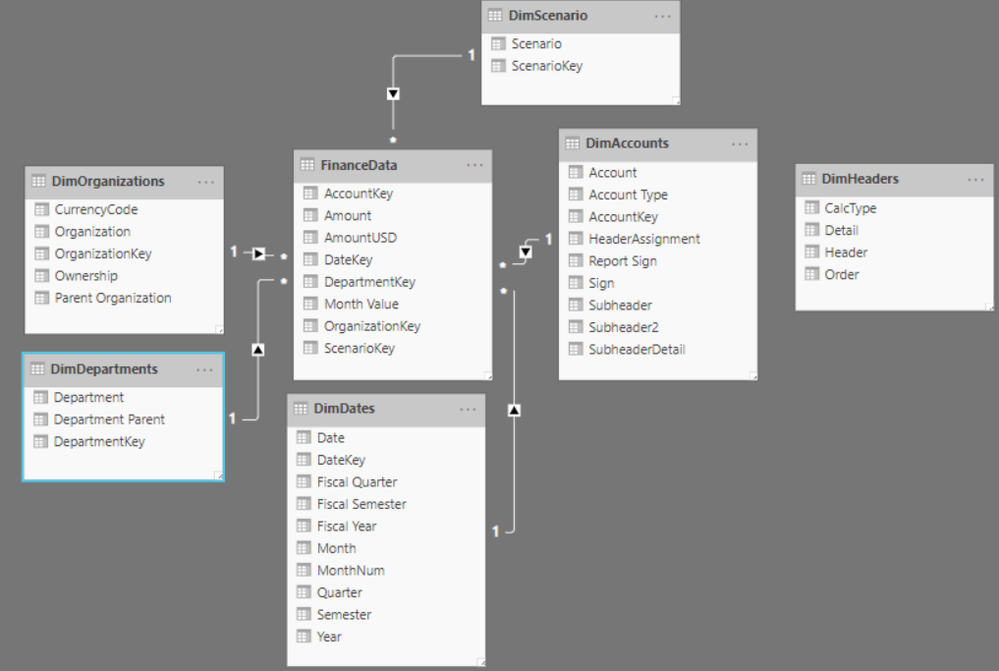
In Power BI Desktop, navigate to the relationships view window (the third one in the left panel). Re-arrange the tables so that they resemble the layout shown here:
Arranging the tables in this way is not required though reflects visually what is known as a star schema.- The transaction table (Finance Data) contains keys to link to all the Reference data tables.
The relationships are shown by the lines between the tables and double clicking on the line will show the field from each table which is used for the relationship - e.g. Account on the DimAccount table links to AccountKey on the Finance Data. The 1 and * on each line indicates the cardinality of the data in the field: the reference data tables contain unique rows for the keys (e.g. the DimAccount table contains one row per GL account) whereas the transaction table potentially contains repeated values for each key as e.g. there are likely multiple transactions which relate to any given account.
The arrow on the relationship line indicates the flow of data – you use the reference data fields on an axis of a chart (or on rows/columns of a table or matrix) and this works as a filter for that data point, filtering transactions for those reference data fields. It is possible to change the flow of data to filter in both directions though doing so risks creating model ambiguity.
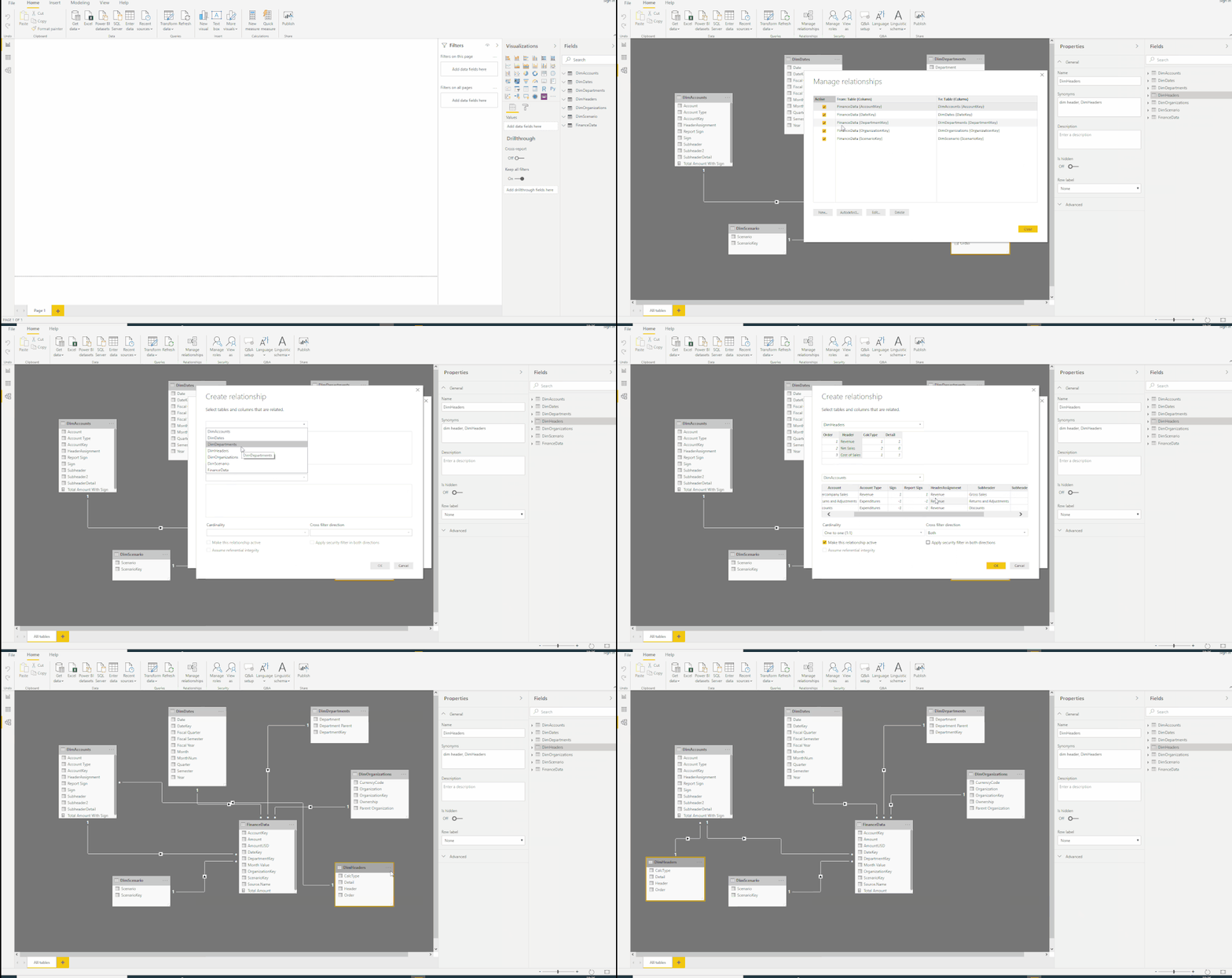
Click on ‘Manage Relationships’ under the ‘Modelling’ tab and ensure that all the following relationships are being shown:
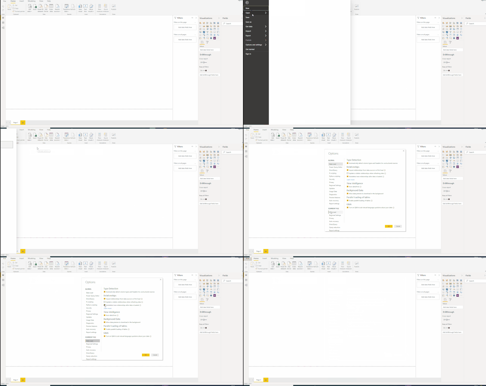
Power BI has autodetected all these relationships because the fields have the same name in the transaction and reference data tables, and there is a 1:many relationship between them. This is the default behaviour for a file though sometimes creates relationships which shouldn’t exist! The behaviour can be turned off by under the options dialog in Power BI:
One table which has not any relationships created from it is DimHeaders. On closer inspection, it does relate to the DimAccounts table – the Header field in DImHeaders should be related to the field ‘HeaderAssignment’ in DimAccounts. This relationship was not automatically created because the fields have different names, though it is easy for us to create it manually ourselves.
Click on New in the manage relationship dialog to create a new relationship and create the following relationship by selecting the columns from each table: DimHeaders[Header] -> DimAccounts[HeaderAssignment]:
2 Create a calculated Column/Measure
There are two types of calculations in Power BI – Calculated columns within a table (which calculate for each row of that table much in the same way as Excel formulas), and Measures which work by aggregating column values. Measures are like pivot table formulas – they work as an aggregation e.g:
Total Amount = SUM(FinanceData[AmountUSD])
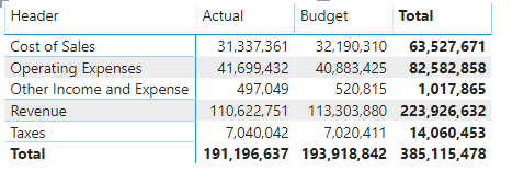
Like in a Pivot table, this sum measure can then be shown for any combination of fields from the reference data tables – e.g. for any combination of Account Header (Revenue/Expenses), Date, Account Key, Organisation, and Scenario. Plotting this measure in the values section of a table with Account Header on Rows and Scenario on columns will return:
Which is already quite a useful visual – it shows us our Top-Level Income Statement Line amounts for Actual and Budget. However, the Total does not represent Net Profit because both Revenue and Expenses are shown as positive values; for them to be summed together effectively we need to represent the expenses as a negative amount, i.e. multiply it by -1.
This multiplier is shown against each GL Account in the DimAccounts table (it is important to have it at this level rather than the Account header level because both Revenue and Expenses can have positive and negative GL’s underneath them):
To bring this into our measure we can’t just refer to the Sign column. The Measure
Total Amount Wrong = SUM(FinanceData[AmountUSD])*DimAccounts[Sign]
won’t work because it contains a naked reference to the Sign column; it needs to be contained in an aggregation function such as Sum or Average. In this case, however, aggregating the sign across multiple GLs makes no sense. Instead we need to perform the calculation on a row by row basis and sum the final result. We can do this either using an iterator function (SUMX) or by use of a calculated column.
Using SUMX the measure:
Total Amount With Sign Correct = SUMX(FinanceData,FinanceData[AmountUSD]*RELATED(DimAccounts[Sign]))
would work. As a calculated column we could add a column:
Amount With Sign = FinanceData[AmountUSD]*RELATED(DimAccounts[Sign])
And then have a measure that sums values in this new column:
Total Amount With Sign = SUM(FinanceData[Amount With Sign])
Of course, the value returned by this measure doesn’t make any sense by itself – it sums all types of values (e.g. budget and actual) together. For a meaningful number, we will need to calculate Actuals and Budget which we will do in the next step.
3 Create Actuals and PY Measures
One of the main benefits of Power BI is the ability to create measures with filter logic embedded in the calculation which allows us to create metrics that are more complex than simple aggregations. An example is where we want to show a growth value since last year. In Excel we would only be able to calculate this row by row on a transactional level and perhaps average the result, though with Power BI (or PowerPivot in Excel) we can create base measures for Actuals and PY Actuals and then a third measure which calculates the growth percentage; we can then show just the growth percentage, e.g. by customer, without having to show all the underlying measures.
The DAX function we use to create a measure with a filter condition specified within it is CALCULATE. For our base actuals measure we would write this as:
Actuals = CALCULATE([Total Amount With Sign],DimScenario[Scenario]="Actual")
This takes our Total Amount With Sign measure and evaluates it in the context where the value in the (related) Scenario table is set to ‘Actual’. This makes use of the relationship between the DimScenario and FinanceData tables – the filter applied on DimScenario (for the value of Actual) passes down via the ScenarioKey field into FinanceData.
We can then use this Actuals Measure as a base for other measures:
Actuals PY = CALCULATE([Actuals],SAMEPERIODLASTYEAR(DimDates[Date]))
Which takes the Actuals measure and evaluates it for the same period last year (Relative to whatever time period is on/applied to the axis of the chart we are looking at), and:
Actuals Variance to PY = [Actuals] - [Actuals PY]
Actuals Variance to PY = [Actuals] - [Actuals PY]
Actuals Annual Growth % = DIVIDE([Actuals Variance to PY],[Actuals PY])
We also need to format the Measures Actuals, Actuals PY, and Actuals Variance. This can be done by navigating to the relationships view window (the third one in the left panel), selecting “Actuals”, choose format “Custom” and enter in the Custom Format: "£"#,0;("£"#,0);"£"#,0. (Include all the speech marks). This will show numbers with a pound sign, a comma separator and negative numbers in brackets .
Repeat for “Actuals PY” & “Actuals Variance”.
4 Create simple matrix
- Start by dragging the actuals measure onto the canvas and choose to represent it as a card visual. It should show 19.93m.
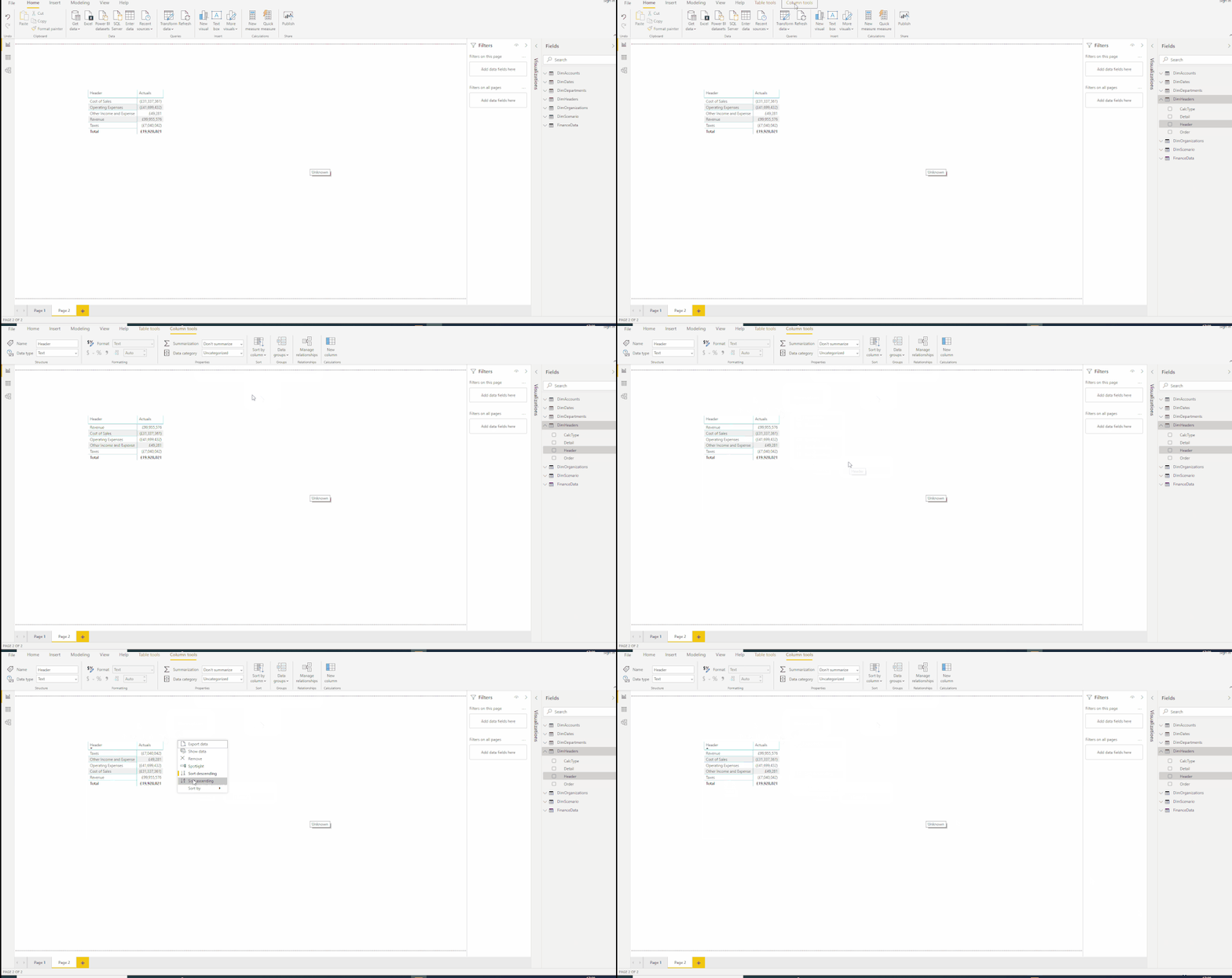
- Apply the required sort order by selecting a field from the fields list and then selecting Column Tools -> Sort By Column (Shown in video under the bullet ‘sort’ below).
-DimHeaders[Header] Sorted By Order
-DimDates[Month] sorted by MonthNum
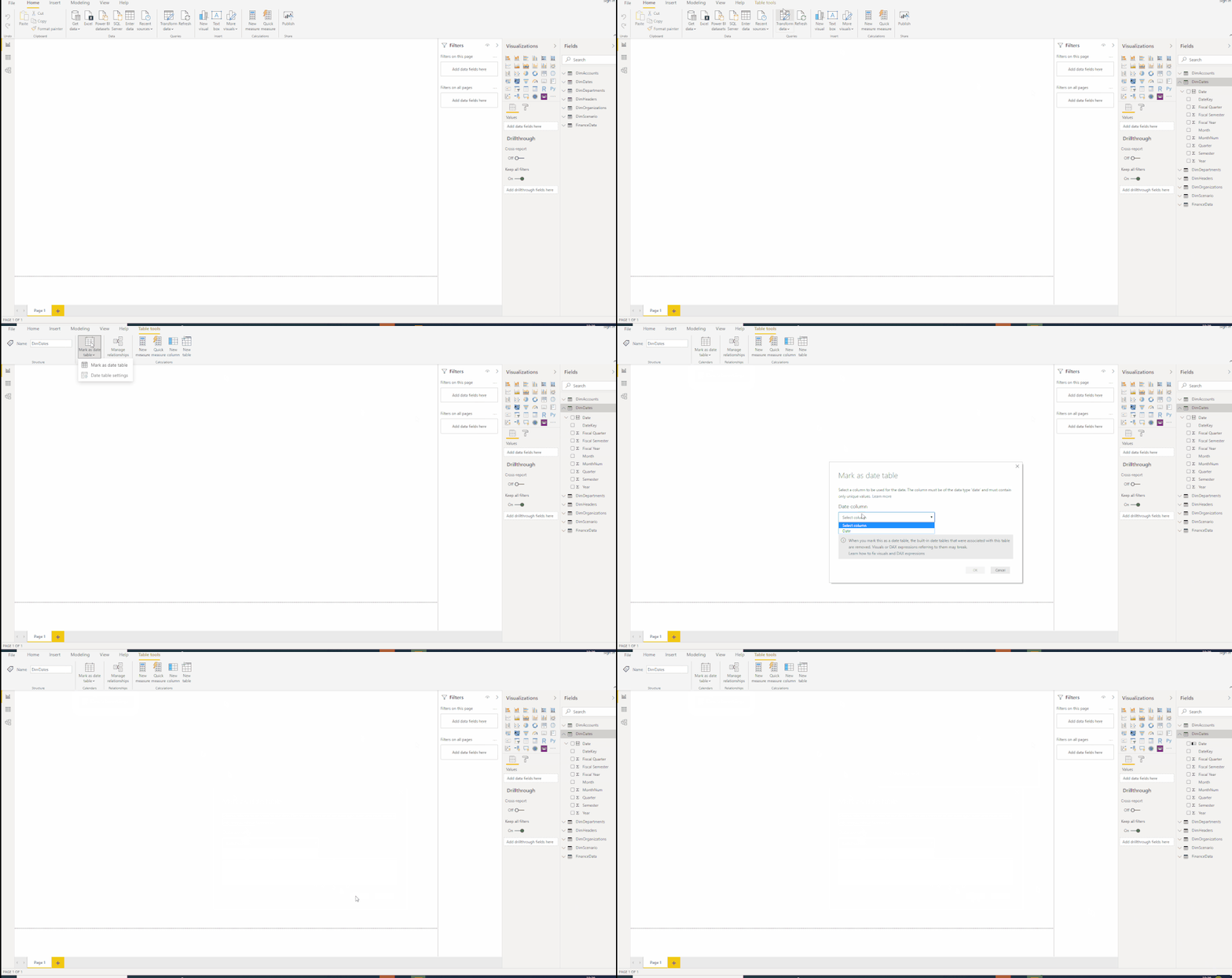
- Mark the DimDates table as a calendar table by selecting Table Tools (With the table selected) -> Mark As Date Table and selecting the DimDates[Date] field:
- Change the visual type of theA card to a matrix and drag the following fields into the Rows bucket:
- DimHeaders[Header]
- DimAccounts[SubHeader]
- DimAccounts[SubHeader2]
- Sort: Click on the 3 dots in the header visual, select Sort By and select Header, ensuring it is sorted in ascending order (Bringing Revenue first and Taxes last):
- Add the Actuals PY, Actuals Variance to PY and Annual Growth % Measures to the Values bucket.
5 Apply formatting to Matrix
Apply the following formatting changes in the matrix:
- Under Grid, set the row padding to 13
- Under Column Headers, set the Text size to 11
- Under Row Headers, set the Text size to 11 and set the +/- icons to On
- Under Values, set the font size to 11pt
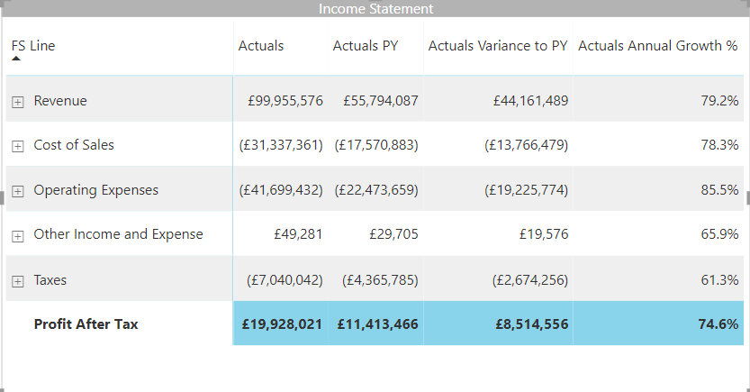
- Under Subtotal, change the background colour to a light blue and set the Row subtotals label to ‘Profit After Tax’
- Under Title, set the title to ‘Income Statement’. Set the font colour to white, the background colour to dark grey and the Text size to 11pt
The matrix visual should now look something like:
6 Add Slicers
- Add two new slicers to the page, one for DimDates[Year] and one for DimDates[Month]
- Change both slicers to a dropdown type (clicking on the arrow next to the eraser in the slicer header) and under the formatting tab of each, Navigate to Selection Controls and turn single select on for both slicers
- Change the slicer values to May 2008
The PBIX should now look like that in the attached
You must be a registered user to add a comment. If you've already registered, sign in. Otherwise, register and sign in.
- While Loop in M Language - In Short
- 🌟 Judges’ Favorites: Honoring More Standout Entri...
- 🎉 And the Winners Are… Celebrating the Best of th...
- 🎉Power BI Turns 10! Grab your digital swag!
- Level Up Your Reports: Mastering Power BI Performa...
- Integrate Python Scripts in Power BI
- ISINSCOPE vs HASONEVALUE in Power BI: The Real Dif...
- Great-Looking Dashboard, Bad Decisions: How Poor D...
- Button Slicer / How to Make Images as Slicers in P...
- Power BI Enhancements You Need to Know – Part 7: V...
-
LucasKoch2900
 on:
🌟 Judges’ Favorites: Honoring More Standout Entri...
-
LucasKoch2900
 on:
🎉 And the Winners Are… Celebrating the Best of th...
-
Leanore
 on:
🎉Power BI Turns 10! Grab your digital swag!
- sgunasekhar1 on: Level Up Your Reports: Mastering Power BI Performa...
-
 bhanu_gautam
on:
ISINSCOPE vs HASONEVALUE in Power BI: The Real Dif...
-
 v-agajavelly
on:
Button Slicer / How to Make Images as Slicers in P...
- lokesh0909 on: Unlocking the Power of Calculation Group - Beyond ...
-
Abhilash_P
 on:
Seamless Power BI Report Management with SharePoin...
-
Magudeswaran_MR
 on:
Field Parameters in Power BI
- Vikranth426 on: How to Organize Measures Effectively in Power BI
-
How to
672 -
Tips & Tricks
649 -
Events
146 -
Support insights
121 -
Opinion
82 -
DAX
66 -
Power BI
65 -
Power Query
62 -
Power BI Dev Camp
45 -
Power BI Desktop
40 -
Roundup
37 -
Dataflow
23 -
Featured User Group Leader
21 -
Power BI Embedded
20 -
Time Intelligence
19 -
Tips&Tricks
18 -
PowerBI REST API
12 -
Data Protection
11 -
Power Query Tips & Tricks
8 -
finance
8 -
Power BI Service
8 -
Direct Query
7 -
Power BI REST API
6 -
Auto ML
6 -
financial reporting
6 -
Data Analysis
6 -
Power Automate
6 -
Python
6 -
Data Visualization
6 -
Machine Learning
5 -
Income Statement
5 -
Dax studio
5 -
powerbi
5 -
service
5 -
Power BI PowerShell
5 -
Bookmarks
4 -
Line chart
4 -
Group By
4 -
community
4 -
RLS
4 -
M language
4 -
External tool
4 -
Paginated Reports
4 -
Power BI Goals
4 -
Desktop
4 -
PowerShell
4 -
Tips and Tricks
3 -
Data Science
3 -
Azure
3 -
Conditional Formatting
3 -
Data model
3 -
Life Sciences
3 -
Visualisation
3 -
Administration
3 -
M code
3 -
Visuals
3 -
SQL Server 2017 Express Edition
3 -
R script
3 -
Aggregation
3 -
calendar
3 -
Gateways
3 -
Webinar
3 -
R
3 -
M Query
3 -
R visual
3 -
CALCULATE
3 -
Reports
3 -
PowerApps
3 -
Power BI Installation and Updates
2 -
How Things Work
2 -
Tabular Editor
2 -
SharePoint
2 -
rank
2 -
ladataweb
2 -
Troubleshooting
2 -
Date DIFF
2 -
Transform data
2 -
Healthcare
2 -
Incremental Refresh
2 -
Query Plans
2 -
Power BI & Power Apps
2 -
Random numbers
2 -
Day of the Week
2 -
Number Ranges
2 -
pivot
2 -
calculated column
2 -
M
2 -
hierarchies
2 -
Power BI Anniversary
2 -
Language M
2 -
Custom Visual
2 -
VLOOKUP
2 -
Date Comparison
2 -
Power BI Premium Per user
2 -
inexact
2 -
Editor
2 -
Split
2 -
Forecasting
2 -
REST API
2 -
Microsoft-flow
2 -
Paginated Report Builder
2 -
Working with Non Standatd Periods
2 -
powerbi.tips
2 -
Custom function
2 -
Reverse
2 -
measure
2 -
Filtering
2 -
PUG
2 -
Custom Measures
2 -
Row and column conversion
2 -
Python script
2 -
Nulls
2 -
DVW Analytics
2 -
Industrial App Store
2 -
Week
2 -
Date duration
2 -
parameter
2 -
Weekday Calendar
2 -
Support insights.
2 -
construct list
2 -
Formatting
2 -
SAP
2 -
Power Platform
2 -
Workday
2 -
external tools
2 -
slicers
2 -
RANKX
2 -
index
2 -
Date Dimension
2 -
Integer
2 -
PBI Desktop
2 -
Power BI Challenge
2 -
Query Parameter
2 -
Date
2 -
Visualization
2 -
Audit Logs
1 -
analytics pane
1 -
step by step
1 -
Top Brand Color on Map
1 -
Tutorial
1 -
Previous Date
1 -
XMLA End point
1 -
color reference
1 -
Date Time
1 -
Marker
1 -
Lineage
1 -
CSV file
1 -
conditional accumulative
1 -
Matrix Subtotal
1 -
Check
1 -
null value
1 -
Excel
1 -
Report Server
1 -
oracle
1 -
mahak
1 -
pandas
1 -
Networkdays
1 -
Button
1 -
Dataset list
1 -
Keyboard Shortcuts
1 -
Fill Function
1 -
LOOKUPVALUE()
1 -
Tips &Tricks
1 -
Plotly package
1 -
Cumulative Totals
1 -
Report Theme
1 -
Bookmarking
1 -
bar chart
1 -
Measures
1 -
powerbi argentina
1 -
Canvas Apps
1 -
total
1 -
Filter context
1 -
Difference between two dates
1 -
get data
1 -
OSI
1 -
Query format convert
1 -
ETL
1 -
Json files
1 -
Merge Rows
1 -
CONCATENATEX()
1 -
take over Datasets;
1 -
Networkdays.Intl
1 -
refresh M language Python script Support Insights
1 -
Sameperiodlastyear
1 -
Office Theme
1 -
matrix
1 -
Elementary
1 -
Custom filters
1 -
Vertipaq Analyzer
1 -
powerbi cordoba
1 -
Model Driven Apps
1 -
REMOVEFILTERS
1 -
XMLA endpoint
1 -
translations
1 -
OSI pi
1 -
Parquet
1 -
Change rows to columns
1 -
remove spaces
1 -
Get row and column totals
1 -
Tutorial Requests
1 -
Governance
1 -
Fun
1 -
Power BI gateway
1 -
gateway
1 -
School
1 -
Cost-Benefit Analysis
1 -
DIisconnected Tables
1 -
Sandbox
1 -
Honeywell
1 -
Combine queries
1 -
X axis at different granularity
1 -
ADLS
1 -
Primary Key
1 -
Microsoft 365 usage analytics data
1 -
Randomly filter
1 -
Week of the Day
1 -
Azure AAD
1 -
Retail
1 -
Power BI Report Server
1 -
Intro
1 -
Icons
1 -
ISV
1 -
Ties
1 -
unpivot
1 -
Practice Model
1 -
Continuous streak
1 -
ProcessVue
1 -
Create function
1 -
Table.Schema
1 -
Acknowledging
1 -
Postman
1 -
Text.ContainsAny
1 -
Power BI Show
1 -
Get latest sign-in data for each user
1 -
query
1 -
Dynamic Visuals
1 -
KPI
1 -
Kingsley
1 -
Merge
1 -
variable
1 -
Issues
1 -
function
1 -
stacked column chart
1 -
ho
1 -
ABB
1 -
KNN algorithm
1 -
List.Zip
1 -
optimization
1 -
Artificial Intelligence
1 -
Map Visual
1 -
Text.ContainsAll
1 -
Tuesday
1 -
API
1 -
Json
1 -
Tops
1 -
financial reporting hierarchies RLS
1 -
Featured Data Stories
1 -
MQTT
1 -
Custom Periods
1 -
Partial group
1 -
Reduce Size
1 -
FBL3N
1 -
Wednesday
1 -
Power Pivot
1 -
help
1 -
group
1 -
Scorecard
1 -
Usage Metrics in Power BI
1 -
Multivalued column
1 -
Pipeline
1 -
Path
1 -
Yokogawa
1 -
Dynamic calculation
1 -
Data Wrangling
1 -
native folded query
1 -
transform table
1 -
UX
1 -
Cell content
1 -
General Ledger
1 -
Thursday
1 -
Quick Tips
1 -
data
1 -
PBIRS
1 -
automation
1 -
Prediction
1 -
newworkspacepowerbi
1 -
Performance KPIs
1 -
HR Analytics
1 -
keepfilters
1 -
Connect Data
1 -
Financial Year
1 -
Schneider
1 -
dynamically delete records
1 -
Copy Measures
1 -
Friday
1 -
Q&A
1 -
Table
1 -
Natural Query Language
1 -
Infographic
1 -
Active Employee
1 -
Custom Date Range on Date Slicer
1 -
refresh error
1 -
PAS
1 -
certain duration
1 -
DA-100
1 -
bulk renaming of columns
1 -
Single Date Picker
1 -
Monday
1 -
PCS
1 -
Saturday
1 -
update
1 -
Event
1 -
Custom Visuals
1 -
Free vs Pro
1 -
Format
1 -
forecast
1 -
Regression
1 -
CICD
1 -
Current Employees
1 -
date hierarchy
1 -
relationship
1 -
SIEMENS
1 -
Multiple Currency
1 -
Power BI Premium
1 -
On-premises data gateway
1 -
Binary
1 -
Power BI Connector for SAP
1 -
Sunday
1 -
Training
1 -
Slicer
1 -
Visual
1 -
domain
1 -
pbiviz
1 -
sport statistics
1 -
Intelligent Plant
1 -
Circular dependency
1 -
GE
1 -
Exchange rate
1 -
Dendrogram
1 -
range of values
1 -
activity log
1 -
Decimal
1 -
Charticulator Challenge
1 -
Field parameters
1 -
Announcement
1 -
Features
1 -
Scripts
1 -
Color Map
1 -
Industrial
1 -
Weekday
1 -
Working Date
1 -
Space Issue
1 -
Emerson
1 -
Date Table
1 -
Cluster Analysis
1 -
Stacked Area Chart
1 -
union tables
1 -
Number
1 -
Start of Week
1 -
Tips& Tricks
1 -
Workspace
1 -
deployment
1 -
ssrs traffic light indicators
1 -
SQL
1 -
trick
1 -
Publish to Web
1 -
Extract
1 -
Topper Color On Map
1 -
Historians
1 -
context transition
1 -
Custom textbox
1 -
OPC
1 -
Zabbix
1 -
Label: DAX
1 -
Business Analysis
1 -
Supporting Insight
1 -
rank value
1 -
Synapse
1 -
End of Week
1 -
Tips&Trick
1 -
Theme Colours
1 -
Text
1 -
Flow
1 -
Waterfall Chart
1 -
Power BI On-Premise Data Gateway
1 -
patch
1 -
Top Category Color
1 -
A&E data
1 -
Previous Order
1 -
Substring
1 -
Wonderware
1 -
Power M
1 -
Format DAX
1 -
Custom functions
1 -
accumulative
1 -
DAX&Power Query
1 -
Premium Per User
1 -
GENERATESERIES
1 -
Showcase
1 -
custom connector
1
- 07-20-2025 - 07-26-2025
- 07-13-2025 - 07-19-2025
- 07-06-2025 - 07-12-2025
- 06-29-2025 - 07-05-2025
- 06-22-2025 - 06-28-2025
- 06-15-2025 - 06-21-2025
- 06-08-2025 - 06-14-2025
- 06-01-2025 - 06-07-2025
- 05-25-2025 - 05-31-2025
- 05-18-2025 - 05-24-2025
- 05-11-2025 - 05-17-2025
- 05-04-2025 - 05-10-2025
- 04-27-2025 - 05-03-2025
- View Complete Archives
