dataviz
2 Topics[Interactive HTML Visual in Power BI] — Highlighted at the DataViz World Championships
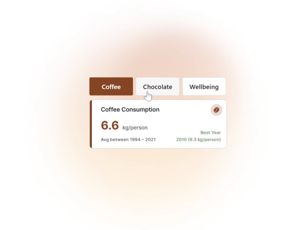
Hi everyone, I’d like to share one of the visuals that received great feedback from the Power BI community during the Power BI DataViz World Championships: an interactive HTML card that dynamically adapts to the selected parameter — changing colors, data, text, tooltips, and visual style, all within Power BI. This kind of solution is part of my regular workflow, especially when the goal is to enhance storytelling, accessibility, and user experience. It’s a way to make data consumption more intuitive and engaging, without compromising clarity or performance. The card was featured in a thematic report exploring coffee, chocolate, and wellbeing across Europe, and it stood out for its flexibility and visual impact. I’m considering starting a series of posts to share more examples, techniques, and practical tips for those interested in pushing the boundaries of HTML, CSS, and advanced interactivity in Power BI. If this type of content interests you, feel free to comment or reach out! I’d love to exchange ideas and learn from others in the community. Feel free to connect on Linkedin http://linkedin.com/in/paulogrijo
I need a help with a histogramme empilé
I would like to put two indicators from two companies (4 in total) on the same histogram. I thought about a unique stacked histogram with two columns, each for one indicator, which cumulates the results of both companies. But I really don't know how to create two columns for a 'stacked histogram.' Could you help me? Or maybe you have other ideas for my visualization? In any case, thanks a lot.509Views0likes1Comment