- Power BI forums
- Updates
- News & Announcements
- Get Help with Power BI
- Desktop
- Service
- Report Server
- Power Query
- Mobile Apps
- Developer
- DAX Commands and Tips
- Custom Visuals Development Discussion
- Health and Life Sciences
- Power BI Spanish forums
- Translated Spanish Desktop
- Power Platform Integration - Better Together!
- Power Platform Integrations (Read-only)
- Power Platform and Dynamics 365 Integrations (Read-only)
- Training and Consulting
- Instructor Led Training
- Dashboard in a Day for Women, by Women
- Galleries
- Community Connections & How-To Videos
- COVID-19 Data Stories Gallery
- Themes Gallery
- Data Stories Gallery
- R Script Showcase
- Webinars and Video Gallery
- Quick Measures Gallery
- 2021 MSBizAppsSummit Gallery
- 2020 MSBizAppsSummit Gallery
- 2019 MSBizAppsSummit Gallery
- Events
- Ideas
- Custom Visuals Ideas
- Issues
- Issues
- Events
- Upcoming Events
- Community Blog
- Power BI Community Blog
- Custom Visuals Community Blog
- Community Support
- Community Accounts & Registration
- Using the Community
- Community Feedback
Earn a 50% discount on the DP-600 certification exam by completing the Fabric 30 Days to Learn It challenge.
- Power BI forums
- Galleries
- Themes Gallery
- Re: Healthy life expectancy (HALE) Data by country
Re: Healthy life expectancy (HALE) Data by country
07-22-2019 22:36 PM


- Mark as New
- Bookmark
- Subscribe
- Mute
- Subscribe to RSS Feed
- Permalink
- Report Inappropriate Content
Healthy life expectancy (HALE) Data by country
Dataset: http://apps.who.int/gho/data/node.main.HALE?lang=en
Domain: Demographic Data
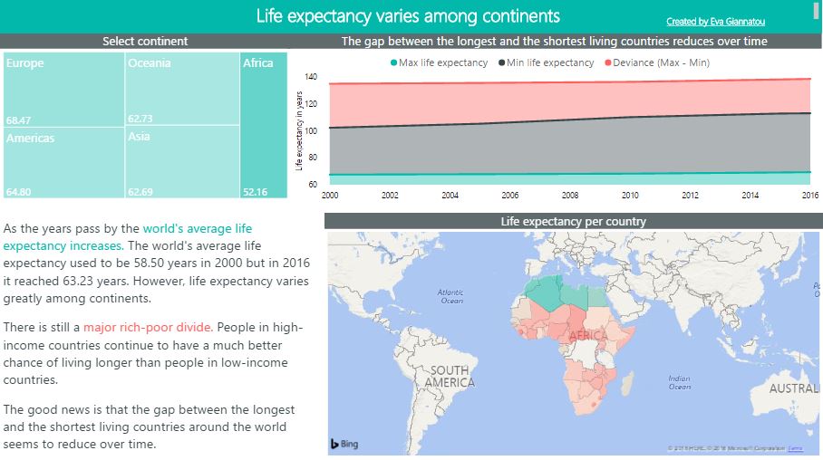
Subject: Life expectancy data by country from the World Health Organization, spanning from 2000 to 2015.
Purpose: Experimentation and familiarization with PowerBI visualizations
Created by: Eva Giannatou
[PAGE 1] – Create some simple charts. Experiment using filters to
locate possible points of interest. Can you discern any outliers? Annotate them. Why are they
important?
[PAGE 2] – Create combined charts. Experiment using filters and observe how charts are adjusted on
the fly. Can you discern any outliers? Annotate them. Why are they important?
[PAGE 3] – Prepare a Visual, Interactive Application depicting your narration (Visual Storytelling) on
the points of interest you have located.
eyJrIjoiNDdlZmE3NTItNDhiNi00YjcxLWIyOWYtNDZiMTA0ZjIzY2U4IiwidCI6IjMwNDMyMDliLTQ4YjItNDVlOS04OTQ3LWVjMWE2Mzc1NjM5MiIsImMiOjh9
- Mark as New
- Bookmark
- Subscribe
- Mute
- Subscribe to RSS Feed
- Permalink
- Report Inappropriate Content
This seems to be posted in the wrong Gallery. Try reposting it in the Data Stories Gallery (and delete this one):
https://community.powerbi.com/t5/Data-Stories-Gallery/bd-p/DataStoriesGallery
- Mark as New
- Bookmark
- Subscribe
- Mute
- Subscribe to RSS Feed
- Permalink
- Report Inappropriate Content
- Mark as New
- Bookmark
- Subscribe
- Mute
- Subscribe to RSS Feed
- Permalink
- Report Inappropriate Content
- Mark as New
- Bookmark
- Subscribe
- Mute
- Subscribe to RSS Feed
- Permalink
- Report Inappropriate Content
Thank you so much!!!! it is beautiful
- Mark as New
- Bookmark
- Subscribe
- Mute
- Subscribe to RSS Feed
- Permalink
- Report Inappropriate Content
Thank you!