Join us at the 2025 Microsoft Fabric Community Conference
Microsoft Fabric Community Conference 2025, March 31 - April 2, Las Vegas, Nevada. Use code FABINSIDER for a $400 discount.
Register now- Power BI forums
- Get Help with Power BI
- Desktop
- Service
- Report Server
- Power Query
- Mobile Apps
- Developer
- DAX Commands and Tips
- Custom Visuals Development Discussion
- Health and Life Sciences
- Power BI Spanish forums
- Translated Spanish Desktop
- Training and Consulting
- Instructor Led Training
- Dashboard in a Day for Women, by Women
- Galleries
- Webinars and Video Gallery
- Data Stories Gallery
- Themes Gallery
- Power BI DataViz World Championships Gallery
- Quick Measures Gallery
- R Script Showcase
- COVID-19 Data Stories Gallery
- Community Connections & How-To Videos
- 2021 MSBizAppsSummit Gallery
- 2020 MSBizAppsSummit Gallery
- 2019 MSBizAppsSummit Gallery
- Events
- Ideas
- Custom Visuals Ideas
- Issues
- Issues
- Events
- Upcoming Events
The Power BI DataViz World Championships are on! With four chances to enter, you could win a spot in the LIVE Grand Finale in Las Vegas. Show off your skills.
- Power BI forums
- Forums
- Get Help with Power BI
- Report Server
- Re: selection of values in graphics
- Subscribe to RSS Feed
- Mark Topic as New
- Mark Topic as Read
- Float this Topic for Current User
- Bookmark
- Subscribe
- Printer Friendly Page
- Mark as New
- Bookmark
- Subscribe
- Mute
- Subscribe to RSS Feed
- Permalink
- Report Inappropriate Content
selection of values in graphics
Hi everyone!
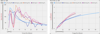
I am having a problem trying to highlight a series of data in a PowerBI graphic.
When I selected one curve in the left graphic, this one show me all the curves and highlight the selected one. However, the right graphic only shows me the selected curve.
Is there a way to show all the curves on the right graphic highlighting the selected curve? I want the same effect in both graphics.
Thanks for your time!
Lucas.
Solved! Go to Solution.
- Mark as New
- Bookmark
- Subscribe
- Mute
- Subscribe to RSS Feed
- Permalink
- Report Inappropriate Content
Hi @Anonymous ,
This can be achieved using Cross-Highlighting feature.
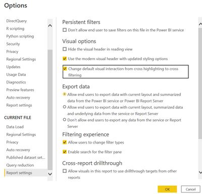
Currently your visuals are getting cross-filtered as it is a default option. You need to change the Power bi settings for applying Cross-Highlighting.
using cross highlighting, the line that you select will be highlighted and other lines will be dimmed but visible.
Steps to do cross highlighting:
Click on File(top left of the report)->Options & Setting -> Options -> Report Settings->Visual Options->Check the 3rd list(Highlighed in the below screenshot) -> Click on OK
later, go to your Edit interactions(Format option)
select your Left hand side Visual and click on Highlight icon of the right hand side visual.
Please find screenshot for your reference(I have selected a visual and i can see 3 icons on other visuals... the one marked in yellow is the highlight option)
If you find this post helpful, Please mark it as a solution and hit the thumbs up. Thank you.
Regards,
TruptiS
- Mark as New
- Bookmark
- Subscribe
- Mute
- Subscribe to RSS Feed
- Permalink
- Report Inappropriate Content
@Anonymous please mark it as a solution if it worked for you so that it will be helpful to other community members. Thanks.
Regards,
TruptiS
- Mark as New
- Bookmark
- Subscribe
- Mute
- Subscribe to RSS Feed
- Permalink
- Report Inappropriate Content
Nice explanations Trupti
- Mark as New
- Bookmark
- Subscribe
- Mute
- Subscribe to RSS Feed
- Permalink
- Report Inappropriate Content
Hi @Anonymous ,
This can be achieved using Cross-Highlighting feature.
Currently your visuals are getting cross-filtered as it is a default option. You need to change the Power bi settings for applying Cross-Highlighting.
using cross highlighting, the line that you select will be highlighted and other lines will be dimmed but visible.
Steps to do cross highlighting:
Click on File(top left of the report)->Options & Setting -> Options -> Report Settings->Visual Options->Check the 3rd list(Highlighed in the below screenshot) -> Click on OK
later, go to your Edit interactions(Format option)
select your Left hand side Visual and click on Highlight icon of the right hand side visual.
Please find screenshot for your reference(I have selected a visual and i can see 3 icons on other visuals... the one marked in yellow is the highlight option)
If you find this post helpful, Please mark it as a solution and hit the thumbs up. Thank you.
Regards,
TruptiS
Helpful resources

Join us at the Microsoft Fabric Community Conference
March 31 - April 2, 2025, in Las Vegas, Nevada. Use code MSCUST for a $150 discount!

Power BI Monthly Update - February 2025
Check out the February 2025 Power BI update to learn about new features.

Join our Community Sticker Challenge 2025
If you love stickers, then you will definitely want to check out our Community Sticker Challenge!

| User | Count |
|---|---|
| 8 | |
| 3 | |
| 3 | |
| 2 | |
| 2 |


