FabCon is coming to Atlanta
Join us at FabCon Atlanta from March 16 - 20, 2026, for the ultimate Fabric, Power BI, AI and SQL community-led event. Save $200 with code FABCOMM.
Register now!- Power BI forums
- Get Help with Power BI
- Desktop
- Service
- Report Server
- Power Query
- Mobile Apps
- Developer
- DAX Commands and Tips
- Custom Visuals Development Discussion
- Health and Life Sciences
- Power BI Spanish forums
- Translated Spanish Desktop
- Training and Consulting
- Instructor Led Training
- Dashboard in a Day for Women, by Women
- Galleries
- Data Stories Gallery
- Themes Gallery
- Contests Gallery
- QuickViz Gallery
- Quick Measures Gallery
- Visual Calculations Gallery
- Notebook Gallery
- Translytical Task Flow Gallery
- TMDL Gallery
- R Script Showcase
- Webinars and Video Gallery
- Ideas
- Custom Visuals Ideas (read-only)
- Issues
- Issues
- Events
- Upcoming Events
The Power BI Data Visualization World Championships is back! Get ahead of the game and start preparing now! Learn more
- Power BI forums
- Forums
- Get Help with Power BI
- Report Server
- "Card (new)" visual does not appear right in Power...
- Subscribe to RSS Feed
- Mark Topic as New
- Mark Topic as Read
- Float this Topic for Current User
- Bookmark
- Subscribe
- Printer Friendly Page
- Mark as New
- Bookmark
- Subscribe
- Mute
- Subscribe to RSS Feed
- Permalink
- Report Inappropriate Content
"Card (new)" visual does not appear right in Power BI Service as it does on Power BI Desktop
Hi everyone!
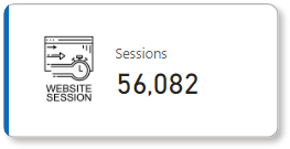
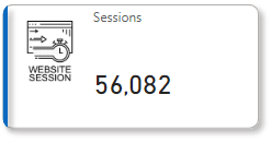
After publishing my report, I saw that the "Card (new)" visual has issues when being shown on the report.
This is how it appears on Power BI Service:
Vs how it appears on Power BI Desktop:
I can't tell why it's happening. I get the feeling that it's a bug because previously published versions of the report did not have this issue, and when I revisited the reports, they now have it even though I did not republish any of them.
Has anyone faced this issue before?
- Mark as New
- Bookmark
- Subscribe
- Mute
- Subscribe to RSS Feed
- Permalink
- Report Inappropriate Content
Any update? has this issue been resolved?
- Mark as New
- Bookmark
- Subscribe
- Mute
- Subscribe to RSS Feed
- Permalink
- Report Inappropriate Content
Almost 2 months after this issue has been raised, have we found any fix?
On desktop:
In the service:
---
Logo reference: https://thumbs.dreamstime.com/b/website-session-icon-element-web-development-signs-name-mobile-conce...
- Mark as New
- Bookmark
- Subscribe
- Mute
- Subscribe to RSS Feed
- Permalink
- Report Inappropriate Content
What worked for me is that after I published it, I edited it on the browser to fix it (when viewing the report after it's published, there's a pencil icon to edit the dashboard as you would in Power BI desktop). I then downloaded the pbix file and continued to use the same file and the problem hasn't occurred since then.
- Mark as New
- Bookmark
- Subscribe
- Mute
- Subscribe to RSS Feed
- Permalink
- Report Inappropriate Content
Hey! I had the same issue with the new card where it would be too small and cutoff the data labels. I removed the border and instead used a fill which fixed it. Hope that works for you too!
- Mark as New
- Bookmark
- Subscribe
- Mute
- Subscribe to RSS Feed
- Permalink
- Report Inappropriate Content
So, has this been fixed? Any updates? I am facing the same issue.
- Mark as New
- Bookmark
- Subscribe
- Mute
- Subscribe to RSS Feed
- Permalink
- Report Inappropriate Content
I am facing the same problem, are we expecting any resolution on this from Power BI
will be glad if someone can help
- Mark as New
- Bookmark
- Subscribe
- Mute
- Subscribe to RSS Feed
- Permalink
- Report Inappropriate Content
Turns out once I published the dashboard, it added glow and shadow to the cards for some reason! I edited the cards through the editor on Power BI service on the browser, and that did it for me.
- Mark as New
- Bookmark
- Subscribe
- Mute
- Subscribe to RSS Feed
- Permalink
- Report Inappropriate Content
Hi!
I am facing since 2 days exactly the same issue. The "Card (new)" visual ist also not available in the visualisation options online.
I hope it will be fixed soon!
- Mark as New
- Bookmark
- Subscribe
- Mute
- Subscribe to RSS Feed
- Permalink
- Report Inappropriate Content
Turns out once I published the dashboard, it added glow and shadow to the cards for some reason! I edited the cards through the editor on Power BI service on the browser, and that did it for me.
Helpful resources

Power BI Dataviz World Championships
The Power BI Data Visualization World Championships is back! Get ahead of the game and start preparing now!

| User | Count |
|---|---|
| 10 | |
| 5 | |
| 5 | |
| 4 | |
| 3 |


