- Power BI forums
- Get Help with Power BI
- Desktop
- Service
- Report Server
- Power Query
- Mobile Apps
- Developer
- DAX Commands and Tips
- Custom Visuals Development Discussion
- Health and Life Sciences
- Power BI Spanish forums
- Translated Spanish Desktop
- Training and Consulting
- Instructor Led Training
- Dashboard in a Day for Women, by Women
- Galleries
- Data Stories Gallery
- Themes Gallery
- Contests Gallery
- QuickViz Gallery
- Quick Measures Gallery
- Visual Calculations Gallery
- Notebook Gallery
- Translytical Task Flow Gallery
- TMDL Gallery
- R Script Showcase
- Webinars and Video Gallery
- Ideas
- Custom Visuals Ideas (read-only)
- Issues
- Issues
- Events
- Upcoming Events
Learn from the best! Meet the four finalists headed to the FINALS of the Power BI Dataviz World Championships! Register now
- Power BI forums
- Forums
- Get Help with Power BI
- Report Server
- Mismatch in Scatter plot Visualization between Pow...
- Subscribe to RSS Feed
- Mark Topic as New
- Mark Topic as Read
- Float this Topic for Current User
- Bookmark
- Subscribe
- Printer Friendly Page
- Mark as New
- Bookmark
- Subscribe
- Mute
- Subscribe to RSS Feed
- Permalink
- Report Inappropriate Content
Mismatch in Scatter plot Visualization between PowerBI Desktop and Server
Hello Community -
I'm trying to plot a scatter plot with 4 dimension -
1. Sales on X-axis
2. Returns on Y-axis
3. Metric on Size of the bubble
4. Transaction date on Play Axis
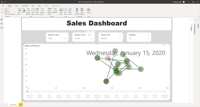
When I build the visualization on my powerbi desktop, I'm successfully able to get the desired graph. Attaching screenshot.
On clicking the bubble, I'm able to trace the path and historical data bubble appears at their respective data points and slightly translucent.
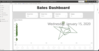
When I try to publish the dashboard on powerbi server (I'm a premium member as well), the visualization doesn't behave the same way as it does on desktop. While I'm able to trace the path, the bubbles for historical data point apper on Y-axis rather than on their respective datapoints. Attaching the screenshot.
Could anyone help me understand why there could be a difference in desktop Vs server? And how can I resolve the issue in powerbi server?
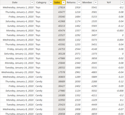
Here is the snapshot of the underlying data.
Below is the link to the powerbi file
https://drive.google.com/file/d/1t-glF6NcDSg4umsI0THieNLYU6oB6WyY/view?usp=sharing
Helpful resources

Power BI DataViz World Championships - June 2026
A new Power BI DataViz World Championship is coming this June! Don't miss out on submitting your entry.

Join our Fabric User Panel
Share feedback directly with Fabric product managers, participate in targeted research studies and influence the Fabric roadmap.

| User | Count |
|---|---|
| 1 | |
| 1 | |
| 1 | |
| 1 | |
| 1 |
| User | Count |
|---|---|
| 3 | |
| 2 | |
| 2 | |
| 2 | |
| 1 |


