New Offer! Become a Certified Fabric Data Engineer
Check your eligibility for this 50% exam voucher offer and join us for free live learning sessions to get prepared for Exam DP-700.
Get Started- Power BI forums
- Get Help with Power BI
- Desktop
- Service
- Report Server
- Power Query
- Mobile Apps
- Developer
- DAX Commands and Tips
- Custom Visuals Development Discussion
- Health and Life Sciences
- Power BI Spanish forums
- Translated Spanish Desktop
- Training and Consulting
- Instructor Led Training
- Dashboard in a Day for Women, by Women
- Galleries
- Community Connections & How-To Videos
- COVID-19 Data Stories Gallery
- Themes Gallery
- Data Stories Gallery
- R Script Showcase
- Webinars and Video Gallery
- Quick Measures Gallery
- 2021 MSBizAppsSummit Gallery
- 2020 MSBizAppsSummit Gallery
- 2019 MSBizAppsSummit Gallery
- Events
- Ideas
- Custom Visuals Ideas
- Issues
- Issues
- Events
- Upcoming Events
Don't miss out! 2025 Microsoft Fabric Community Conference, March 31 - April 2, Las Vegas, Nevada. Use code MSCUST for a $150 discount. Prices go up February 11th. Register now.
- Power BI forums
- Forums
- Get Help with Power BI
- Report Server
- Dial Gauge Dashboard Subscription showing blank vi...
- Subscribe to RSS Feed
- Mark Topic as New
- Mark Topic as Read
- Float this Topic for Current User
- Bookmark
- Subscribe
- Printer Friendly Page
- Mark as New
- Bookmark
- Subscribe
- Mute
- Subscribe to RSS Feed
- Permalink
- Report Inappropriate Content
Dial Gauge Dashboard Subscription showing blank visual
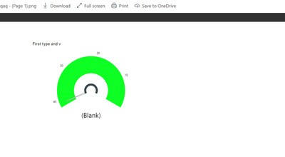
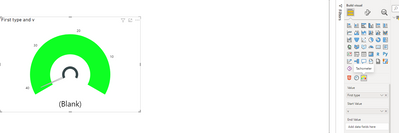
I have a custom Dial Gauge Visual from the Power BI store that is showing well in the report on Power BI online. However, when I pin the visual onto the online dashboard and then send the dashboard to subscribers in an email, the gauge is coming out blank in the email. Please help me sort this out asap, I need to send automated reports to my team.
Solved! Go to Solution.
- Mark as New
- Bookmark
- Subscribe
- Mute
- Subscribe to RSS Feed
- Permalink
- Report Inappropriate Content
Hi @Zvikovich ,
Yes ,it still work successful. And you could create a report only with the visual ,and test again.You could also try resizing the visuals, which I suspect may have something to do with the size.
Best Regards
Lucien
- Mark as New
- Bookmark
- Subscribe
- Mute
- Subscribe to RSS Feed
- Permalink
- Report Inappropriate Content
Hi @Zvikovich ,
Has your problem been solved, if so, please consider Accept a correct reply as the solution or share your own solution to help others find it.
Best Regards
Lucien
- Mark as New
- Bookmark
- Subscribe
- Mute
- Subscribe to RSS Feed
- Permalink
- Report Inappropriate Content
Hi @Zvikovich ,
In my tests, the visual subscription was successful and there were no problems with the visual.
You may pin too much tiles or live report pages on one dashboard.
You may refer to this blog: Dashboards
- Dashboards with over 25 pinned tiles, or 4 pinned live report pages, may not render fully in subscription e-mails sent to users. Subscriptions to dashboards over these numbers of tiles aren't blocked. However, they're considered unsupported if you encounter issues. Consider modifying them accordingly to fall within a supported range.
You can build more dashboards and subscribe thems to yourselves to aviod pining too much tiles on one dashboard.
Did I answer your question? Mark my post as a solution!
Best Regards
Lucien
- Mark as New
- Bookmark
- Subscribe
- Mute
- Subscribe to RSS Feed
- Permalink
- Report Inappropriate Content
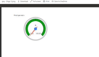
Thanks for replying @v-luwang-msft , it's actually the tachometer that is the problem. The other gauge works but it's not ideal for what i want to show. Please let me know when you test if the tachometer is also giving you a substription problem. Thanks
- Mark as New
- Bookmark
- Subscribe
- Mute
- Subscribe to RSS Feed
- Permalink
- Report Inappropriate Content
Hi @Zvikovich ,
Yes ,it still work successful. And you could create a report only with the visual ,and test again.You could also try resizing the visuals, which I suspect may have something to do with the size.
Best Regards
Lucien


