FabCon is coming to Atlanta
Join us at FabCon Atlanta from March 16 - 20, 2026, for the ultimate Fabric, Power BI, AI and SQL community-led event. Save $200 with code FABCOMM.
Register now!- Power BI forums
- Get Help with Power BI
- Desktop
- Service
- Report Server
- Power Query
- Mobile Apps
- Developer
- DAX Commands and Tips
- Custom Visuals Development Discussion
- Health and Life Sciences
- Power BI Spanish forums
- Translated Spanish Desktop
- Training and Consulting
- Instructor Led Training
- Dashboard in a Day for Women, by Women
- Galleries
- Data Stories Gallery
- Themes Gallery
- Contests Gallery
- QuickViz Gallery
- Quick Measures Gallery
- Visual Calculations Gallery
- Notebook Gallery
- Translytical Task Flow Gallery
- TMDL Gallery
- R Script Showcase
- Webinars and Video Gallery
- Ideas
- Custom Visuals Ideas (read-only)
- Issues
- Issues
- Events
- Upcoming Events
Get Fabric Certified for FREE during Fabric Data Days. Don't miss your chance! Request now
- Power BI forums
- Forums
- Get Help with Power BI
- Report Server
- Custom Theme Data Colors not in Proper Order
- Subscribe to RSS Feed
- Mark Topic as New
- Mark Topic as Read
- Float this Topic for Current User
- Bookmark
- Subscribe
- Printer Friendly Page
- Mark as New
- Bookmark
- Subscribe
- Mute
- Subscribe to RSS Feed
- Permalink
- Report Inappropriate Content
Custom Theme Data Colors not in Proper Order
Hi all,
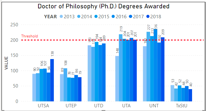
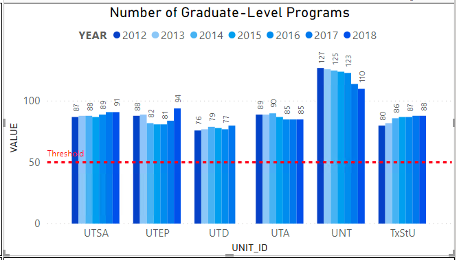
I'm using PowerBI Desktop (January 2020) for Report Server. I have a dashboard that pulls flat data from a single table, with multiple data types represented in multiple visualizations, i.e. one visualization shows Research in Millions of Dollars from 2013 - 2018, one visualization shows Doctoral Graduation Rates from 2013 - 2018, and so on.
My issue is that some visualizations also are showing 2012, but 2012 is now the darkest shade of blue, which is inconsistent with the rest of the visualizations having darker colors for more recent years.
I was wondering if anyone could help me order these colors correctly. I've tried using a Conditional Column to order my color scheme, as was done in this post by @v-lili6-msft, but it appears I cannot select Field Data Color, and then select Modeling -> Sort by Column. I thought this might be due to the edition of PowerBI I was using.
Thanks!
Helpful resources

Power BI Monthly Update - November 2025
Check out the November 2025 Power BI update to learn about new features.

Fabric Data Days
Advance your Data & AI career with 50 days of live learning, contests, hands-on challenges, study groups & certifications and more!

| User | Count |
|---|---|
| 7 | |
| 2 | |
| 2 | |
| 2 | |
| 1 |
| User | Count |
|---|---|
| 13 | |
| 5 | |
| 3 | |
| 3 | |
| 2 |


