FabCon is coming to Atlanta
Join us at FabCon Atlanta from March 16 - 20, 2026, for the ultimate Fabric, Power BI, AI and SQL community-led event. Save $200 with code FABCOMM.
Register now!- Power BI forums
- Get Help with Power BI
- Desktop
- Service
- Report Server
- Power Query
- Mobile Apps
- Developer
- DAX Commands and Tips
- Custom Visuals Development Discussion
- Health and Life Sciences
- Power BI Spanish forums
- Translated Spanish Desktop
- Training and Consulting
- Instructor Led Training
- Dashboard in a Day for Women, by Women
- Galleries
- Data Stories Gallery
- Themes Gallery
- Contests Gallery
- QuickViz Gallery
- Quick Measures Gallery
- Visual Calculations Gallery
- Notebook Gallery
- Translytical Task Flow Gallery
- TMDL Gallery
- R Script Showcase
- Webinars and Video Gallery
- Ideas
- Custom Visuals Ideas (read-only)
- Issues
- Issues
- Events
- Upcoming Events
Get Fabric Certified for FREE during Fabric Data Days. Don't miss your chance! Request now
- Power BI forums
- Forums
- Get Help with Power BI
- Report Server
- Company branding of Power BI Report Services brows...
- Subscribe to RSS Feed
- Mark Topic as New
- Mark Topic as Read
- Float this Topic for Current User
- Bookmark
- Subscribe
- Printer Friendly Page
- Mark as New
- Bookmark
- Subscribe
- Mute
- Subscribe to RSS Feed
- Permalink
- Report Inappropriate Content
Company branding of Power BI Report Services browser interface not identical to SSRS
After installing Power BI Report Server, I have noted that the branding package (identical user for SSRS) does not translate the colors the same for the left (vertical) menu bar (example: Site Settings). We did a scaled-out deployment where both SSRS and PBIRS were sharing the same Reporting Services database. Both sites looked identical (SSRS and PBIRS) expect for the area of the interface noted above, which mostly affects the font colors. The inactive menu options show up in a grayish hue for the font color, while the active/selected menu option shows up in white in PBIRS. However, under SSRS they were both dark blue, based on our uploaded branding package.
We have since removed the SSRS database instance from the scale-out deployment and uninstalled 2016 SSRS, just leaving PBIRS running. Even after that, this issue with the colors not being the same as SSRS for the area of the interface noted above still remains.
Does anyone know of any issues or changes to the branding templates between SSRS and PBIRS, or is this a bug with PBIRS?
- Mark as New
- Bookmark
- Subscribe
- Mute
- Subscribe to RSS Feed
- Permalink
- Report Inappropriate Content
Hi @pz68lk,
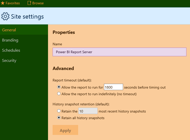
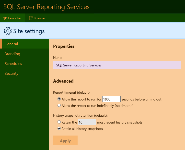
Do you mean the font color (in the left menu) was not changed in Power BI report server?
Power BI report server
SQL Server Reporting Services
Based on my test in different browsers, the font color will be changed to the corresponding color as configured in branding package when we hover over the selection.
If I have something misunderstood, please correct me and show us the screenshots.
Regards,
Yuliana Gu
If this post helps, then please consider Accept it as the solution to help the other members find it more quickly.
- Mark as New
- Bookmark
- Subscribe
- Mute
- Subscribe to RSS Feed
- Permalink
- Report Inappropriate Content
Yes. That is exactly what I'm referring to (left sidebar menu font differences between SSRS and PBIRS). I applied our SSRS branding package which DID change the font color in SSRS, but was not working in PBIRS. Maybe the version of the branding package changed since creating it under SSRS, or there's a new one for PBIRS? All I can say is I experimented with our branding package elements and could not get it to work, but yet it worked flawlessly under SSRS for the left menu pane font colors as defined in our branding package.
I am providing screenshots I saved so you can see the left menu and the differences in font colors using the EXACT SAME company branding package with both SSRS and PBIRS. (Using latest version of PBIRS or v14.0.600.286).
If you're stating it's working perhaps you could provide me with the JSON files (before and after) to alter the colors as you noted in your reply. I'm providing you the evidence below that it does NOT work and would like further clarification. It makes NO sense that it shows up one way under SSRS and another way under PBIRS with the EXACT same branding package.
Here's how the company branding package looks in SSRS (SQL Server Reporting Services):
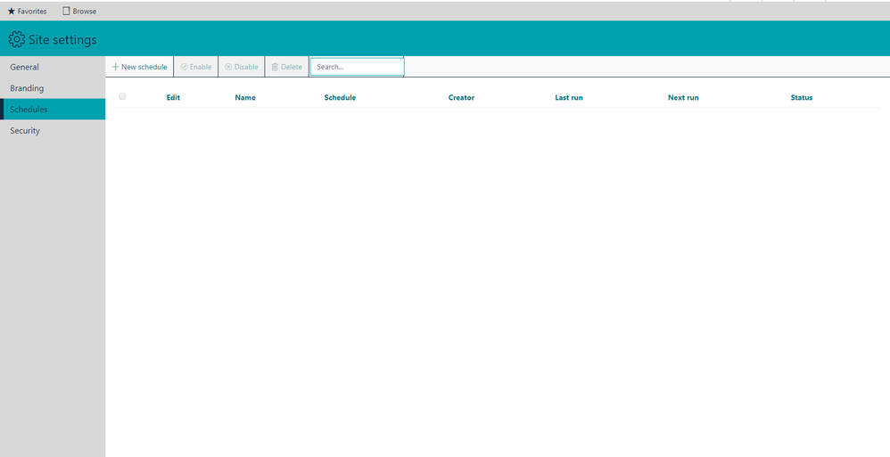
Here's how the same branding package looks with PBIRS (Power BI Reporting Server):
Helpful resources

Power BI Monthly Update - November 2025
Check out the November 2025 Power BI update to learn about new features.

Fabric Data Days
Advance your Data & AI career with 50 days of live learning, contests, hands-on challenges, study groups & certifications and more!

| User | Count |
|---|---|
| 7 | |
| 2 | |
| 2 | |
| 2 | |
| 1 |
| User | Count |
|---|---|
| 13 | |
| 5 | |
| 3 | |
| 3 | |
| 2 |


