FabCon is coming to Atlanta
Join us at FabCon Atlanta from March 16 - 20, 2026, for the ultimate Fabric, Power BI, AI and SQL community-led event. Save $200 with code FABCOMM.
Register now!- Power BI forums
- Get Help with Power BI
- Desktop
- Service
- Report Server
- Power Query
- Mobile Apps
- Developer
- DAX Commands and Tips
- Custom Visuals Development Discussion
- Health and Life Sciences
- Power BI Spanish forums
- Translated Spanish Desktop
- Training and Consulting
- Instructor Led Training
- Dashboard in a Day for Women, by Women
- Galleries
- Data Stories Gallery
- Themes Gallery
- Contests Gallery
- QuickViz Gallery
- Quick Measures Gallery
- Visual Calculations Gallery
- Notebook Gallery
- Translytical Task Flow Gallery
- TMDL Gallery
- R Script Showcase
- Webinars and Video Gallery
- Ideas
- Custom Visuals Ideas (read-only)
- Issues
- Issues
- Events
- Upcoming Events
Get Fabric Certified for FREE during Fabric Data Days. Don't miss your chance! Request now
- Power BI forums
- Forums
- Get Help with Power BI
- Report Server
- Cell background colors and gauges not working in P...
- Subscribe to RSS Feed
- Mark Topic as New
- Mark Topic as Read
- Float this Topic for Current User
- Bookmark
- Subscribe
- Printer Friendly Page
- Mark as New
- Bookmark
- Subscribe
- Mute
- Subscribe to RSS Feed
- Permalink
- Report Inappropriate Content
Cell background colors and gauges not working in Power BI Report Server after toggling visibility
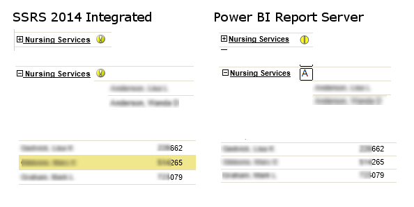
I'm migrating an existing SSRS 2014 report to Power BI Report Server. The report has an indicator gauge based on a lookup to a second dataset. There's also a toggle to expand a row group that's hidden by default, in which certain rows are highlighted based on a lookup to the dataset mentioned above.

Edit: Just in case the image above isn't displaying properly (and for search optimization), what's happening is that 1.) the exclamation mark indicator looks different in PBIRS than in SSRS 2014, then 2.) after I expand the row group under the indicator, it becomes an A in a square -- assumedly some sort of image issue, be it webfonts or missing raster file or something else. Also, 3.) the background highlight color in the detail row group (associated with the indicator) doesn't display at all in Power BI Report Server -- it just shows a normal white background.
Helpful resources

Power BI Monthly Update - November 2025
Check out the November 2025 Power BI update to learn about new features.

Fabric Data Days
Advance your Data & AI career with 50 days of live learning, contests, hands-on challenges, study groups & certifications and more!

| User | Count |
|---|---|
| 7 | |
| 2 | |
| 2 | |
| 2 | |
| 1 |
| User | Count |
|---|---|
| 13 | |
| 5 | |
| 3 | |
| 3 | |
| 2 |
