Get Fabric or SQL Certified for Free.
Get certified for free when you join Fabric Data Days 2026 and dive into Fabric, Power BI, SQL, AI, and other essential data skills.
Join now- Power BI forums
- Get Help with Power BI
- Desktop
- Service
- Report Server
- Power Query
- Mobile Apps
- Developer
- DAX Commands and Tips
- Custom Visuals Development Discussion
- Health and Life Sciences
- Power BI Spanish forums
- Translated Spanish Desktop
- Training and Consulting
- Instructor Led Training
- Dashboard in a Day for Women, by Women
- Galleries
- Data Stories Gallery
- Themes Gallery
- Contests Gallery
- QuickViz Gallery
- Quick Measures Gallery
- Visual Calculations Gallery
- Notebook Gallery
- Translytical Task Flow Gallery
- TMDL Gallery
- R Script Showcase
- Webinars and Video Gallery
- Ideas
- Custom Visuals Ideas (read-only)
- Issues
- Issues
- Events
- Upcoming Events
July 7 - July 17 | Round 2 of the Power BI Dataviz World Championships. Don't miss your chance! Learn more
- Power BI forums
- Galleries
- R Script Showcase
- PunchCard Chart in R
Your file has been submitted successfully. We’re processing it now - please check back in a few minutes to view your report.
PunchCard Chart in R
03-10-2017 06:24 AM - last edited 03-10-2017 06:36 AM


- Mark as New
- Bookmark
- Subscribe
- Mute
- Subscribe to RSS Feed
- Permalink
- Report Inappropriate Content
PunchCard Chart in R
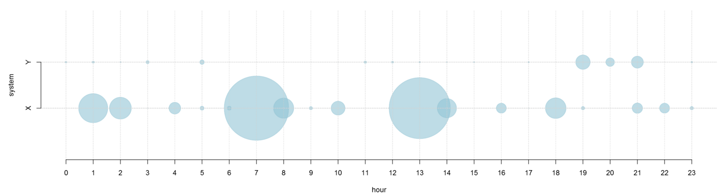
Used the visual R code below to generate a PunchCard chart for visualizing ingestion of files on two systems.
Since, I had to replace the visual with a standard Power Bi visual + DAX calculations
Prerequisite
MRO or any other flavour of R is a must.
- Mark as New
- Bookmark
- Subscribe
- Mute
- Subscribe to RSS Feed
- Permalink
- Report Inappropriate Content
Please could you post R script?
- Mark as New
- Bookmark
- Subscribe
- Mute
- Subscribe to RSS Feed
- Permalink
- Report Inappropriate Content
For some reason the upload tool has failed multiple times. Try the code below
par(mar=c(4,4,0,0))
par(oma=c(0,0,0,0))
plot(dataset$Hour,
	dataset$system,
	cex=dataset$Files/(max(dataset$Files)/20),
	col=rgb(144,195,212, maxColorValue=255, alpha=150),
	pch=19,
	xaxt="n",
	yaxt="n",
	ylab = "system",
	xlab="hour",
	bty="n",
	ylim=c(0,3))
abline(v=dataset$Hour,h=dataset$system,lty=3,col="lightgrey")
axis(1, at=0:23, labels=c(0:23))
axis(2, at=1:2, labels=c("X","Y"))
- Mark as New
- Bookmark
- Subscribe
- Mute
- Subscribe to RSS Feed
- Permalink
- Report Inappropriate Content
Try another browser (may be "chrome").
- Mark as New
- Bookmark
- Subscribe
- Mute
- Subscribe to RSS Feed
- Permalink
- Report Inappropriate Content
Hello is this missing R file?