- Power BI forums
- Get Help with Power BI
- Desktop
- Service
- Report Server
- Power Query
- Mobile Apps
- Developer
- DAX Commands and Tips
- Custom Visuals Development Discussion
- Health and Life Sciences
- Power BI Spanish forums
- Translated Spanish Desktop
- Training and Consulting
- Instructor Led Training
- Dashboard in a Day for Women, by Women
- Galleries
- Data Stories Gallery
- Themes Gallery
- Contests Gallery
- QuickViz Gallery
- Quick Measures Gallery
- Visual Calculations Gallery
- Notebook Gallery
- Translytical Task Flow Gallery
- TMDL Gallery
- R Script Showcase
- Webinars and Video Gallery
- Ideas
- Custom Visuals Ideas (read-only)
- Issues
- Issues
- Events
- Upcoming Events
Learn from the best! Meet the four finalists headed to the FINALS of the Power BI Dataviz World Championships! Register now
- Power BI forums
- Galleries
- R Script Showcase
- Matrix Bubble Chart
Your file has been submitted successfully. We’re processing it now - please check back in a few minutes to view your report.
Matrix Bubble Chart
02-23-2021 06:33 AM - last edited 02-23-2021 06:35 AM
- Mark as New
- Bookmark
- Subscribe
- Mute
- Subscribe to RSS Feed
- Permalink
- Report Inappropriate Content
Matrix Bubble Chart
What
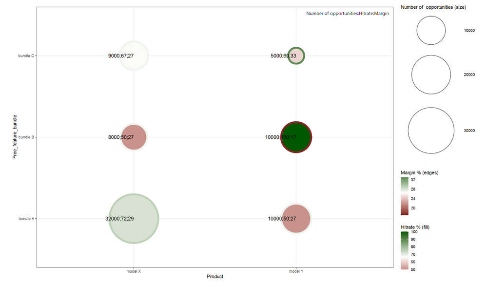
A powerful Power BI R visual, matrix bubble chart, to analyze three measures (facts) with two selected dimensions.

How
One needs to have R installed on the computer or to the server / enabled in the cloud environment.
Here is a guide to get started: https://docs.microsoft.com/en-us/power-bi/create-reports/desktop-r-visuals
Here is a link to some details: https://docs.microsoft.com/en-us/power-bi/visuals/service-r-visuals
Analysis example
- The edge color of a bubble tells about the margin % of a product.
- The fill color of a bubble tells about the % of opportunities won (hitrate) of a product.
- The bubble size illustrates the number of the opportunities.
- In the X-axis is the product dimension.
- In the Y-axis is the free feature bundle given together with the product dimension.
This could be an example from the car industry. The question could be what bundles we want to offer with what products and how should we price the product & bundle combinations.
See my blog post for an example use case:
https://www.plainlyresults.com/blog/power-bi-r-matrix-bubble-chart-sales-opportunity-analysis/
CODE
Add in your Power BI R visual the code below the "Paste or type your script code here:" text.
#change lib path to were you have ggplot2 and scales installed
library(ggplot2, lib="D:/Program Files/R/R-3.6.3/library")
require(ggplot2)
library(scales, lib="D:/Program Files/R/R-3.6.3/library")
#change columns Product, Free_feature_bundle, dataset$... to your columns in the Power BI model selected to the R visual
ggplot(dataset, aes(x = Product, y = Free_feature_bundle, label = paste(round(dataset$Opportunity_count, digits=0), round(dataset$Hitrate_perc, digits=2)*100, round(dataset$Margin_perc, digits=2)*100, sep=";"))) +
geom_point(shape = 21, aes(size = round(dataset$Opportunity_count, digits=0) , fill = round(dataset$Hitrate_perc, digits=2)*100, color = round(dataset$Margin_perc, digits=2)*100, stroke = 3)) +
geom_text(hjust = 1, size = 4) +
scale_size(range = c(15,50)) + #scaling of the bubbles
theme_bw()+ scale_fill_gradient2("Hitrate % (fill)", low=muted("red"), high=muted("green"), midpoint =
mean(dataset$Hitrate_perc*100)) +theme_bw()+ scale_color_gradient2("Margin % (edges)", low=muted("red"),
high=muted("green"), midpoint = mean(dataset$Margin_perc*100)) + labs(size = "Number of opportunities (size)")
- Mark as New
- Bookmark
- Subscribe
- Mute
- Subscribe to RSS Feed
- Permalink
- Report Inappropriate Content
Hi,
I am trying to create a chart but I am stuck while running the script, the error is "
can you please help me to proceed?
Thanks,
Neha
"
- Mark as New
- Bookmark
- Subscribe
- Mute
- Subscribe to RSS Feed
- Permalink
- Report Inappropriate Content
@nehajadhav166 Assuming that ggplot2 and scales packages are installed, try modifying the R script and remove or comment out the lib= instructions, like this:
# if R is already in your path, you do not need the lib= instruction
library(ggplot2) #, lib="D:/Program Files/R/R-3.6.3/library")
require(ggplot2)
library(scales) #, lib="D:/Program Files/R/R-3.6.3/library")
That worked for me.
Good luck!


