A new Data Days event is coming soon!
This time we’re going bigger than ever. Fabric, Power BI, SQL, AI and more. We're covering it all. You won't want to miss it.
Learn more- Power BI forums
- Get Help with Power BI
- Desktop
- Service
- Report Server
- Power Query
- Mobile Apps
- Developer
- DAX Commands and Tips
- Custom Visuals Development Discussion
- Health and Life Sciences
- Power BI Spanish forums
- Translated Spanish Desktop
- Training and Consulting
- Instructor Led Training
- Dashboard in a Day for Women, by Women
- Galleries
- Data Stories Gallery
- Themes Gallery
- Contests Gallery
- QuickViz Gallery
- Quick Measures Gallery
- Visual Calculations Gallery
- Notebook Gallery
- Translytical Task Flow Gallery
- TMDL Gallery
- R Script Showcase
- Webinars and Video Gallery
- Ideas
- Custom Visuals Ideas (read-only)
- Issues
- Issues
- Events
- Upcoming Events
Did you hear? There's a new SQL AI Developer certification (DP-800). Start preparing now and be one of the first to get certified. Register now
- Power BI forums
- Forums
- Get Help with Power BI
- Developer
- Matrix in Stack Column chart
- Subscribe to RSS Feed
- Mark Topic as New
- Mark Topic as Read
- Float this Topic for Current User
- Bookmark
- Subscribe
- Printer Friendly Page
- Mark as New
- Bookmark
- Subscribe
- Mute
- Subscribe to RSS Feed
- Permalink
- Report Inappropriate Content
Matrix in Stack Column chart
Hi,
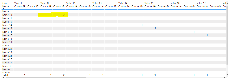
I tried to show the stack column chart in matrix view which is possible in tableau but I am not able to do it in Power Bi.
How to show Stack bar chart in Matrix view in Power BI ?
Mainly I need to see two values in one cell like in stack column chart
In the above image I tried to convert to single matrix view like if you see the Name 10 and value 10 I need to see the countsof A and B in Single cell as stack column chart.
- Mark as New
- Bookmark
- Subscribe
- Mute
- Subscribe to RSS Feed
- Permalink
- Report Inappropriate Content
Greetings ... I have been scouring the forum and web to find a solution for this as well. Since our hospital switched from Tableau to BI recently I have been porting dashboards over. I have run in to one issue like the topic above and was wondering if there has been a solution to this since 2021?
Below is the visual I want to re-create but with three stacks:
Tableau
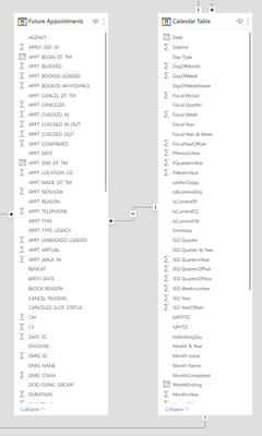
And this is the common relationship in BI for the visual that I am jtrying to build:
The fields in which I want to stack are in the future appointment table are:
Appt_booked_loaded | Appt_Unbooked_loaded | Appt_Block
I have got to this point below:
I have tried multiple ways to get a stacked bar into the cells for each clinician under the date column header but have not reached the desired end state.
Any help is truly appreciated, Have a great day.
Mark
- Mark as New
- Bookmark
- Subscribe
- Mute
- Subscribe to RSS Feed
- Permalink
- Report Inappropriate Content
Hi @Anonymous ,
You can refer the solution in the following threads as a workaround to implement it:
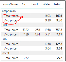
1. Multiple Values for a Matrix can now Appear as Row Headers
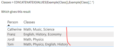
2. Turning multiple values into one string in Power BI (If the matrix values are Text type)
If the above ones can't help you get the expected result, please provide some original sample data in your tables and your expected result with the formula of involved measure/calculated column and special examples. Thank you.
Best Regards
- Mark as New
- Bookmark
- Subscribe
- Mute
- Subscribe to RSS Feed
- Permalink
- Report Inappropriate Content
Hi @Anonymous
No this is not a solution I have two different measure which we need to show to one cell like a stack column chart with different colours.
- Mark as New
- Bookmark
- Subscribe
- Mute
- Subscribe to RSS Feed
- Permalink
- Report Inappropriate Content
Hi @Anonymous,
Based on my research, I'm afraid that your requirement (display two field values in one cell cell of the stacked column visual with different colors) is not possible. You can raise a new idea and add your comments there to make this feature coming sooner.
Best Regards
Helpful resources

Power BI Monthly Update - April 2026
Check out the April 2026 Power BI update to learn about new features.

Data Days 2026 coming soon!
Sign up to receive a private message when registration opens and key events begin.

New to Fabric Survey
If you have recently started exploring Fabric, we'd love to hear how it's going. Your feedback can help with product improvements.

| User | Count |
|---|---|
| 4 | |
| 2 | |
| 1 | |
| 1 | |
| 1 |


