FabCon is coming to Atlanta
Join us at FabCon Atlanta from March 16 - 20, 2026, for the ultimate Fabric, Power BI, AI and SQL community-led event. Save $200 with code FABCOMM.
Register now!- Power BI forums
- Get Help with Power BI
- Desktop
- Service
- Report Server
- Power Query
- Mobile Apps
- Developer
- DAX Commands and Tips
- Custom Visuals Development Discussion
- Health and Life Sciences
- Power BI Spanish forums
- Translated Spanish Desktop
- Training and Consulting
- Instructor Led Training
- Dashboard in a Day for Women, by Women
- Galleries
- Data Stories Gallery
- Themes Gallery
- Contests Gallery
- Quick Measures Gallery
- Notebook Gallery
- Translytical Task Flow Gallery
- TMDL Gallery
- R Script Showcase
- Webinars and Video Gallery
- Ideas
- Custom Visuals Ideas (read-only)
- Issues
- Issues
- Events
- Upcoming Events
Calling all Data Engineers! Fabric Data Engineer (Exam DP-700) live sessions are back! Starting October 16th. Sign up.
- Power BI forums
- Forums
- Get Help with Power BI
- Developer
- Is it possible to shift Sankey values to the left ...
- Subscribe to RSS Feed
- Mark Topic as New
- Mark Topic as Read
- Float this Topic for Current User
- Bookmark
- Subscribe
- Printer Friendly Page
- Mark as New
- Bookmark
- Subscribe
- Mute
- Subscribe to RSS Feed
- Permalink
- Report Inappropriate Content
Is it possible to shift Sankey values to the left with padding?
I currently have a sankey that looks like this
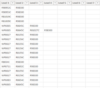
My goal is to create some kinda measure or use some kind of tool that will allow me to shift certain levels to the right. I am trying to force the values on the sankey to their specified level according to this table. Is this possible in Power BI?
Solved! Go to Solution.
- Mark as New
- Bookmark
- Subscribe
- Mute
- Subscribe to RSS Feed
- Permalink
- Report Inappropriate Content
Hi @Anonymous ,
Please review the following links and check whether they are what you want.
Creating Custom Sankey Diagrams Using R
anyone successfully generate sankey chart with R plotly in powerBI desktop and powerBI service?
No, this is a HTML plot, that cannot work. You have to use pbiviz, see here.
i tried and it works with pbiviz. Sankey created by R plotly can be displayed in powerBI desktop and powerBI service
Best Regards
- Mark as New
- Bookmark
- Subscribe
- Mute
- Subscribe to RSS Feed
- Permalink
- Report Inappropriate Content
This is not really a Power BI issue. You need to modify/transform your data to be more suitable for a Sankey, including better bucketing and Source/Target pairing. As you can see from your screenshot it's not really useful in its current state.
You can unlock item positions in the Sankey visual and move them around as needed.
- Mark as New
- Bookmark
- Subscribe
- Mute
- Subscribe to RSS Feed
- Permalink
- Report Inappropriate Content
Hi, thanks for the reply. I know it is not an issue with Power Bi, I was just wondering if there was a work around to what I am trying to accomplish. This is mainly so I can ensure that all future data inputs will be placed in the right place for sure. Is there no way to add padding to a sankey visual?
- Mark as New
- Bookmark
- Subscribe
- Mute
- Subscribe to RSS Feed
- Permalink
- Report Inappropriate Content
As I said, this is the least of your problems. You will want to work on rebuilding your source data into a format that is compatible with Sankey's concept of Source and Target.
- Mark as New
- Bookmark
- Subscribe
- Mute
- Subscribe to RSS Feed
- Permalink
- Report Inappropriate Content
The data right now currently displays the correct values, I am trying to have it shifted more for aesthetic reasons so it is easier for the user to see. For eample if I narrow down the graph to display something from level 1 it will show all flows related to that. Do you have any tips I can use to restructure the data so I can sort of force it to behave how I want it to?
- Mark as New
- Bookmark
- Subscribe
- Mute
- Subscribe to RSS Feed
- Permalink
- Report Inappropriate Content
Have at most ten sources and targets.
- Mark as New
- Bookmark
- Subscribe
- Mute
- Subscribe to RSS Feed
- Permalink
- Report Inappropriate Content
I saw that this problem is possible in R, do you know how I would go about doing that? I saw that alluvial is a package that is allowed in Power Bi.
- Mark as New
- Bookmark
- Subscribe
- Mute
- Subscribe to RSS Feed
- Permalink
- Report Inappropriate Content
Hi @Anonymous ,
Please review the following links and check whether they are what you want.
Creating Custom Sankey Diagrams Using R
anyone successfully generate sankey chart with R plotly in powerBI desktop and powerBI service?
No, this is a HTML plot, that cannot work. You have to use pbiviz, see here.
i tried and it works with pbiviz. Sankey created by R plotly can be displayed in powerBI desktop and powerBI service
Best Regards
Helpful resources

FabCon Global Hackathon
Join the Fabric FabCon Global Hackathon—running virtually through Nov 3. Open to all skill levels. $10,000 in prizes!

Power BI Monthly Update - October 2025
Check out the October 2025 Power BI update to learn about new features.

| User | Count |
|---|---|
| 3 | |
| 3 | |
| 2 | |
| 1 | |
| 1 |


