A new Data Days event is coming soon!
This time we’re going bigger than ever. Fabric, Power BI, SQL, AI and more. We're covering it all. You won't want to miss it.
Learn more- Power BI forums
- Get Help with Power BI
- Desktop
- Service
- Report Server
- Power Query
- Mobile Apps
- Developer
- DAX Commands and Tips
- Custom Visuals Development Discussion
- Health and Life Sciences
- Power BI Spanish forums
- Translated Spanish Desktop
- Training and Consulting
- Instructor Led Training
- Dashboard in a Day for Women, by Women
- Galleries
- Data Stories Gallery
- Themes Gallery
- Contests Gallery
- QuickViz Gallery
- Quick Measures Gallery
- Visual Calculations Gallery
- Notebook Gallery
- Translytical Task Flow Gallery
- TMDL Gallery
- R Script Showcase
- Webinars and Video Gallery
- Ideas
- Custom Visuals Ideas (read-only)
- Issues
- Issues
- Events
- Upcoming Events
Level up your Power BI skills this month - build one visual each week and tell better stories with data! Get started
- Power BI forums
- Forums
- Get Help with Power BI
- Developer
- Inconsistent Data from Google Analytics
- Subscribe to RSS Feed
- Mark Topic as New
- Mark Topic as Read
- Float this Topic for Current User
- Bookmark
- Subscribe
- Printer Friendly Page
- Mark as New
- Bookmark
- Subscribe
- Mute
- Subscribe to RSS Feed
- Permalink
- Report Inappropriate Content
Inconsistent Data from Google Analytics
I have pulled from the same data source into several different data tables (main quiery tables) and have displayed this data into report tables.
When I first did this I pulled all the metrics and dimensions I planned to use from Google Analytics into one data table in power bi. But it was brought to my attention that this could cause some of the metrics/dimensions to be inflated (have multiple lines of the same data).
So my plan was to test this by created several data tables with just a few metrics and then create relationships and avoid the duplicate data issue. But when I did this the data I got was not constistent.
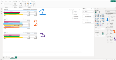
The first report from a data table with several metrics/dimentinos
breaking down the metrics into smaller tabels
The first table shows the data when I pulled all the metrics and dimentions into one large data table.
The second shows where I pulled in a table focused on total users with date, sessions, pagePath, totalUsers.
Another data table focused on new users with date, sessions, pagePath, newUsers.
Then ended up adding one with both to compare becasue the numbers were not matching up.
Can anyone explain why these have different numbers. I expected these all to be the same.
Helpful resources

Power BI Monthly Update - April 2026
Check out the April 2026 Power BI update to learn about new features.

Data Days 2026 coming soon!
Sign up to receive a private message when registration opens and key events begin.

New to Fabric Survey
If you have recently started exploring Fabric, we'd love to hear how it's going. Your feedback can help with product improvements.


