FabCon is coming to Atlanta
Join us at FabCon Atlanta from March 16 - 20, 2026, for the ultimate Fabric, Power BI, AI and SQL community-led event. Save $200 with code FABCOMM.
Register now!- Power BI forums
- Get Help with Power BI
- Desktop
- Service
- Report Server
- Power Query
- Mobile Apps
- Developer
- DAX Commands and Tips
- Custom Visuals Development Discussion
- Health and Life Sciences
- Power BI Spanish forums
- Translated Spanish Desktop
- Training and Consulting
- Instructor Led Training
- Dashboard in a Day for Women, by Women
- Galleries
- Data Stories Gallery
- Themes Gallery
- Contests Gallery
- Quick Measures Gallery
- Notebook Gallery
- Translytical Task Flow Gallery
- TMDL Gallery
- R Script Showcase
- Webinars and Video Gallery
- Ideas
- Custom Visuals Ideas (read-only)
- Issues
- Issues
- Events
- Upcoming Events
Join the Fabric FabCon Global Hackathon—running virtually through Nov 3. Open to all skill levels. $10,000 in prizes! Register now.
- Power BI forums
- Forums
- Get Help with Power BI
- Developer
- Does anyone has the chart pbiviz file?
- Subscribe to RSS Feed
- Mark Topic as New
- Mark Topic as Read
- Float this Topic for Current User
- Bookmark
- Subscribe
- Printer Friendly Page
- Mark as New
- Bookmark
- Subscribe
- Mute
- Subscribe to RSS Feed
- Permalink
- Report Inappropriate Content
Does anyone has the chart pbiviz file?
Hi all,
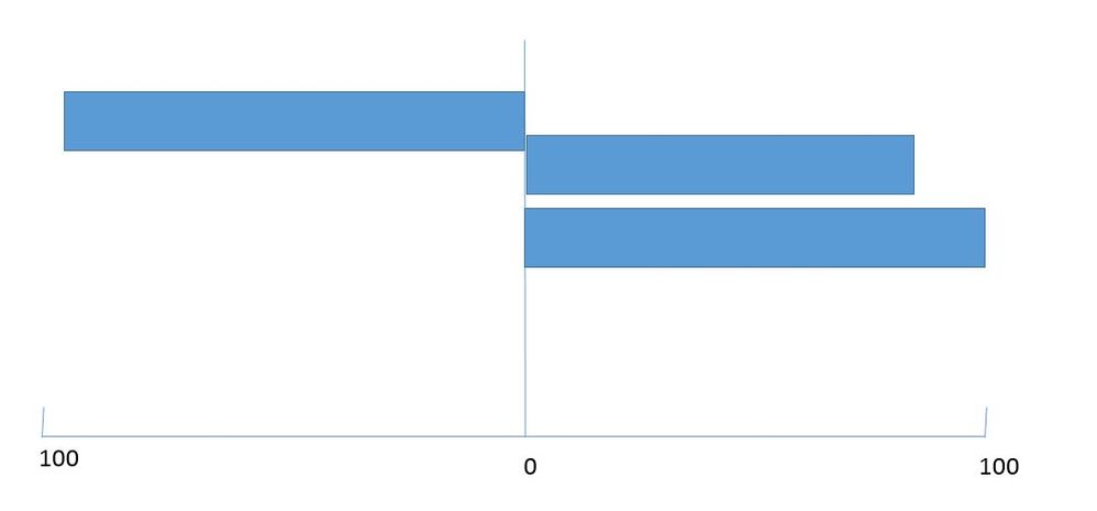
Now we have three measures which are Sales in,Sales Out and inventory. The current chart in powerbi can only put three measure at the same side. Does anyone has the chart template which is similar to below picture?(either horizontal or vertical). Then we only have positive values in the chart.
Thanks in advance.
Did I answer your question? Mark my post as a solution!
Proud to be a Super User!
- Mark as New
- Bookmark
- Subscribe
- Mute
- Subscribe to RSS Feed
- Permalink
- Report Inappropriate Content
Hi,
I agree that this looks pretty much like a Tornado Chart,
An all wrapped pbiviz package is available online from Appsource.Microsoft.com:
https://appsource.microsoft.com/en-us/product/office/WA104380768?src=office&corrid=1b5c4c60-237c-485...
-------
In case you wanted to add other personal modifications or custom features, you can check how the visualization is built under the hood on Github:
Power BI Visual Code available on Github
https://github.com/Microsoft/PowerBI-visuals-Tornado
After downloading the code:
1- run > npm install
2- run >pbiviz package
last action should generate a pbiviz under dist folder.
-----
Finally. an original d3.js sample of Tornado Chart [from which demo was inspired...]:
https://bl.ocks.org/lmatteis/d0f7533895da2e59cd6f62f3589fd8eb
Hope this helps 😉
- Mark as New
- Bookmark
- Subscribe
- Mute
- Subscribe to RSS Feed
- Permalink
- Report Inappropriate Content
Does Tornado Chart meet your requirements?
Ignat Vilesov,
Software Engineer
Microsoft Power BI Custom Visuals
Helpful resources
| User | Count |
|---|---|
| 11 | |
| 4 | |
| 4 | |
| 3 | |
| 3 |


