Join us at FabCon Vienna from September 15-18, 2025
The ultimate Fabric, Power BI, SQL, and AI community-led learning event. Save €200 with code FABCOMM.
Get registered- Power BI forums
- Get Help with Power BI
- Desktop
- Service
- Report Server
- Power Query
- Mobile Apps
- Developer
- DAX Commands and Tips
- Custom Visuals Development Discussion
- Health and Life Sciences
- Power BI Spanish forums
- Translated Spanish Desktop
- Training and Consulting
- Instructor Led Training
- Dashboard in a Day for Women, by Women
- Galleries
- Data Stories Gallery
- Themes Gallery
- Contests Gallery
- Quick Measures Gallery
- Notebook Gallery
- Translytical Task Flow Gallery
- TMDL Gallery
- R Script Showcase
- Webinars and Video Gallery
- Ideas
- Custom Visuals Ideas (read-only)
- Issues
- Issues
- Events
- Upcoming Events
Enhance your career with this limited time 50% discount on Fabric and Power BI exams. Ends August 31st. Request your voucher.
- Power BI forums
- Forums
- Get Help with Power BI
- Desktop
- variable width of stacked column and X axis not al...
- Subscribe to RSS Feed
- Mark Topic as New
- Mark Topic as Read
- Float this Topic for Current User
- Bookmark
- Subscribe
- Printer Friendly Page
- Mark as New
- Bookmark
- Subscribe
- Mute
- Subscribe to RSS Feed
- Permalink
- Report Inappropriate Content
variable width of stacked column and X axis not aligned
Hi all,
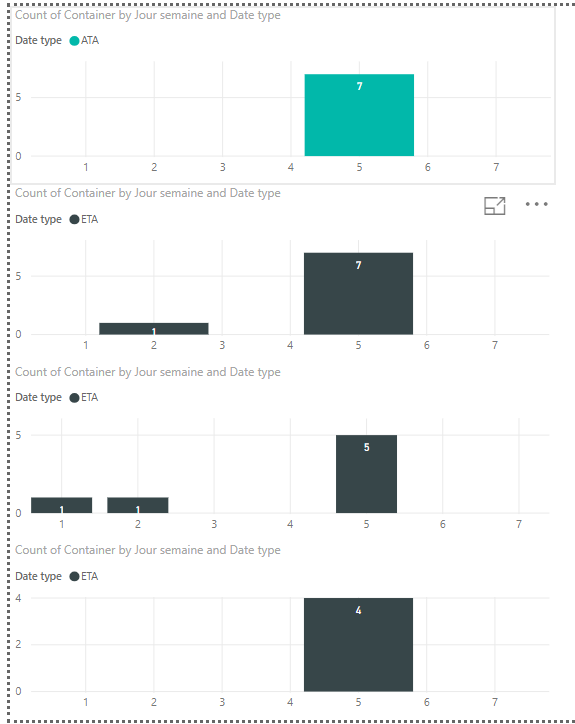
I am creating a report in which I copy paste 4 times the same chart by applying a different filter.
- Chart #1 represents the number of containers arriving at the port for each day of week 1
- Chart #2 represents the number of containers arriving at the port for each day of week 2
- Chart #3 represents the number of containers arriving at the port for each day of week 3
- Chart #4 represents the number of containers arriving at the port for each day of week 4
As you can see on the picture below, X axis are not aligned with each others despite each chart has the same setting. Can you help me to arrange the width of the columns to be the same on each chart ? and aligne the X axis.
Thanks for your help.
Solved! Go to Solution.
- Mark as New
- Bookmark
- Subscribe
- Mute
- Subscribe to RSS Feed
- Permalink
- Report Inappropriate Content
Hi
Actually I think the problem was due to the fact that in my database not all the charts had data for each value of my X-axis. So I have create fake data for each value of my X-axes (1 to 7) with no Y coordonates (those fake data don't change my results) and the display is now ok.
Thanks !!
- Mark as New
- Bookmark
- Subscribe
- Mute
- Subscribe to RSS Feed
- Permalink
- Report Inappropriate Content
@Anonymous ,
Could you please share some sample data and clarify more details about your requirement?
Regards,
Jimmy Tao


