Join us at FabCon Vienna from September 15-18, 2025
The ultimate Fabric, Power BI, SQL, and AI community-led learning event. Save €200 with code FABCOMM.
Get registered- Power BI forums
- Get Help with Power BI
- Desktop
- Service
- Report Server
- Power Query
- Mobile Apps
- Developer
- DAX Commands and Tips
- Custom Visuals Development Discussion
- Health and Life Sciences
- Power BI Spanish forums
- Translated Spanish Desktop
- Training and Consulting
- Instructor Led Training
- Dashboard in a Day for Women, by Women
- Galleries
- Data Stories Gallery
- Themes Gallery
- Contests Gallery
- Quick Measures Gallery
- Notebook Gallery
- Translytical Task Flow Gallery
- TMDL Gallery
- R Script Showcase
- Webinars and Video Gallery
- Ideas
- Custom Visuals Ideas (read-only)
- Issues
- Issues
- Events
- Upcoming Events
Enhance your career with this limited time 50% discount on Fabric and Power BI exams. Ends September 15. Request your voucher.
- Power BI forums
- Forums
- Get Help with Power BI
- Desktop
- using max column value as filter in scatter chart
- Subscribe to RSS Feed
- Mark Topic as New
- Mark Topic as Read
- Float this Topic for Current User
- Bookmark
- Subscribe
- Printer Friendly Page
- Mark as New
- Bookmark
- Subscribe
- Mute
- Subscribe to RSS Feed
- Permalink
- Report Inappropriate Content
using max column value as filter in scatter chart
Hello,
I have data from following URL:
https://fingertips.phe.org.uk/api/all_data/csv/by_indicator_id?indicator_ids=811%2C%2022001%2C%2030301&child_area_type_id=402&parent_area_type_id=6
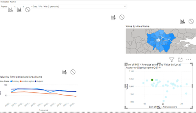
The 3 datasets returned for different Indicator IDs use different 'Time period' formats. The 'Time period sortable' field instead is more user friendly. I want to be able to create a line chart showing trend and a map and scatter chart showing just the latest data for each indicator:
How can I force the scatter chart and map to use the last year for which the different indicators have data as sometimes this is 20200000 and sometimes this is 20210000. I have tried chiclet slicer with forced selection but I want to hide that and when I do so, the scatter chart and map don't always update when the indicator name is changed. Without such a slicer or filter in place the values for the indicators are being summed over all the available years of data for each Area.
Any advice greatly appreciated
Solved! Go to Solution.
- Mark as New
- Bookmark
- Subscribe
- Mute
- Subscribe to RSS Feed
- Permalink
- Report Inappropriate Content
It would help if you could show us the structure of the dataset.
However, try creating a measure along the lines of:
Filter year = CALCULATE (MAX(Table[Time period sortable]), ALL(Table[Time period sortable)))
Add the Timeperiod sortable field to the filter pane for each visual. In the dropdown, select TopN and set the value to greater or equal to 1
Did I answer your question? Mark my post as a solution!
In doing so, you are also helping me. Thank you!
Proud to be a Super User!
Paul on Linkedin.
- Mark as New
- Bookmark
- Subscribe
- Mute
- Subscribe to RSS Feed
- Permalink
- Report Inappropriate Content
- Mark as New
- Bookmark
- Subscribe
- Mute
- Subscribe to RSS Feed
- Permalink
- Report Inappropriate Content
It would help if you could show us the structure of the dataset.
However, try creating a measure along the lines of:
Filter year = CALCULATE (MAX(Table[Time period sortable]), ALL(Table[Time period sortable)))
Add the Timeperiod sortable field to the filter pane for each visual. In the dropdown, select TopN and set the value to greater or equal to 1
Did I answer your question? Mark my post as a solution!
In doing so, you are also helping me. Thank you!
Proud to be a Super User!
Paul on Linkedin.
Helpful resources
| User | Count |
|---|---|
| 65 | |
| 61 | |
| 60 | |
| 54 | |
| 30 |
| User | Count |
|---|---|
| 180 | |
| 88 | |
| 72 | |
| 48 | |
| 46 |


