Join us at FabCon Vienna from September 15-18, 2025
The ultimate Fabric, Power BI, SQL, and AI community-led learning event. Save €200 with code FABCOMM.
Get registered- Power BI forums
- Get Help with Power BI
- Desktop
- Service
- Report Server
- Power Query
- Mobile Apps
- Developer
- DAX Commands and Tips
- Custom Visuals Development Discussion
- Health and Life Sciences
- Power BI Spanish forums
- Translated Spanish Desktop
- Training and Consulting
- Instructor Led Training
- Dashboard in a Day for Women, by Women
- Galleries
- Data Stories Gallery
- Themes Gallery
- Contests Gallery
- Quick Measures Gallery
- Notebook Gallery
- Translytical Task Flow Gallery
- TMDL Gallery
- R Script Showcase
- Webinars and Video Gallery
- Ideas
- Custom Visuals Ideas (read-only)
- Issues
- Issues
- Events
- Upcoming Events
Enhance your career with this limited time 50% discount on Fabric and Power BI exams. Ends September 15. Request your voucher.
- Power BI forums
- Forums
- Get Help with Power BI
- Desktop
- undefinedVisulization X/Y axis line
- Subscribe to RSS Feed
- Mark Topic as New
- Mark Topic as Read
- Float this Topic for Current User
- Bookmark
- Subscribe
- Printer Friendly Page
- Mark as New
- Bookmark
- Subscribe
- Mute
- Subscribe to RSS Feed
- Permalink
- Report Inappropriate Content
undefinedVisulization X/Y axis line
hi,
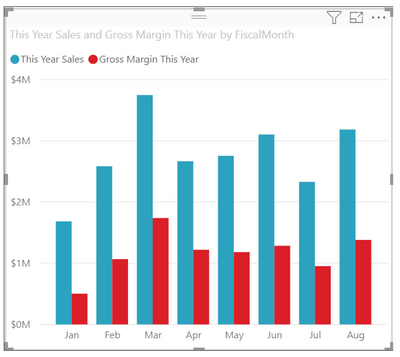
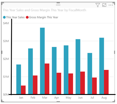
I am working on a visualization pbix report, when I am dragging any visuals in to my canvas I found none of them have x/y axis line, and seems there is no such settings to enable the x/y axis line (not the trends line or constant line or indicator line, just the axis itself.
Please refer to below captures (1st one, is the one currently I have in pbix file, the 2nd one is what i want), anyone knows how to let the visual show the axis line ?
Solved! Go to Solution.
- Mark as New
- Bookmark
- Subscribe
- Mute
- Subscribe to RSS Feed
- Permalink
- Report Inappropriate Content
@WendyDUFE
Currently, Power bi doesn't provide such feature to display the solid lines. You might want to submit a Idea.
Paul Zheng _ Community Support Team
If this post helps, please Accept it as the solution to help the other members find it more quickly.
- Mark as New
- Bookmark
- Subscribe
- Mute
- Subscribe to RSS Feed
- Permalink
- Report Inappropriate Content
@WendyDUFE , Only XY visual is scatter, Or you can check for custom visual or Use Python or R
https://appsource.microsoft.com/en-us/marketplace/apps?product=power-bi-visuals
Python https://towardsdatascience.com/using-python-in-power-bi-ee95a6b71443
- Mark as New
- Bookmark
- Subscribe
- Mute
- Subscribe to RSS Feed
- Permalink
- Report Inappropriate Content
@amitchandak thanks for the comments, excep the two options you provided, is there any other work arounds? my requirement is not that complicated, just wanna the x/y axis with one line is visible to the user ...
Helpful resources
| User | Count |
|---|---|
| 68 | |
| 63 | |
| 59 | |
| 54 | |
| 28 |
| User | Count |
|---|---|
| 182 | |
| 81 | |
| 64 | |
| 46 | |
| 38 |


