Go To
- Power BI forums
- Updates
- News & Announcements
- Get Help with Power BI
- Desktop
- Service
- Report Server
- Power Query
- Mobile Apps
- Developer
- DAX Commands and Tips
- Custom Visuals Development Discussion
- Health and Life Sciences
- Power BI Spanish forums
- Translated Spanish Desktop
- Power Platform Integration - Better Together!
- Power Platform Integrations (Read-only)
- Power Platform and Dynamics 365 Integrations (Read-only)
- Training and Consulting
- Instructor Led Training
- Dashboard in a Day for Women, by Women
- Galleries
- Community Connections & How-To Videos
- COVID-19 Data Stories Gallery
- Themes Gallery
- Data Stories Gallery
- R Script Showcase
- Webinars and Video Gallery
- Quick Measures Gallery
- 2021 MSBizAppsSummit Gallery
- 2020 MSBizAppsSummit Gallery
- 2019 MSBizAppsSummit Gallery
- Events
- Ideas
- Custom Visuals Ideas
- Issues
- Issues
- Events
- Upcoming Events
- Community Blog
- Power BI Community Blog
- Custom Visuals Community Blog
- Community Support
- Community Accounts & Registration
- Using the Community
- Community Feedback
Turn on suggestions
Auto-suggest helps you quickly narrow down your search results by suggesting possible matches as you type.
Showing results for
Earn a 50% discount on the DP-600 certification exam by completing the Fabric 30 Days to Learn It challenge.
- Power BI forums
- Forums
- Get Help with Power BI
- Desktop
- Re: undefined
Reply
Topic Options
- Subscribe to RSS Feed
- Mark Topic as New
- Mark Topic as Read
- Float this Topic for Current User
- Bookmark
- Subscribe
- Printer Friendly Page
Anonymous
Not applicable
- Mark as New
- Bookmark
- Subscribe
- Mute
- Subscribe to RSS Feed
- Permalink
- Report Inappropriate Content
undefined
08-31-2019
07:14 AM
Hi,
I need to create the visual with trend lines:
1. How to compare distance between two trend lines?
2. Is it possible to make visual with trends and two differente x axis, eg. X - Sum, X -% and Y - date?
Thanks!
I need to create the visual with trend lines:
1. How to compare distance between two trend lines?
2. Is it possible to make visual with trends and two differente x axis, eg. X - Sum, X -% and Y - date?
Thanks!
2 REPLIES 2
- Mark as New
- Bookmark
- Subscribe
- Mute
- Subscribe to RSS Feed
- Permalink
- Report Inappropriate Content
09-10-2019
01:44 AM
Hi @Anonymous ,
Is this problem sloved?
If it is sloved, could you kindly accept it as a solution to close this case?
If not, please let me know.
Best Regards
Icey
- Mark as New
- Bookmark
- Subscribe
- Mute
- Subscribe to RSS Feed
- Permalink
- Report Inappropriate Content
09-02-2019
12:55 AM
Hi @Anonymous ,
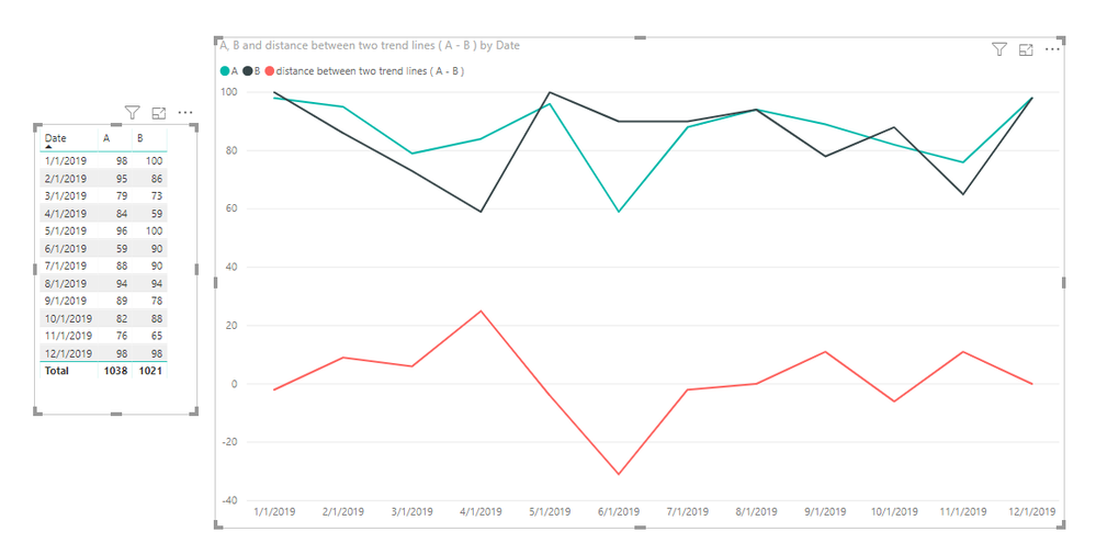
1. For 'How to compare distance between two trend lines?',
You can create a measure like so:
distance between two trend lines ( A - B ) =
MAX ( 'Table'[A] ) - MAX ( 'Table'[B] )
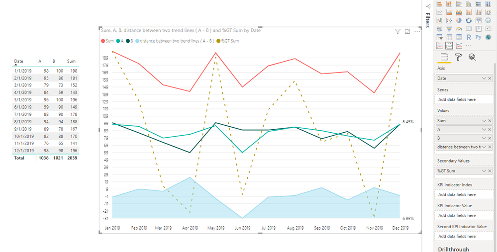
2. For ‘Is it possible to make visual with trends and two different x axis, e.g. X - Sum, X -% and Y - date? ’,
Power BI does not currently support it. You can submit your idea here.
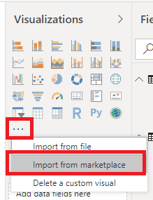
Or you can use 'Power KPI' and can refer to this article. This visual can have two different y axis. You can import it from marketplace.
This is my sample file.
Best Regards,
Icey
If this post helps, then please consider Accept it as the solution to help the other members find it more quickly.
Helpful resources
Announcements
Featured Topics
Top Solution Authors
| User | Count |
|---|---|
| 93 | |
| 83 | |
| 77 | |
| 72 | |
| 65 |
Top Kudoed Authors
| User | Count |
|---|---|
| 114 | |
| 101 | |
| 96 | |
| 65 | |
| 60 |


