FabCon is coming to Atlanta
Join us at FabCon Atlanta from March 16 - 20, 2026, for the ultimate Fabric, Power BI, AI and SQL community-led event. Save $200 with code FABCOMM.
Register now!- Power BI forums
- Get Help with Power BI
- Desktop
- Service
- Report Server
- Power Query
- Mobile Apps
- Developer
- DAX Commands and Tips
- Custom Visuals Development Discussion
- Health and Life Sciences
- Power BI Spanish forums
- Translated Spanish Desktop
- Training and Consulting
- Instructor Led Training
- Dashboard in a Day for Women, by Women
- Galleries
- Data Stories Gallery
- Themes Gallery
- Contests Gallery
- QuickViz Gallery
- Quick Measures Gallery
- Visual Calculations Gallery
- Notebook Gallery
- Translytical Task Flow Gallery
- TMDL Gallery
- R Script Showcase
- Webinars and Video Gallery
- Ideas
- Custom Visuals Ideas (read-only)
- Issues
- Issues
- Events
- Upcoming Events
The Power BI Data Visualization World Championships is back! Get ahead of the game and start preparing now! Learn more
- Power BI forums
- Forums
- Get Help with Power BI
- Desktop
- % total in a pie chart, can be done per row only?
- Subscribe to RSS Feed
- Mark Topic as New
- Mark Topic as Read
- Float this Topic for Current User
- Bookmark
- Subscribe
- Printer Friendly Page
- Mark as New
- Bookmark
- Subscribe
- Mute
- Subscribe to RSS Feed
- Permalink
- Report Inappropriate Content
% total in a pie chart, can be done per row only?
Hello,
I have the following table in database.
| Application | Stage1 | Stage2 | Stage3 |
| A | 01/09/2018 | 02/09/2018 | 03/09/2018 |
| B | 01/09/2018 | 03/09/2018 | 07/09/2018 |
I added two columns to find out the hours it take to pass each stage:
The formula of the new added columns:
Stage1 -> Stage2 = DATEDIFF(Sheet1[Stage1],Sheet1[Stage2],HOUR)
Stage2 -> Stage3 = DATEDIFF(Sheet1[Stage2],Sheet1[Stage3],HOUR)
Then, I display the information in a table and a pie chart like this:
Then, I select row 1, application A, to see the % of the pie chart:
My problem arised in here: I expected the chart to be 50% (Stage1 -> Stage2) and 50% (Stage2->Stage3) because each stage takes 24 hours. The maths should be 24 /(24+24) = 50%
However, I think power bi adds up the total of both stages I.e. So "Stage1 -> Stage2" is 24/(72+120) = 12.5%.
This is not what I need. Is there a solution for this?
Thanks,
Ricky
Solved! Go to Solution.
- Mark as New
- Bookmark
- Subscribe
- Mute
- Subscribe to RSS Feed
- Permalink
- Report Inappropriate Content
@rickylee I've tried below steps to solve your scenario..
Please do the additional calculation columns in "Power Query Editor" using custom column as below
Duration.TotalHours([Stage2]-[Stage1])
Duration.TotalHours([Stage3]-[Stage2])
Now the table looks like this...
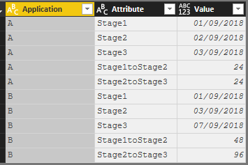
Now, unpivot all the fields apart from the "Application" field and it will look like this
Now use the "Matrix" visual and Pie-Chart and the output looks like this...
But in the pie-chart, you need to have visual level filters to have only "Stage1toStage2" and "Stage2toStage3" attributes only.
Hope this helps !!
Did I answer your question? Mark my post as a solution!
Proud to be a PBI Community Champion
- Mark as New
- Bookmark
- Subscribe
- Mute
- Subscribe to RSS Feed
- Permalink
- Report Inappropriate Content
- Mark as New
- Bookmark
- Subscribe
- Mute
- Subscribe to RSS Feed
- Permalink
- Report Inappropriate Content
@rickylee I've tried below steps to solve your scenario..
Please do the additional calculation columns in "Power Query Editor" using custom column as below
Duration.TotalHours([Stage2]-[Stage1])
Duration.TotalHours([Stage3]-[Stage2])
Now the table looks like this...
Now, unpivot all the fields apart from the "Application" field and it will look like this
Now use the "Matrix" visual and Pie-Chart and the output looks like this...
But in the pie-chart, you need to have visual level filters to have only "Stage1toStage2" and "Stage2toStage3" attributes only.
Hope this helps !!
Did I answer your question? Mark my post as a solution!
Proud to be a PBI Community Champion
Helpful resources

Power BI Dataviz World Championships
The Power BI Data Visualization World Championships is back! Get ahead of the game and start preparing now!

| User | Count |
|---|---|
| 39 | |
| 39 | |
| 37 | |
| 29 | |
| 24 |
| User | Count |
|---|---|
| 120 | |
| 95 | |
| 70 | |
| 69 | |
| 65 |


