New Offer! Become a Certified Fabric Data Engineer
Check your eligibility for this 50% exam voucher offer and join us for free live learning sessions to get prepared for Exam DP-700.
Get Started- Power BI forums
- Get Help with Power BI
- Desktop
- Service
- Report Server
- Power Query
- Mobile Apps
- Developer
- DAX Commands and Tips
- Custom Visuals Development Discussion
- Health and Life Sciences
- Power BI Spanish forums
- Translated Spanish Desktop
- Training and Consulting
- Instructor Led Training
- Dashboard in a Day for Women, by Women
- Galleries
- Community Connections & How-To Videos
- COVID-19 Data Stories Gallery
- Themes Gallery
- Data Stories Gallery
- R Script Showcase
- Webinars and Video Gallery
- Quick Measures Gallery
- 2021 MSBizAppsSummit Gallery
- 2020 MSBizAppsSummit Gallery
- 2019 MSBizAppsSummit Gallery
- Events
- Ideas
- Custom Visuals Ideas
- Issues
- Issues
- Events
- Upcoming Events
Don't miss out! 2025 Microsoft Fabric Community Conference, March 31 - April 2, Las Vegas, Nevada. Use code MSCUST for a $150 discount. Prices go up February 11th. Register now.
- Power BI forums
- Forums
- Get Help with Power BI
- Desktop
- Re: time period over time period charts
- Subscribe to RSS Feed
- Mark Topic as New
- Mark Topic as Read
- Float this Topic for Current User
- Bookmark
- Subscribe
- Printer Friendly Page
- Mark as New
- Bookmark
- Subscribe
- Mute
- Subscribe to RSS Feed
- Permalink
- Report Inappropriate Content
time period over time period charts
I am having trouble building a chart that compares the sales prices for two different time periods. For example, in excel, I have built a chart that compares the median sales price of homes from the last 12 months to the last 13-24 months. I would also like to add a feature that shows the percentage change in these two time periods. Also, I would like to be able to customize the time periods. Maybe instead of comparing 12-month time periods, I will be able to toggle it to show the median sales price for the last three months compared to the prior 4-6 months. Finally, I would like this to be automatically updated every time I open power bi. So when I open the dashboard in four months, it will automatically compare the data from the date that I open the dash
Solved! Go to Solution.
- Mark as New
- Bookmark
- Subscribe
- Mute
- Subscribe to RSS Feed
- Permalink
- Report Inappropriate Content
Thank you for providing the sample data. That helps a lot with proposing a potential solution.
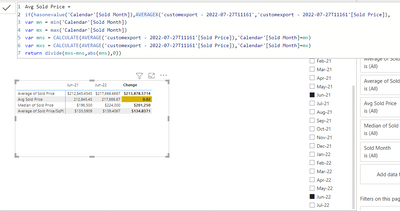
Here is the general idea how to tackle your expected output with customized measures. You'll still need to add the formatting.
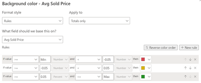
and here is the conditional formatting. Note: Only applied to Totals.
see attached for a boilerplate PBIX.
- Mark as New
- Bookmark
- Subscribe
- Mute
- Subscribe to RSS Feed
- Permalink
- Report Inappropriate Content
- Mark as New
- Bookmark
- Subscribe
- Mute
- Subscribe to RSS Feed
- Permalink
- Report Inappropriate Content
Please provide sanitized sample data that fully covers your issue. I cannot help you without usable sample data.
Please paste the data into a table in your post or use one of the file services like OneDrive or Google Drive. I cannot use screenshots of your source data.
Please show the expected outcome based on the sample data you provided. Screenshots of the expected outcome are ok.
https://community.powerbi.com/t5/Desktop/How-to-Get-Your-Question-Answered-Quickly/m-p/1447523
- Mark as New
- Bookmark
- Subscribe
- Mute
- Subscribe to RSS Feed
- Permalink
- Report Inappropriate Content
lbendlin, I am not sure how to post a link to my data in excel. Can I email you the data?
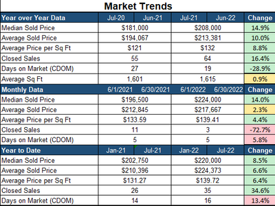
Here is a screenshot of what I am looking to accomplish in power bi. However, I would like to be able to have one chart and just edit the dates, that way I can customize the time periods.
- Mark as New
- Bookmark
- Subscribe
- Mute
- Subscribe to RSS Feed
- Permalink
- Report Inappropriate Content
Please paste the data into a table in your post or use one of the file services like OneDrive or Google Drive. I cannot use screenshots of your source data.
- Mark as New
- Bookmark
- Subscribe
- Mute
- Subscribe to RSS Feed
- Permalink
- Report Inappropriate Content
Here is the google drive link:
- Mark as New
- Bookmark
- Subscribe
- Mute
- Subscribe to RSS Feed
- Permalink
- Report Inappropriate Content
Thank you for providing the sample data. That helps a lot with proposing a potential solution.
Here is the general idea how to tackle your expected output with customized measures. You'll still need to add the formatting.
and here is the conditional formatting. Note: Only applied to Totals.
see attached for a boilerplate PBIX.
Helpful resources

Join us at the Microsoft Fabric Community Conference
March 31 - April 2, 2025, in Las Vegas, Nevada. Use code MSCUST for a $150 discount! Prices go up Feb. 11th.

Power BI Monthly Update - January 2025
Check out the January 2025 Power BI update to learn about new features in Reporting, Modeling, and Data Connectivity.

| User | Count |
|---|---|
| 144 | |
| 87 | |
| 65 | |
| 50 | |
| 45 |
| User | Count |
|---|---|
| 217 | |
| 88 | |
| 81 | |
| 65 | |
| 56 |


