Join us at the 2025 Microsoft Fabric Community Conference
Microsoft Fabric Community Conference 2025, March 31 - April 2, Las Vegas, Nevada. Use code FABINSIDER for a $400 discount.
Register now- Power BI forums
- Get Help with Power BI
- Desktop
- Service
- Report Server
- Power Query
- Mobile Apps
- Developer
- DAX Commands and Tips
- Custom Visuals Development Discussion
- Health and Life Sciences
- Power BI Spanish forums
- Translated Spanish Desktop
- Training and Consulting
- Instructor Led Training
- Dashboard in a Day for Women, by Women
- Galleries
- Webinars and Video Gallery
- Data Stories Gallery
- Themes Gallery
- Power BI DataViz World Championships Gallery
- Quick Measures Gallery
- R Script Showcase
- COVID-19 Data Stories Gallery
- Community Connections & How-To Videos
- 2021 MSBizAppsSummit Gallery
- 2020 MSBizAppsSummit Gallery
- 2019 MSBizAppsSummit Gallery
- Events
- Ideas
- Custom Visuals Ideas (read-only)
- Issues
- Issues
- Events
- Upcoming Events
The Power BI DataViz World Championships are on! With four chances to enter, you could win a spot in the LIVE Grand Finale in Las Vegas. Show off your skills.
- Power BI forums
- Forums
- Get Help with Power BI
- Desktop
- Re: stacked area chart distorted: can we treat bla...
- Subscribe to RSS Feed
- Mark Topic as New
- Mark Topic as Read
- Float this Topic for Current User
- Bookmark
- Subscribe
- Printer Friendly Page
- Mark as New
- Bookmark
- Subscribe
- Mute
- Subscribe to RSS Feed
- Permalink
- Report Inappropriate Content
stacked area chart distorted: can we treat blank as 0?
Hello,
I am displaying data on a chart on 4 categories (1 color each below). On some days I have no data for some categories
Instead of being treated as 0, the area for the particular categories with no data jumps in a straight line to the following day that has some data - cutting through the rest of the chart in a very weird and unintuitive way.
See below:
Basically the issue is the blank data which i think is not interpreted as a zero. Is it an expected behavior and is there a way to fix the visual?
(i would like to avoid forcing blank to 0 in my measure because it will then calculate a value for days that i'm not interested in)
Solved! Go to Solution.
- Mark as New
- Bookmark
- Subscribe
- Mute
- Subscribe to RSS Feed
- Permalink
- Report Inappropriate Content
@Anonymous,
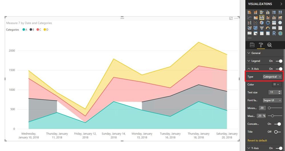
In the stacked ared chart, change the type of your X-Axis from Continuous to Categorical, this way, you will not get any area for the blank data in the chart. There is an example for your reference.
Regards,
Lydia
If this post helps, then please consider Accept it as the solution to help the other members find it more quickly.
- Mark as New
- Bookmark
- Subscribe
- Mute
- Subscribe to RSS Feed
- Permalink
- Report Inappropriate Content
The blank (white background) areas look odd in the middle of the graph. They appear to correspond to when the count of items is zero but instead of the total being 0 the total is blank and the chart displays a discontinuity. How can this be avoided?
- Mark as New
- Bookmark
- Subscribe
- Mute
- Subscribe to RSS Feed
- Permalink
- Report Inappropriate Content
Thanks @v-yuezhe-msft it worked.
The axis is now displaying the dates in a long format (just like in your example). Any possibility to keep the format to the previous one?
Helpful resources

Join us at the Microsoft Fabric Community Conference
March 31 - April 2, 2025, in Las Vegas, Nevada. Use code MSCUST for a $150 discount!

Power BI Monthly Update - February 2025
Check out the February 2025 Power BI update to learn about new features.

| User | Count |
|---|---|
| 82 | |
| 79 | |
| 52 | |
| 39 | |
| 35 |
| User | Count |
|---|---|
| 94 | |
| 79 | |
| 51 | |
| 47 | |
| 47 |


