FabCon is coming to Atlanta
Join us at FabCon Atlanta from March 16 - 20, 2026, for the ultimate Fabric, Power BI, AI and SQL community-led event. Save $200 with code FABCOMM.
Register now!- Power BI forums
- Get Help with Power BI
- Desktop
- Service
- Report Server
- Power Query
- Mobile Apps
- Developer
- DAX Commands and Tips
- Custom Visuals Development Discussion
- Health and Life Sciences
- Power BI Spanish forums
- Translated Spanish Desktop
- Training and Consulting
- Instructor Led Training
- Dashboard in a Day for Women, by Women
- Galleries
- Data Stories Gallery
- Themes Gallery
- Contests Gallery
- QuickViz Gallery
- Quick Measures Gallery
- Visual Calculations Gallery
- Notebook Gallery
- Translytical Task Flow Gallery
- TMDL Gallery
- R Script Showcase
- Webinars and Video Gallery
- Ideas
- Custom Visuals Ideas (read-only)
- Issues
- Issues
- Events
- Upcoming Events
The Power BI Data Visualization World Championships is back! Get ahead of the game and start preparing now! Learn more
- Power BI forums
- Forums
- Get Help with Power BI
- Desktop
- select which filter to use
- Subscribe to RSS Feed
- Mark Topic as New
- Mark Topic as Read
- Float this Topic for Current User
- Bookmark
- Subscribe
- Printer Friendly Page
- Mark as New
- Bookmark
- Subscribe
- Mute
- Subscribe to RSS Feed
- Permalink
- Report Inappropriate Content
select which filter to use
I have a date dimension that contains the date an event is due to fall on. I have created one additional column to flag if the date occurs within 7 days of today's date, and a second column to flag if the date occurs within 30 days of todays date, like so:
It's easy enough to use the 7 day and the 30 day column as a single filter (slicer) in a dashboard. What I really want is to let the user choose which filter they want, in one single slicer. I can display two separate slicers to show each filter, but this gets messy, takes up space, and lets them choose combinations of 7 and 30 days (and others) that don't make sense.
A similar thing in Tableau is when you can use the date filters to choose '1w','1m','3m','6m','1y','5y'.
Am I thinking about this all wrong?
Solved! Go to Solution.
- Mark as New
- Bookmark
- Subscribe
- Mute
- Subscribe to RSS Feed
- Permalink
- Report Inappropriate Content
According to your description, it seems you want to achieve a last X period slicer to filter dates. In this scenario, you need to create a calculated table for each period, and union those calculated tables into a "DatePeriod" table. Then build the relationship to date table for filtering. For more details, please see a blog below:
POWER BI – TIME PERIOD SLICER FOR LAST 7 DAYS,LAST 30 DAYS..
Regards,
- Mark as New
- Bookmark
- Subscribe
- Mute
- Subscribe to RSS Feed
- Permalink
- Report Inappropriate Content
Two good answers there! I've chosen @v-sihou-msft's as the accepted solution because I found that post easier to implement, but I believe both will work.
Thanks for the responses guys!
- Mark as New
- Bookmark
- Subscribe
- Mute
- Subscribe to RSS Feed
- Permalink
- Report Inappropriate Content
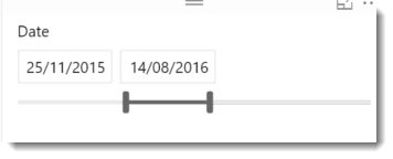
Dont forget that when you add a column which is DateTime format to the canvas and make it a Slicer you get this flexibility now, where the user can adjust the range to get any date range requred.
- Mark as New
- Bookmark
- Subscribe
- Mute
- Subscribe to RSS Feed
- Permalink
- Report Inappropriate Content
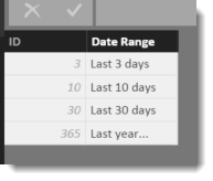
I have used a Date Range table with some success. I build one that looks like this
And then I create a measure on my date table that looks like this :
Date Range Filter = if(
MAX('Dates'[Date]) >= NOW() - MIN ('Date Ranges'[ID])
&& MAX('Dates'[Date]) < NOW()
---------------------------------------------------------
,1
,0
)
This should return a 1 or 0 that you can use as a filter on the visual. eg, specifiy that the output of that measure should always be one.
Then you can add a slicer to the report page over the [Date Range] column. This will allow the user to easily select several dynamic date ranges. Just add to the table if you want to offer more interesting ranges.
Helpful resources

Power BI Dataviz World Championships
The Power BI Data Visualization World Championships is back! Get ahead of the game and start preparing now!

| User | Count |
|---|---|
| 39 | |
| 37 | |
| 33 | |
| 32 | |
| 29 |
| User | Count |
|---|---|
| 132 | |
| 88 | |
| 82 | |
| 68 | |
| 64 |


