- Power BI forums
- Updates
- News & Announcements
- Get Help with Power BI
- Desktop
- Service
- Report Server
- Power Query
- Mobile Apps
- Developer
- DAX Commands and Tips
- Custom Visuals Development Discussion
- Health and Life Sciences
- Power BI Spanish forums
- Translated Spanish Desktop
- Power Platform Integration - Better Together!
- Power Platform Integrations (Read-only)
- Power Platform and Dynamics 365 Integrations (Read-only)
- Training and Consulting
- Instructor Led Training
- Dashboard in a Day for Women, by Women
- Galleries
- Community Connections & How-To Videos
- COVID-19 Data Stories Gallery
- Themes Gallery
- Data Stories Gallery
- R Script Showcase
- Webinars and Video Gallery
- Quick Measures Gallery
- 2021 MSBizAppsSummit Gallery
- 2020 MSBizAppsSummit Gallery
- 2019 MSBizAppsSummit Gallery
- Events
- Ideas
- Custom Visuals Ideas
- Issues
- Issues
- Events
- Upcoming Events
- Community Blog
- Power BI Community Blog
- Custom Visuals Community Blog
- Community Support
- Community Accounts & Registration
- Using the Community
- Community Feedback
Register now to learn Fabric in free live sessions led by the best Microsoft experts. From Apr 16 to May 9, in English and Spanish.
- Power BI forums
- Forums
- Get Help with Power BI
- Desktop
- Re: removing filter on columns for scatter plot
- Subscribe to RSS Feed
- Mark Topic as New
- Mark Topic as Read
- Float this Topic for Current User
- Bookmark
- Subscribe
- Printer Friendly Page
- Mark as New
- Bookmark
- Subscribe
- Mute
- Subscribe to RSS Feed
- Permalink
- Report Inappropriate Content
removing filter on columns for scatter plot
Hi all,
I am trying to visualise client potential (0€ to xxx million €) (x Axis) vs penetration (0-100%) (y Axis) for a number of clients using a scatter plot. Per default this is shown for all clients. (potential, penetration and client name is all in the same table)
think of it as follows
client potential penetration sector
A 2000 0,5 business services
B 1000 0,2 business services
C 5000 0,1 healthcare
The user then has the possibility of selecting a single client from a slicer. The result being that only that particular client is shown on the scatter plot.
However, despite the single client being selected, I would like to show also some peers (think of it as clients in the same sector). Basically if A is selected, I would also like to show B, but not C in the scatter plot. I would need to un-do the filter on the client somehow
I have not found anything online and have tried multiple approaches in the last hours with measures or calculatetable, but i can conceputally not get there.
Before giving up I wanted to try and resort to your wisdom..!
thanks for any inputs
Solved! Go to Solution.
- Mark as New
- Bookmark
- Subscribe
- Mute
- Subscribe to RSS Feed
- Permalink
- Report Inappropriate Content
Hi @eliapl
In this scenario, besides the dataset you provided, create a new table as below
in this table, create two measures
selected client = SELECTEDVALUE(Table2[client])
selected sector = SELECTEDVALUE(Table2[sector])
in origial table, create a measure
flag = IF(SELECTEDVALUE(Table1[sector])=[selected sector],1,0)
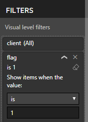
then add a filter condition to this measure.

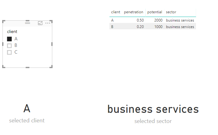
finally, we could get this
Here is my pbix.
Best Regards
Maggie
- Mark as New
- Bookmark
- Subscribe
- Mute
- Subscribe to RSS Feed
- Permalink
- Report Inappropriate Content
Hi @eliapl
In this scenario, besides the dataset you provided, create a new table as below
in this table, create two measures
selected client = SELECTEDVALUE(Table2[client])
selected sector = SELECTEDVALUE(Table2[sector])
in origial table, create a measure
flag = IF(SELECTEDVALUE(Table1[sector])=[selected sector],1,0)
then add a filter condition to this measure.

finally, we could get this
Here is my pbix.
Best Regards
Maggie
Helpful resources

Microsoft Fabric Learn Together
Covering the world! 9:00-10:30 AM Sydney, 4:00-5:30 PM CET (Paris/Berlin), 7:00-8:30 PM Mexico City

Power BI Monthly Update - April 2024
Check out the April 2024 Power BI update to learn about new features.

| User | Count |
|---|---|
| 107 | |
| 97 | |
| 75 | |
| 63 | |
| 62 |
| User | Count |
|---|---|
| 139 | |
| 104 | |
| 104 | |
| 80 | |
| 66 |


