Fabric Data Days starts November 4th!
Advance your Data & AI career with 50 days of live learning, dataviz contests, hands-on challenges, study groups & certifications and more!
Get registered- Power BI forums
- Get Help with Power BI
- Desktop
- Service
- Report Server
- Power Query
- Mobile Apps
- Developer
- DAX Commands and Tips
- Custom Visuals Development Discussion
- Health and Life Sciences
- Power BI Spanish forums
- Translated Spanish Desktop
- Training and Consulting
- Instructor Led Training
- Dashboard in a Day for Women, by Women
- Galleries
- Data Stories Gallery
- Themes Gallery
- Contests Gallery
- Quick Measures Gallery
- Visual Calculations Gallery
- Notebook Gallery
- Translytical Task Flow Gallery
- TMDL Gallery
- R Script Showcase
- Webinars and Video Gallery
- Ideas
- Custom Visuals Ideas (read-only)
- Issues
- Issues
- Events
- Upcoming Events
Join us at FabCon Atlanta from March 16 - 20, 2026, for the ultimate Fabric, Power BI, AI and SQL community-led event. Save $200 with code FABCOMM. Register now.
- Power BI forums
- Forums
- Get Help with Power BI
- Desktop
- python visual: Scatter Plot 2 sets of data points
- Subscribe to RSS Feed
- Mark Topic as New
- Mark Topic as Read
- Float this Topic for Current User
- Bookmark
- Subscribe
- Printer Friendly Page
- Mark as New
- Bookmark
- Subscribe
- Mute
- Subscribe to RSS Feed
- Permalink
- Report Inappropriate Content
python visual: Scatter Plot 2 sets of data points
Hello,
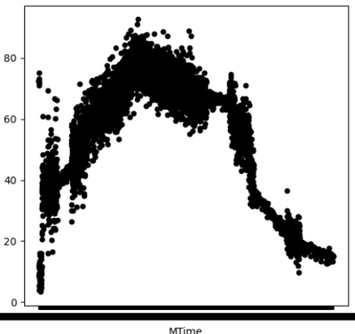
I used a Python Visual to make the Scatter Plot Chart below, however the X-Axis is not visible?
The X-Axis has a lot of Date Time Data (Eg: 2021-10-04 07:57:40). However it is just showing as a blank black line.
Black Points Marked (Measured)
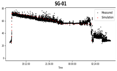
Also, how do I add another set of data points to this graph? Red Points (For Simulation) But that will be against another X and Y axis. I require it in the same scatter plot chart.
Thank you!
- Mark as New
- Bookmark
- Subscribe
- Mute
- Subscribe to RSS Feed
- Permalink
- Report Inappropriate Content
Hi @YukiK ,
Thanks for replying, appreciate it!
Actually the color of the data points is not the issue here. And yes, I did try streching the visual to its max size, and I used the formula too however my x-axis is not visible still.
Okay, let me explain exactly what I require.
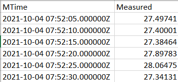
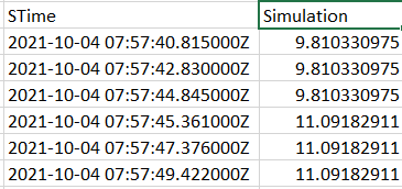
Currently I'm working with CSV data, 2 Files as shown below,
Measured Data
Simulation Data
I want to make a scatter plot chart using a python visual.
Imp Note: The measured CSV File has around 8k rows,
and the simulation CSV File has around 1.5k rows.
They are not plotted against the same exact times. The reason why Simulation has less points is that, once the Measured is marked on the chart, the simulation data points cover from the beginning to the end like overall.
So bascially for both of these, we need to use all the 4 axes.
This is what I finally want,
I tried it in Power BI, I can get the Measured points in one chart (Like I have shown here), and similarly Simulation points in another chart.
But, how do I combine the 2 together in one chart like this one?
Kindly require your assistance asap. Thank you in advance!
- Mark as New
- Bookmark
- Subscribe
- Mute
- Subscribe to RSS Feed
- Permalink
- Report Inappropriate Content
I'm guessing the issue is in your Python code. You can specify color like this (if using matplotlib):
plt.scatter(x, y, color = 'hotpink')
As far as the x-axis goes, I think the size of the visual is simply small for the number of values that need to be shown. So if just making the visual bigger in Power BI doesn't work, try have it wider in matplotlib like this:
figure(figsize=(20, 8))
Let me know if this helps!
Helpful resources

FabCon Global Hackathon
Join the Fabric FabCon Global Hackathon—running virtually through Nov 3. Open to all skill levels. $10,000 in prizes!

Power BI Monthly Update - October 2025
Check out the October 2025 Power BI update to learn about new features.

| User | Count |
|---|---|
| 76 | |
| 38 | |
| 31 | |
| 27 | |
| 26 |


