New Offer! Become a Certified Fabric Data Engineer
Check your eligibility for this 50% exam voucher offer and join us for free live learning sessions to get prepared for Exam DP-700.
Get Started- Power BI forums
- Get Help with Power BI
- Desktop
- Service
- Report Server
- Power Query
- Mobile Apps
- Developer
- DAX Commands and Tips
- Custom Visuals Development Discussion
- Health and Life Sciences
- Power BI Spanish forums
- Translated Spanish Desktop
- Training and Consulting
- Instructor Led Training
- Dashboard in a Day for Women, by Women
- Galleries
- Community Connections & How-To Videos
- COVID-19 Data Stories Gallery
- Themes Gallery
- Data Stories Gallery
- R Script Showcase
- Webinars and Video Gallery
- Quick Measures Gallery
- 2021 MSBizAppsSummit Gallery
- 2020 MSBizAppsSummit Gallery
- 2019 MSBizAppsSummit Gallery
- Events
- Ideas
- Custom Visuals Ideas
- Issues
- Issues
- Events
- Upcoming Events
Don't miss out! 2025 Microsoft Fabric Community Conference, March 31 - April 2, Las Vegas, Nevada. Use code MSCUST for a $150 discount. Prices go up February 11th. Register now.
- Power BI forums
- Forums
- Get Help with Power BI
- Desktop
- Re: presenting unpivot column as percentage in pow...
- Subscribe to RSS Feed
- Mark Topic as New
- Mark Topic as Read
- Float this Topic for Current User
- Bookmark
- Subscribe
- Printer Friendly Page
- Mark as New
- Bookmark
- Subscribe
- Mute
- Subscribe to RSS Feed
- Permalink
- Report Inappropriate Content
presenting unpivot column as percentage in power query
Hello all,
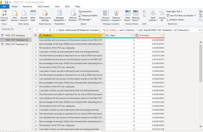
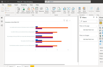
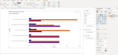
I'm trying to present data that has been converted to unpivoted columns in the power query as percentages instead of numbers. Can anyone support me on that?
Solved! Go to Solution.
- Mark as New
- Bookmark
- Subscribe
- Mute
- Subscribe to RSS Feed
- Permalink
- Report Inappropriate Content
Hi @Christal_Azzam ,
What is the expected result?
Column = 'Table'[Value]/SUM('Table'[Value])
Column = 'Table'[Value]/CALCULATE(SUM('Table'[Value]),ALLEXCEPT('Table','Table'[Attribute]))
Best Regards,
Jay
If this post helps, then please consider Accept it as the solution to help the other members find it.
- Mark as New
- Bookmark
- Subscribe
- Mute
- Subscribe to RSS Feed
- Permalink
- Report Inappropriate Content
Hi @Christal_Azzam ,
I did this with DAX.
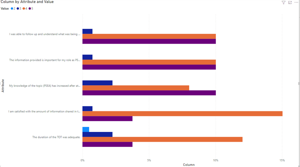
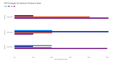
After unpivoting the columns in Power Query, I created a calculated column as below:
Column = 'Table'[Value]/CALCULATE(SUM('Table'[Value]),ALLEXCEPT('Table','Table'[Attribute]))
Then I changed the column format to "percentage" and created the visual like below:
Pbix as attachment.
Best Regards,
Jay
If this post helps, then please consider Accept it as the solution to help the other members find it.
- Mark as New
- Bookmark
- Subscribe
- Mute
- Subscribe to RSS Feed
- Permalink
- Report Inappropriate Content
Hi @Christal_Azzam ,
What is the expected result?
Column = 'Table'[Value]/SUM('Table'[Value])
Column = 'Table'[Value]/CALCULATE(SUM('Table'[Value]),ALLEXCEPT('Table','Table'[Attribute]))
Best Regards,
Jay
If this post helps, then please consider Accept it as the solution to help the other members find it.
- Mark as New
- Bookmark
- Subscribe
- Mute
- Subscribe to RSS Feed
- Permalink
- Report Inappropriate Content
Hello Jay,
Yes, it's the second one, can you give me the exact steps to produce the same graph?
- Mark as New
- Bookmark
- Subscribe
- Mute
- Subscribe to RSS Feed
- Permalink
- Report Inappropriate Content
Hi @Christal_Azzam ,
I did this with DAX.
After unpivoting the columns in Power Query, I created a calculated column as below:
Column = 'Table'[Value]/CALCULATE(SUM('Table'[Value]),ALLEXCEPT('Table','Table'[Attribute]))
Then I changed the column format to "percentage" and created the visual like below:
Pbix as attachment.
Best Regards,
Jay
If this post helps, then please consider Accept it as the solution to help the other members find it.
- Mark as New
- Bookmark
- Subscribe
- Mute
- Subscribe to RSS Feed
- Permalink
- Report Inappropriate Content
Thank you!
Exactly what I needed!
- Mark as New
- Bookmark
- Subscribe
- Mute
- Subscribe to RSS Feed
- Permalink
- Report Inappropriate Content
Hi,
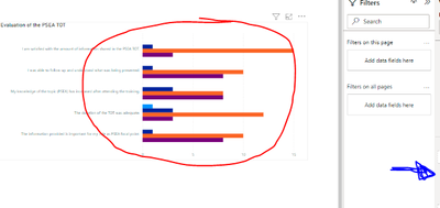
Please, click on the graph (red) and select this sign in your values (it will be where the blue sign show):
After go to "show value as"
And select percentage.
I hope it helps you
Regards from BR!
- Mark as New
- Bookmark
- Subscribe
- Mute
- Subscribe to RSS Feed
- Permalink
- Report Inappropriate Content
Hello HenriqueReis,
In the usual case, this is what I would do, but for this data, since they were 4 columns, unpivoted to give the attribute and the value, in terms of count it's correct but if I covernt to percentage of total, it displays the wrong percentages.
- Mark as New
- Bookmark
- Subscribe
- Mute
- Subscribe to RSS Feed
- Permalink
- Report Inappropriate Content
ohh, now I understand
Can I see how the data of the search is in your table?
Maybe we can create something like a SUM of the total and divide each of the three columns by the total, so we are going to have what you want, I think.
- Mark as New
- Bookmark
- Subscribe
- Mute
- Subscribe to RSS Feed
- Permalink
- Report Inappropriate Content
Sure! So this is the original data on excel:
| I am satisfied with the amount of information shared in the PSEA TOT. | My knowledge of the topic (PSEA) has increased after attending the training. | The duration of the TOT was adequate. | I was able to follow up and understand what was being presented. | The information provided is important for my role as PSEA focal point. |
| 4 | 3 | 4 | 5 | 5 |
| 3 | 4 | 4 | 4 | 4 |
| 4 | 4 | 3 | 4 | 4 |
| 4 | 5 | 4 | 4 | 4 |
| 4 | 4 | 4 | 5 | 4 |
| 4 | 5 | 5 | 5 | 5 |
| 4 | 5 | 2 | 4 | 4 |
| 4 | 3 | 5 | 5 | 5 |
| 4 | 4 | 4 | 4 | 5 |
| 4 | 5 | 4 | 4 | 4 |
| 4 | 5 | 4 | 3 | 3 |
| 4 | 4 | 4 | 4 | 4 |
| 4 | 4 | 4 | 4 | 4 |
| 4 | 3 | 4 | 4 | 4 |
| 5 | 5 | 4 | 5 | 5 |
| 5 | 5 | 3 | 5 | 5 |
| 4 | 4 | 3 | 4 | 4 |
| 5 | 5 | 5 | 5 | 5 |
| 4 | 4 | 4 | 5 | 5 |
So I usually do is add the raw data on power bi - which is a rating from 1 to 5 for each statement on the survey- then I select the columns in the power query and unpivot the columns so that I can combine them into 1 graph showing the rating of each. I managed to show the correct numerical data on the graph, but if I want to convert to percentage, it doesn't show the correct %s. the respondents are a total of 19 persons rating each statement on the survey.
Hope you can help me.
- Mark as New
- Bookmark
- Subscribe
- Mute
- Subscribe to RSS Feed
- Permalink
- Report Inappropriate Content
I'm sorry!
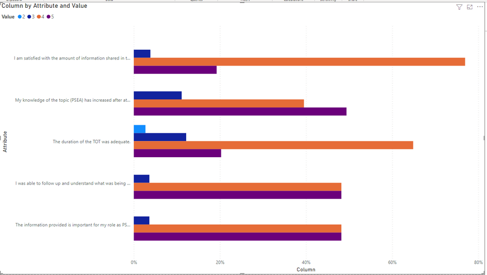
This was what I should do, but anyway I think it's not what you want:
I say that beacuse I used different graphs for each "atribute" and after I edited to look like just one graph.
I think there's a way to do what you want, but I'm not finding it on DAX.
Regards!
Helpful resources

Join us at the Microsoft Fabric Community Conference
March 31 - April 2, 2025, in Las Vegas, Nevada. Use code MSCUST for a $150 discount! Prices go up Feb. 11th.

Power BI Monthly Update - January 2025
Check out the January 2025 Power BI update to learn about new features in Reporting, Modeling, and Data Connectivity.

| User | Count |
|---|---|
| 143 | |
| 85 | |
| 66 | |
| 51 | |
| 45 |
| User | Count |
|---|---|
| 217 | |
| 89 | |
| 82 | |
| 66 | |
| 57 |
