Join us at the 2025 Microsoft Fabric Community Conference
Microsoft Fabric Community Conference 2025, March 31 - April 2, Las Vegas, Nevada. Use code MSCUST for a $150 discount.
Register now- Power BI forums
- Get Help with Power BI
- Desktop
- Service
- Report Server
- Power Query
- Mobile Apps
- Developer
- DAX Commands and Tips
- Custom Visuals Development Discussion
- Health and Life Sciences
- Power BI Spanish forums
- Translated Spanish Desktop
- Training and Consulting
- Instructor Led Training
- Dashboard in a Day for Women, by Women
- Galleries
- Webinars and Video Gallery
- Data Stories Gallery
- Themes Gallery
- Contests Gallery
- Quick Measures Gallery
- R Script Showcase
- COVID-19 Data Stories Gallery
- Community Connections & How-To Videos
- 2021 MSBizAppsSummit Gallery
- 2020 MSBizAppsSummit Gallery
- 2019 MSBizAppsSummit Gallery
- Events
- Ideas
- Custom Visuals Ideas
- Issues
- Issues
- Events
- Upcoming Events
The Power BI DataViz World Championships are on! With four chances to enter, you could win a spot in the LIVE Grand Finale in Las Vegas. Show off your skills.
- Power BI forums
- Forums
- Get Help with Power BI
- Desktop
- Re: open revenue spread over future days
- Subscribe to RSS Feed
- Mark Topic as New
- Mark Topic as Read
- Float this Topic for Current User
- Bookmark
- Subscribe
- Printer Friendly Page
- Mark as New
- Bookmark
- Subscribe
- Mute
- Subscribe to RSS Feed
- Permalink
- Report Inappropriate Content
open revenue spread over future days
I'm trying to make a workload/financial forecast based on the openstanding revenue in combination with the # of days of work.
What i have:
Open revenue / project
# open work days / project
Open revenue / # open work days = € / day
This € / day i want to visualize in a column chart with time on the x axis.
In SQL i would make a function to return the 'open work days' in a date format (loop with dateadd(now,'# open work days',dd) and do a cross join to assign my '€ / day' value to all these 'open work days' per project, after which front-end wise the values of different projects will be summed.
In Powerbi i'm not sure this is an approach that can be used. Is there a formula based combination which would arrive in assigning the € / day value to a
dateadd(TODAY();'# open work days counter';DAY) as long as '# open work days counter' < '# open work days'.
Solved! Go to Solution.
- Mark as New
- Bookmark
- Subscribe
- Mute
- Subscribe to RSS Feed
- Permalink
- Report Inappropriate Content
@ben_w wrote:
Of course,
I'll keep it simple with 1 project only,
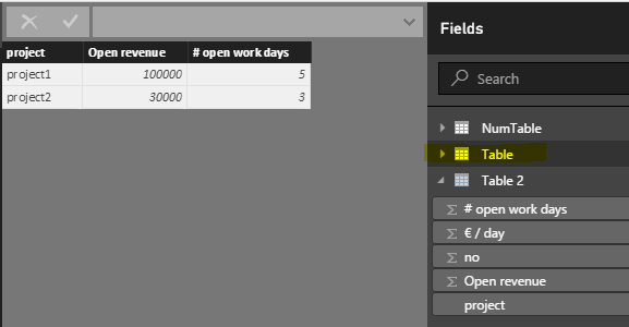
Open revenue: 100000
# open work days: 5
Open revenue / # open work days = 20000 € / day
These 3 measures I already have today in PowerBI.
They tell the company that for this project we have only 5 days remaining on which 20k can be spent every day. This 20k we have a formula for to +- recalculate it to Hours, in order to allocate people to the project, but this is out of the scope of the question.
Now the visualisation of this 100k, seeing as we are today the 23/05, would have to be like this:
23/05: 20k
24/05: 20k
25/05: 20k
26/05: 20k
27/05: 20k
Imagine the above in a table element, but of course if we got the measure set right, i would not use a table element but a column/bar chart with one axis date, second axis €.
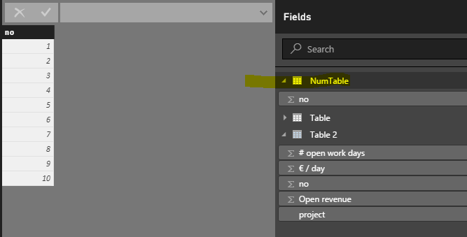
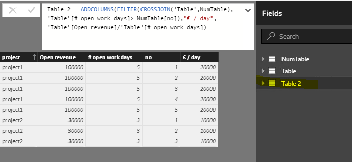
You can use the CROSSJOIN in DAX as well, just need a auxiliary number table.
Table 2 =
ADDCOLUMNS (
    FILTER (
        CROSSJOIN ( 'Table', NumTable ),
        'Table'[# open work days] >= NumTable[no]
    ),
    "€ / day", 'Table'[Open revenue] / 'Table'[# open work days]
)
- Mark as New
- Bookmark
- Subscribe
- Mute
- Subscribe to RSS Feed
- Permalink
- Report Inappropriate Content
Your requirement is not quite clear for me. Would you mind posting some sample data and expected output? Kindly post sample data in plain text other than snapshot if possible.
- Mark as New
- Bookmark
- Subscribe
- Mute
- Subscribe to RSS Feed
- Permalink
- Report Inappropriate Content
Of course,
I'll keep it simple with 1 project only,
Open revenue: 100000
# open work days: 5
Open revenue / # open work days = 20000 € / day
These 3 measures I already have today in PowerBI.
They tell the company that for this project we have only 5 days remaining on which 20k can be spent every day. This 20k we have a formula for to +- recalculate it to Hours, in order to allocate people to the project, but this is out of the scope of the question.
Now the visualisation of this 100k, seeing as we are today the 23/05, would have to be like this:
23/05: 20k
24/05: 20k
25/05: 20k
26/05: 20k
27/05: 20k
Imagine the above in a table element, but of course if we got the measure set right, i would not use a table element but a column/bar chart with one axis date, second axis €.
- Mark as New
- Bookmark
- Subscribe
- Mute
- Subscribe to RSS Feed
- Permalink
- Report Inappropriate Content
@ben_w wrote:
Of course,
I'll keep it simple with 1 project only,
Open revenue: 100000
# open work days: 5
Open revenue / # open work days = 20000 € / day
These 3 measures I already have today in PowerBI.
They tell the company that for this project we have only 5 days remaining on which 20k can be spent every day. This 20k we have a formula for to +- recalculate it to Hours, in order to allocate people to the project, but this is out of the scope of the question.
Now the visualisation of this 100k, seeing as we are today the 23/05, would have to be like this:
23/05: 20k
24/05: 20k
25/05: 20k
26/05: 20k
27/05: 20k
Imagine the above in a table element, but of course if we got the measure set right, i would not use a table element but a column/bar chart with one axis date, second axis €.
You can use the CROSSJOIN in DAX as well, just need a auxiliary number table.
Table 2 =
ADDCOLUMNS (
    FILTER (
        CROSSJOIN ( 'Table', NumTable ),
        'Table'[# open work days] >= NumTable[no]
    ),
    "€ / day", 'Table'[Open revenue] / 'Table'[# open work days]
)
- Mark as New
- Bookmark
- Subscribe
- Mute
- Subscribe to RSS Feed
- Permalink
- Report Inappropriate Content
Exactly what i was looking for, thanks!
For people reading this and wondering, just add
"Dateforgraph"; TODAY()+(NumTable[no]-1)
to the new table code from Eric and you'll have everything you need to make the graph.
Helpful resources
| User | Count |
|---|---|
| 121 | |
| 72 | |
| 71 | |
| 57 | |
| 50 |
| User | Count |
|---|---|
| 167 | |
| 83 | |
| 68 | |
| 65 | |
| 55 |


