- Power BI forums
- Updates
- News & Announcements
- Get Help with Power BI
- Desktop
- Service
- Report Server
- Power Query
- Mobile Apps
- Developer
- DAX Commands and Tips
- Custom Visuals Development Discussion
- Health and Life Sciences
- Power BI Spanish forums
- Translated Spanish Desktop
- Power Platform Integration - Better Together!
- Power Platform Integrations (Read-only)
- Power Platform and Dynamics 365 Integrations (Read-only)
- Training and Consulting
- Instructor Led Training
- Dashboard in a Day for Women, by Women
- Galleries
- Community Connections & How-To Videos
- COVID-19 Data Stories Gallery
- Themes Gallery
- Data Stories Gallery
- R Script Showcase
- Webinars and Video Gallery
- Quick Measures Gallery
- 2021 MSBizAppsSummit Gallery
- 2020 MSBizAppsSummit Gallery
- 2019 MSBizAppsSummit Gallery
- Events
- Ideas
- Custom Visuals Ideas
- Issues
- Issues
- Events
- Upcoming Events
- Community Blog
- Power BI Community Blog
- Custom Visuals Community Blog
- Community Support
- Community Accounts & Registration
- Using the Community
- Community Feedback
Register now to learn Fabric in free live sessions led by the best Microsoft experts. From Apr 16 to May 9, in English and Spanish.
- Power BI forums
- Forums
- Get Help with Power BI
- Desktop
- % of Total by Week
- Subscribe to RSS Feed
- Mark Topic as New
- Mark Topic as Read
- Float this Topic for Current User
- Bookmark
- Subscribe
- Printer Friendly Page
- Mark as New
- Bookmark
- Subscribe
- Mute
- Subscribe to RSS Feed
- Permalink
- Report Inappropriate Content
% of Total by Week
Hey guys,
I've been digging around the forums today to try and find a solution, but can't quite find what I'm looking for.
I'm trying to make a sparkline of 3 categories of data and their "% contribution" to the total for each week (my x-axis).
The following is an example of my data:
| Week | Category | Value |
| 1/1/2016 | A | 10 |
| 1/1/2016 | B | 20 |
| 1/1/2016 | C | 70 |
| 1/8/2016 | A | 70 |
| 1/8/2016 | B | 20 |
| 1/8/2016 | C | 10 |
I want to be able to have for the first week Category A = 10%, B = 20%, C = 70%, and for second week Category A = 70%, etc...
Using the "Percent of Grand Total" quick calc gives me the percent of the whole, not the week, which isn't helpful for my graph.
Anyone have any guidance or suggestions? I've considered a DAX formula possibly helping in this case.
I already forsee my future problem of actually charting it when I want 3 separate sparklines, one of each category, and that breaking the formula we put together in this post but...for another day!
Thanks!
- Mark as New
- Bookmark
- Subscribe
- Mute
- Subscribe to RSS Feed
- Permalink
- Report Inappropriate Content
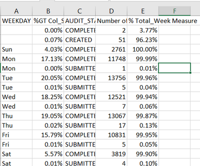
I need help in same kind of problem.
Here Column B is the correct calculation which is done by using built-in option to "show value as percentage of grand total", I need to create measure to get the same calculations, for which "D" I created using the dax-
but I am getting the incorrect value.
Note- B or D is calculated respective to Audit_Status and Weekday columns.
Solution to this is much appreciated.
- Mark as New
- Bookmark
- Subscribe
- Mute
- Subscribe to RSS Feed
- Permalink
- Report Inappropriate Content
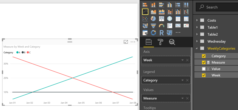
Create a measure like this:
Measure = SUM([Value]) / SUMX(ALLEXCEPT(WeeklyCategories,WeeklyCategories[Week]),[Value])
Then a visual like this:
@ me in replies or I'll lose your thread!!!
Instead of a Kudo, please vote for this idea
Become an expert!: Enterprise DNA
External Tools: MSHGQM
YouTube Channel!: Microsoft Hates Greg
Latest book!: The Definitive Guide to Power Query (M)
DAX is easy, CALCULATE makes DAX hard...
- Mark as New
- Bookmark
- Subscribe
- Mute
- Subscribe to RSS Feed
- Permalink
- Report Inappropriate Content
Thanks for the quick response!
I've thought of 2 things since reviewing your post:
1. It seems as though the formula you presented isn't given the correct percentages by week. If you see, C in week 2 is below 10%, when it should be 10% on the dot. It seems as though they are cut in half?
2. I've re-read my question, and think I presented my problem incorrectly. My data is really much more like as follows:
| Week | ID | Value | Category |
| 1/1/2016 | 1 | 10 | A |
| 1/1/2016 | 2 | 20 | A |
| 1/1/2016 | 3 | 20 | B |
| 1/1/2016 | 4 | 50 | C |
| 1/8/2016 | 5 | 90 | C |
| 1/8/2016 | 6 | 100 | C |
| 1/8/2016 | 7 | 10 | A |
| 1/8/2016 | 8 | 20 | B |
What I'm actually driving towards is understanding my contributions of the categories, not by the categories. So in the data above, the value field is a means to drive the Category column (a conditional column I've established i.e. "If above x then A if above y then B etc..."). So what I would want to see in my week 1 data point is A = 50%, B = 25%, C = 25%, Week 2 etc... Does that make sense?
I really appreciate your help!
- Mark as New
- Bookmark
- Subscribe
- Mute
- Subscribe to RSS Feed
- Permalink
- Report Inappropriate Content
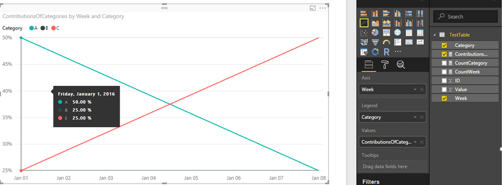
What I'm actually driving towards is understanding my contributions of the categories, not by the categories. So in the data above, the value field is a means to drive the Category column (a conditional column I've established i.e. "If above x then A if above y then B etc..."). So what I would want to see in my week 1 data point is A = 50%, B = 25%, C = 25%, Week 2 etc... Does that make sense?
You can create a measure like below.
ContributionsOfCategories =
COUNTA ( TestTable[Category] )
    / CALCULATE (
        COUNTA ( TestTable[Week] ),
        ALLEXCEPT ( TestTable, TestTable[Week] )
    )
Then you should be able to use Line Chart to show it on the report.
Regards
- Mark as New
- Bookmark
- Subscribe
- Mute
- Subscribe to RSS Feed
- Permalink
- Report Inappropriate Content
@v-ljerr-msft, thank you very much! This is so close to the solution I need.
I have double checked my formula to match yours, however, the values I'm getting are greater than 1...however, when I sum up for a given week the result divide by, say, one category's value, it comes out to the correct percentage. Does that make sense?
So for one week I get A = 4.2, B = 2.2, C = 1.1, which is odd. However, 4.2/(4.2+2.2+1.1) is the correct value I'm trying to display, so I know this is close...any thoughts?
- Mark as New
- Bookmark
- Subscribe
- Mute
- Subscribe to RSS Feed
- Permalink
- Report Inappropriate Content
I have double checked my formula to match yours, however, the values I'm getting are greater than 1...
So could you share your formula and some sample data which can reproduce this issue in your case?
Regards
- Mark as New
- Bookmark
- Subscribe
- Mute
- Subscribe to RSS Feed
- Permalink
- Report Inappropriate Content
it is a row count by category you seek. Is the total count for a week always 4 as per your example....or must the week row count also be established?
- Mark as New
- Bookmark
- Subscribe
- Mute
- Subscribe to RSS Feed
- Permalink
- Report Inappropriate Content
I believe a "count by week" must be established...if we can get that, then I think I can use a calc field to get my %total by category for each week, correct?
Helpful resources

Microsoft Fabric Learn Together
Covering the world! 9:00-10:30 AM Sydney, 4:00-5:30 PM CET (Paris/Berlin), 7:00-8:30 PM Mexico City

Power BI Monthly Update - April 2024
Check out the April 2024 Power BI update to learn about new features.

| User | Count |
|---|---|
| 107 | |
| 97 | |
| 75 | |
| 63 | |
| 62 |
| User | Count |
|---|---|
| 139 | |
| 104 | |
| 104 | |
| 80 | |
| 66 |


