FabCon is coming to Atlanta
Join us at FabCon Atlanta from March 16 - 20, 2026, for the ultimate Fabric, Power BI, AI and SQL community-led event. Save $200 with code FABCOMM.
Register now!- Power BI forums
- Get Help with Power BI
- Desktop
- Service
- Report Server
- Power Query
- Mobile Apps
- Developer
- DAX Commands and Tips
- Custom Visuals Development Discussion
- Health and Life Sciences
- Power BI Spanish forums
- Translated Spanish Desktop
- Training and Consulting
- Instructor Led Training
- Dashboard in a Day for Women, by Women
- Galleries
- Data Stories Gallery
- Themes Gallery
- Contests Gallery
- QuickViz Gallery
- Quick Measures Gallery
- Visual Calculations Gallery
- Notebook Gallery
- Translytical Task Flow Gallery
- TMDL Gallery
- R Script Showcase
- Webinars and Video Gallery
- Ideas
- Custom Visuals Ideas (read-only)
- Issues
- Issues
- Events
- Upcoming Events
The Power BI Data Visualization World Championships is back! Get ahead of the game and start preparing now! Learn more
- Power BI forums
- Forums
- Get Help with Power BI
- Desktop
- line chart help
- Subscribe to RSS Feed
- Mark Topic as New
- Mark Topic as Read
- Float this Topic for Current User
- Bookmark
- Subscribe
- Printer Friendly Page
- Mark as New
- Bookmark
- Subscribe
- Mute
- Subscribe to RSS Feed
- Permalink
- Report Inappropriate Content
line chart help
I need a bit of help plotting a line graph. Not sure its how i have my data or how i'm using the graph settings
I have 10 sites with finance data over 5 years for each site.
I want to plot the year over the x axis. Each site is a line on the graph. Y is the value. We can then see growth over time or not growth over time.
Excel looks like
| site | 18/19 | 19/20 | 20/21 |
| 1 | 456465 | 56776 | 88990 |
| 2 | 435345 | 67567 | 80978 |
| 3 | 656345 | 67674 | 70077 |
Solved! Go to Solution.
- Mark as New
- Bookmark
- Subscribe
- Mute
- Subscribe to RSS Feed
- Permalink
- Report Inappropriate Content
Hi, @jblackburnHWGA
According to your description and sample data, I think you can use the “Unpiovit columns” operation in the Power Query to get the correct data model to achieve your requirement, you can try my steps:
- Go to the Power Query and click like this:
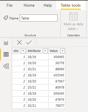
Then you can get the correct data model like this:
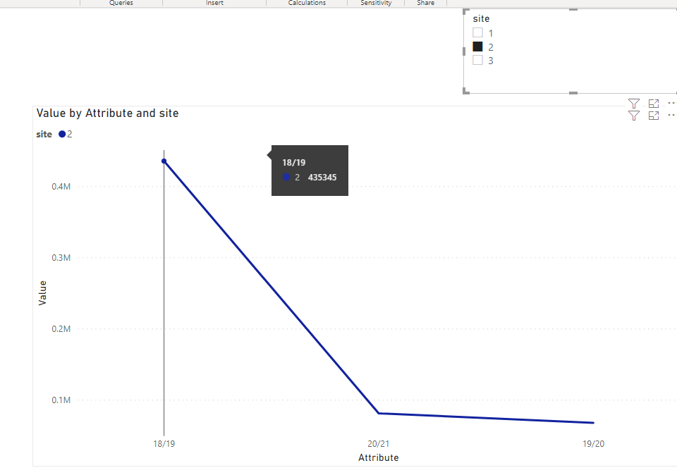
- Click on “Close and apply” and create a line chart and place it like this:
You can also create a slicer for the [Site] to slice the chart by site id, like this:
And you can get what you want.
You can download my test pbix file below
Thank you very much!
Best Regards,
Community Support Team _Robert Qin
If this post helps, then please consider Accept it as the solution to help the other members find it more quickly.
- Mark as New
- Bookmark
- Subscribe
- Mute
- Subscribe to RSS Feed
- Permalink
- Report Inappropriate Content
Yes all working. Many thanks
- Mark as New
- Bookmark
- Subscribe
- Mute
- Subscribe to RSS Feed
- Permalink
- Report Inappropriate Content
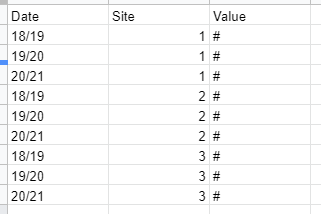
You need to structure your data differently to work with that scenario.
Here is the best way for that:
Then put the data in your line chart feilds as follows:
Axis : `Date`
Legend : `Site`
Values : `Value`
- Mark as New
- Bookmark
- Subscribe
- Mute
- Subscribe to RSS Feed
- Permalink
- Report Inappropriate Content
Did this work for you?
- Mark as New
- Bookmark
- Subscribe
- Mute
- Subscribe to RSS Feed
- Permalink
- Report Inappropriate Content
my table didn't come out well lol hope you get the idea
Helpful resources

Power BI Dataviz World Championships
The Power BI Data Visualization World Championships is back! Get ahead of the game and start preparing now!

| User | Count |
|---|---|
| 38 | |
| 36 | |
| 33 | |
| 32 | |
| 29 |
| User | Count |
|---|---|
| 129 | |
| 88 | |
| 79 | |
| 68 | |
| 63 |


