European Microsoft Fabric Community Conference
The ultimate Microsoft Fabric, Power BI, Azure AI, and SQL learning event! Join us in Stockholm, Sweden from September 24-27, 2024.
2-for-1 sale on June 20 only!
- Power BI forums
- Updates
- News & Announcements
- Get Help with Power BI
- Desktop
- Service
- Report Server
- Power Query
- Mobile Apps
- Developer
- DAX Commands and Tips
- Custom Visuals Development Discussion
- Health and Life Sciences
- Power BI Spanish forums
- Translated Spanish Desktop
- Training and Consulting
- Instructor Led Training
- Dashboard in a Day for Women, by Women
- Galleries
- Community Connections & How-To Videos
- COVID-19 Data Stories Gallery
- Themes Gallery
- Data Stories Gallery
- R Script Showcase
- Webinars and Video Gallery
- Quick Measures Gallery
- 2021 MSBizAppsSummit Gallery
- 2020 MSBizAppsSummit Gallery
- 2019 MSBizAppsSummit Gallery
- Events
- Ideas
- Custom Visuals Ideas
- Issues
- Issues
- Events
- Upcoming Events
- Community Blog
- Power BI Community Blog
- Custom Visuals Community Blog
- Community Support
- Community Accounts & Registration
- Using the Community
- Community Feedback
Find everything you need to get certified on Fabric—skills challenges, live sessions, exam prep, role guidance, and more. Get started
- Power BI forums
- Forums
- Get Help with Power BI
- Desktop
- Re: how to use multiple columns in visual for x ax...
- Subscribe to RSS Feed
- Mark Topic as New
- Mark Topic as Read
- Float this Topic for Current User
- Bookmark
- Subscribe
- Printer Friendly Page
- Mark as New
- Bookmark
- Subscribe
- Mute
- Subscribe to RSS Feed
- Permalink
- Report Inappropriate Content
how to use multiple columns in visual for x axis
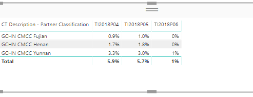
Hello. i have a visual having data from differnt measures coming as column. now i want to have a line chart from it with multiple columns falling on x axis. currently i am exporting it csv and then re importing it and using transform->unipivot to make the multiple columns in one and using.. but i guess this should not be the correct way to do it and we should have a better way.
below is snapshot of the table. here i want the last 3 columns on the X axis, 1st Column as Legend and the values as values.
- Mark as New
- Bookmark
- Subscribe
- Mute
- Subscribe to RSS Feed
- Permalink
- Report Inappropriate Content
Hi,@sandeepganju
Can you please share pbix or some data sample and these three measure and expected output.
then we can try to find a better way.You can upload it to OneDrive or Dropbox and post the link here. Do mask sensitive data before uploading.
Best Regards,
Lin
If this post helps, then please consider Accept it as the solution to help the other members find it more quickly.
Helpful resources

Europe’s largest Microsoft Fabric Community Conference
Join the community in Stockholm for expert Microsoft Fabric learning including a very exciting keynote from Arun Ulag, Corporate Vice President, Azure Data.

Power BI Monthly Update - June 2024
Check out the June 2024 Power BI update to learn about new features.

| User | Count |
|---|---|
| 99 | |
| 93 | |
| 81 | |
| 63 | |
| 56 |
| User | Count |
|---|---|
| 247 | |
| 122 | |
| 110 | |
| 77 | |
| 72 |

