Join us at FabCon Vienna from September 15-18, 2025
The ultimate Fabric, Power BI, SQL, and AI community-led learning event. Save €200 with code FABCOMM.
Get registered- Power BI forums
- Get Help with Power BI
- Desktop
- Service
- Report Server
- Power Query
- Mobile Apps
- Developer
- DAX Commands and Tips
- Custom Visuals Development Discussion
- Health and Life Sciences
- Power BI Spanish forums
- Translated Spanish Desktop
- Training and Consulting
- Instructor Led Training
- Dashboard in a Day for Women, by Women
- Galleries
- Data Stories Gallery
- Themes Gallery
- Contests Gallery
- Quick Measures Gallery
- Notebook Gallery
- Translytical Task Flow Gallery
- TMDL Gallery
- R Script Showcase
- Webinars and Video Gallery
- Ideas
- Custom Visuals Ideas (read-only)
- Issues
- Issues
- Events
- Upcoming Events
Enhance your career with this limited time 50% discount on Fabric and Power BI exams. Ends September 15. Request your voucher.
- Power BI forums
- Forums
- Get Help with Power BI
- Desktop
- how to create bar chart combining 3 measures that ...
- Subscribe to RSS Feed
- Mark Topic as New
- Mark Topic as Read
- Float this Topic for Current User
- Bookmark
- Subscribe
- Printer Friendly Page
- Mark as New
- Bookmark
- Subscribe
- Mute
- Subscribe to RSS Feed
- Permalink
- Report Inappropriate Content
how to create bar chart combining 3 measures that are based on 3 different date columns
Hi,
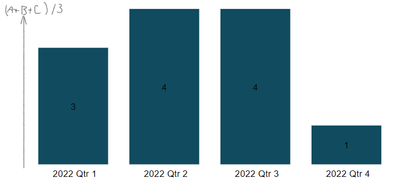
I have 3 measures say, A, B, and C and I want to create a bar chart visual where the y-axis = (A+B+C)/3, and the x-axis is date as Year-Quarter. Something like this:
However, all A, B, and C are based on different date columns as follow:
- A uses the columns Table1[Year] and Table1[Quarter]
- B uses the columns Table1[Closed Date]
- C uses the columns DateTable1[Date] which has a relationship with Table1[Date]
These date columns are all different so the measures can't be calculated using the same date column.
What is the most simple way to create this graph?
Thank you.
- Mark as New
- Bookmark
- Subscribe
- Mute
- Subscribe to RSS Feed
- Permalink
- Report Inappropriate Content
Hi,
The most simple way would be to make to adjust the model so that they all reference the same date column. For example, you could to Table 1 add a calculated column that returns the last date of each quarter based on year and quarter (e.g. 2022 and Qtr 1 becomes 31/3/2022 if that's your fiscal year) and then create a relationship between that column and the date column in the date table. And then something similar for column B.
Another approach could be to create a calculated table that you group in common date periods, using for example SUMMARIZE(), so that A, B, C turn out in the same table with the same date column.
- Mark as New
- Bookmark
- Subscribe
- Mute
- Subscribe to RSS Feed
- Permalink
- Report Inappropriate Content
Hi @TomasAndersson ,
Thank you for your reply!
For the first solution, the newly added relationships will have to be inactive relationships, as measure A, B, and C all use a date column in the same table? - and I thought that visuals don't use inactive relationships?
- Mark as New
- Bookmark
- Subscribe
- Mute
- Subscribe to RSS Feed
- Permalink
- Report Inappropriate Content
Hi, sorry missed that they were all Table 1.
I'm a bit unsure of what your model looks like. What date is Table1[Year] and Table1[Quarter]? Table1[Date]? And Table1[Date] has a relationship to your DateTable? If so, they should work fine together if you use the year and quarter columns from the DateTable to summarize.
For [ClosingDate], you'd have to create an inactive relationship to the date table and then use
- Mark as New
- Bookmark
- Subscribe
- Mute
- Subscribe to RSS Feed
- Permalink
- Report Inappropriate Content
Hi @TomasAndersson,
To summarise, the data is an historical view on work items. Table1[Year] and Table1[PI] refers to the quarter the work item is allocated to be completed in. Table1[Date] refers to the date this version of the work item was recorded. Table1[Closed Date] is the date that the item is completed.
Another question I have about using USERELATIONSHIP. I am not sure how to implement this as the measures A,B, and C don't use the respective date columns in their calculation. The date columns only come into play when I plot these measures on separate visuals (e.g. y axis is measure A, and x axis is the date column measure A uses.)
As an example, one of the measures is as follow, the others are similar:
- Mark as New
- Bookmark
- Subscribe
- Mute
- Subscribe to RSS Feed
- Permalink
- Report Inappropriate Content
Hi @TomasAndersson ,
I have tried wrapping the finalValue in a calculate function with userelationship as such:
Helpful resources
| User | Count |
|---|---|
| 68 | |
| 63 | |
| 59 | |
| 54 | |
| 28 |
| User | Count |
|---|---|
| 181 | |
| 82 | |
| 63 | |
| 47 | |
| 43 |


