FabCon is coming to Atlanta
Join us at FabCon Atlanta from March 16 - 20, 2026, for the ultimate Fabric, Power BI, AI and SQL community-led event. Save $200 with code FABCOMM.
Register now!- Power BI forums
- Get Help with Power BI
- Desktop
- Service
- Report Server
- Power Query
- Mobile Apps
- Developer
- DAX Commands and Tips
- Custom Visuals Development Discussion
- Health and Life Sciences
- Power BI Spanish forums
- Translated Spanish Desktop
- Training and Consulting
- Instructor Led Training
- Dashboard in a Day for Women, by Women
- Galleries
- Data Stories Gallery
- Themes Gallery
- Contests Gallery
- Quick Measures Gallery
- Visual Calculations Gallery
- Notebook Gallery
- Translytical Task Flow Gallery
- TMDL Gallery
- R Script Showcase
- Webinars and Video Gallery
- Ideas
- Custom Visuals Ideas (read-only)
- Issues
- Issues
- Events
- Upcoming Events
Calling all Data Engineers! Fabric Data Engineer (Exam DP-700) live sessions are back! Starting October 16th. Sign up.
- Power BI forums
- Forums
- Get Help with Power BI
- Desktop
- how can i choose a plot visual's date axis time in...
- Subscribe to RSS Feed
- Mark Topic as New
- Mark Topic as Read
- Float this Topic for Current User
- Bookmark
- Subscribe
- Printer Friendly Page
- Mark as New
- Bookmark
- Subscribe
- Mute
- Subscribe to RSS Feed
- Permalink
- Report Inappropriate Content
how can i choose a plot visual's date axis time interval at run time?
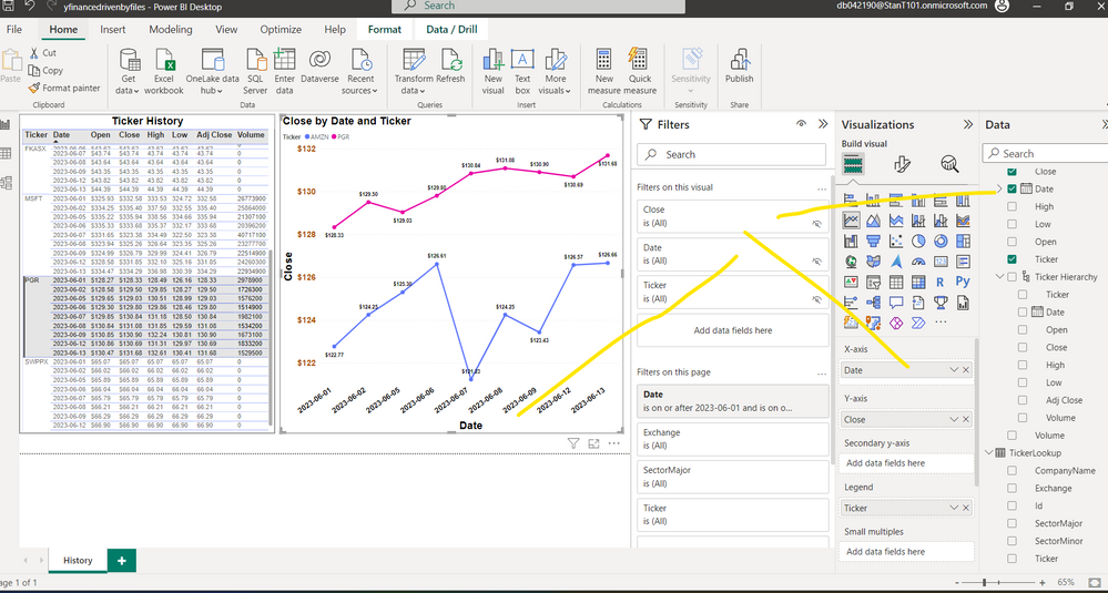
Hi , can someone direct me in making the right hand visual below smarter?
I already have page level filters on date range, exchange , sector and ticker. It seems that a user might decide when sitting down that weekly or monthly or yearly intervals would be more interesting than daily. And of course the last data point in an interval would be the best one to choose ie May 1 thru one day before the last biz day in May would be irrelevant in a monthly view. Maybe except for current month.
Solved! Go to Solution.
- Mark as New
- Bookmark
- Subscribe
- Mute
- Subscribe to RSS Feed
- Permalink
- Report Inappropriate Content
Consider creating a date table and using the date-heirarchy to easily switch between daily, weekly and yearly view: https://radacad.com/what-a-power-bi-hierarchy-is-and-how-to-use-it
If you need weekly date ranges, then you'll also need to create a calculated column and also custom date heirarchy.
- Mark as New
- Bookmark
- Subscribe
- Mute
- Subscribe to RSS Feed
- Permalink
- Report Inappropriate Content
thx vicky i dont think that will work. not sure though.
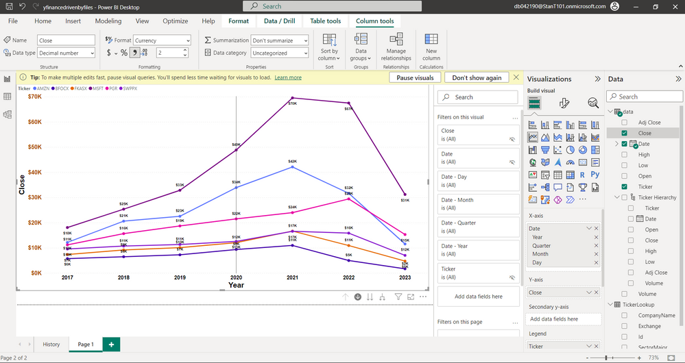
below is a picture of a pasted copy i made of that visual onto a different page. Instead of date I now have the built in pbi date hierarchy on the x axis. Unfortunately , because there is no option to summarize close as "last" this doesnt work. Right now i think what you are seeing is a sum of the entire year after i drilled up. Average , count etc dont make sense. I dont think a measure would make sense because thats one value for the entire dataset. But i'm thinking maybe if calculated columns are more flexible than i thought, maybe that one context dax function that asks "am i currently summarized on x" can be used to get the last close value of the part of the date hierarchy I'm in at this moment. My gut says no, but maybe someone can offer some advice here.
- Mark as New
- Bookmark
- Subscribe
- Mute
- Subscribe to RSS Feed
- Permalink
- Report Inappropriate Content
here is a post on getting last value. I'm going to play with one of these examples as an additional column. I dont think a measure makes sense (because there is only one per datset i thought) but i'll play with that too. https://community.fabric.microsoft.com/t5/Desktop/How-to-create-a-measure-to-find-the-last-value-of-...
- Mark as New
- Bookmark
- Subscribe
- Mute
- Subscribe to RSS Feed
- Permalink
- Report Inappropriate Content
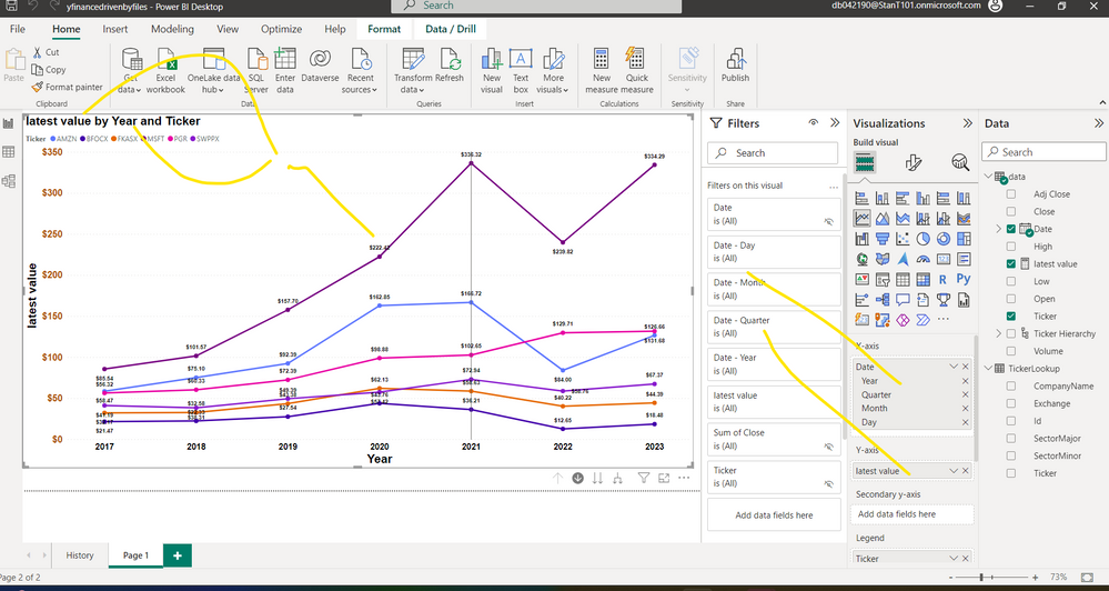
i incorporated this measure into the picture and it seems to do the trick. It seems limited in scope to ticker and date but thats ok for my purposes. I was pleasantly surprised to see the title change automatically. Thx Vicky.
Latest Value =
CALCULATE (
MAX ( 'data'[Close] ),
FILTER (
ALLEXCEPT ( 'data', 'data'[Ticker] ),
'data'[Date] = MAX ( 'data'[Date] )
)
)
- Mark as New
- Bookmark
- Subscribe
- Mute
- Subscribe to RSS Feed
- Permalink
- Report Inappropriate Content
Consider creating a date table and using the date-heirarchy to easily switch between daily, weekly and yearly view: https://radacad.com/what-a-power-bi-hierarchy-is-and-how-to-use-it
If you need weekly date ranges, then you'll also need to create a calculated column and also custom date heirarchy.
Helpful resources

FabCon Global Hackathon
Join the Fabric FabCon Global Hackathon—running virtually through Nov 3. Open to all skill levels. $10,000 in prizes!

Power BI Monthly Update - October 2025
Check out the October 2025 Power BI update to learn about new features.


