Jumpstart your career with the Fabric Career Hub
Find everything you need to get certified on Fabric—skills challenges, live sessions, exam prep, role guidance, and more.
Get started- Power BI forums
- Updates
- News & Announcements
- Get Help with Power BI
- Desktop
- Service
- Report Server
- Power Query
- Mobile Apps
- Developer
- DAX Commands and Tips
- Custom Visuals Development Discussion
- Health and Life Sciences
- Power BI Spanish forums
- Translated Spanish Desktop
- Power Platform Integration - Better Together!
- Power Platform Integrations (Read-only)
- Power Platform and Dynamics 365 Integrations (Read-only)
- Training and Consulting
- Instructor Led Training
- Dashboard in a Day for Women, by Women
- Galleries
- Community Connections & How-To Videos
- COVID-19 Data Stories Gallery
- Themes Gallery
- Data Stories Gallery
- R Script Showcase
- Webinars and Video Gallery
- Quick Measures Gallery
- 2021 MSBizAppsSummit Gallery
- 2020 MSBizAppsSummit Gallery
- 2019 MSBizAppsSummit Gallery
- Events
- Ideas
- Custom Visuals Ideas
- Issues
- Issues
- Events
- Upcoming Events
- Community Blog
- Power BI Community Blog
- Custom Visuals Community Blog
- Community Support
- Community Accounts & Registration
- Using the Community
- Community Feedback
Grow your Fabric skills and prepare for the DP-600 certification exam by completing the latest Microsoft Fabric challenge.
- Power BI forums
- Forums
- Get Help with Power BI
- Desktop
- Re: hidden limit of 100 Bars on Mixed Line and Bar...
- Subscribe to RSS Feed
- Mark Topic as New
- Mark Topic as Read
- Float this Topic for Current User
- Bookmark
- Subscribe
- Printer Friendly Page
- Mark as New
- Bookmark
- Subscribe
- Mute
- Subscribe to RSS Feed
- Permalink
- Report Inappropriate Content
hidden limit of 100 Bars on Mixed Line and Bars Official visualizations
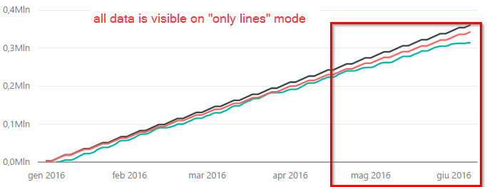
I noticed a hidden limit of visible bars on the mixed visuals (Bars and Lines) when there are data both for lines and bars:

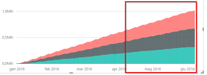
if I only drag a field from the Line Group to the Bar Group:
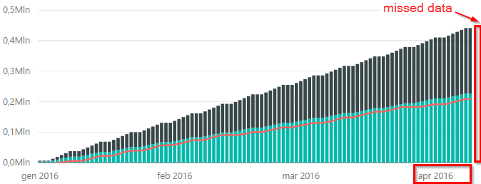
This is a Big Visual Bug, Because there is no visual feedback to the user ![]() that some data was dropped after aproximatly 100 samples.
that some data was dropped after aproximatly 100 samples.
This make me a very bad day...
A
- Mark as New
- Bookmark
- Subscribe
- Mute
- Subscribe to RSS Feed
- Permalink
- Report Inappropriate Content
it does not solve the problem. it's shifting it.
choosing "Category" makes appear all the data, but also a scrollbar and increases a lot (10x , 15x) the lenght of the axis.
it's not an acceptable workaround.
thx
- Mark as New
- Bookmark
- Subscribe
- Mute
- Subscribe to RSS Feed
- Permalink
- Report Inappropriate Content
@mondinelli, @benbateman, the issue can be reproduced. I will report it internally and will post back once I got any updates.
- Mark as New
- Bookmark
- Subscribe
- Mute
- Subscribe to RSS Feed
- Permalink
- Report Inappropriate Content
@mondinelli, @benbateman, it’s confirmed as by design by our engineers. As you figured out, you need to set the x-axis to categorical as a temporarily.
- Mark as New
- Bookmark
- Subscribe
- Mute
- Subscribe to RSS Feed
- Permalink
- Report Inappropriate Content
Hi mondinelli,
According to your screenshots, from my point of view, you created three types of visualizations to display data in Power BI Desktop: Line chart, Stacked column chart, Line and stacked column chart. All data are visible in Line chart or Stacked column chart, however only 100 sample data are displayed in Line and stacked column chart, right? If that is the case, I can reproduce your issue, it seems that there is a limitation in the Line and stacked column chart.
If not, could you please describe more details about that how you perform the whole process and drag a field from the Line Group to the Bar Group?
Thanks,
Lydia Zhang
If this post helps, then please consider Accept it as the solution to help the other members find it more quickly.
- Mark as New
- Bookmark
- Subscribe
- Mute
- Subscribe to RSS Feed
- Permalink
- Report Inappropriate Content
Hey Lydia,
That appears exactly to be the issue I have. I reported my details here:
https://community.powerbi.com/t5/Desktop/Line-Stacked-visualisation-broken-after-update/td-p/40242
Thanks
- Mark as New
- Bookmark
- Subscribe
- Mute
- Subscribe to RSS Feed
- Permalink
- Report Inappropriate Content
i've used always the "Line and stacked column chart" visual.
in the first and in the second graph i've used only the Line or the Column DataFileds, in the last i've used both.
- Mark as New
- Bookmark
- Subscribe
- Mute
- Subscribe to RSS Feed
- Permalink
- Report Inappropriate Content
Hi mondinelli,
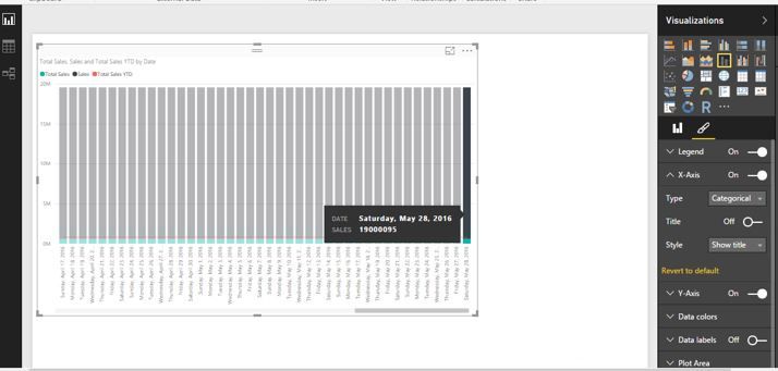
Does it work as expected when you set X-Axis to be Categorical(as shown in the following similar screenshot)?
Thanks,
Lydia Zhang
If this post helps, then please consider Accept it as the solution to help the other members find it more quickly.
- Mark as New
- Bookmark
- Subscribe
- Mute
- Subscribe to RSS Feed
- Permalink
- Report Inappropriate Content
Just to confirm setting the X-Axis to Categorical does not solve the issue for me.
- Mark as New
- Bookmark
- Subscribe
- Mute
- Subscribe to RSS Feed
- Permalink
- Report Inappropriate Content
I have noticed this as well. You should send a Frown.
Helpful resources

New forum boards available in Real-Time Intelligence.
Ask questions in Eventhouse and KQL, Eventstream, and Reflex.

Power BI Monthly Update - May 2024
Check out the May 2024 Power BI update to learn about new features.

| User | Count |
|---|---|
| 91 | |
| 85 | |
| 65 | |
| 62 | |
| 58 |
| User | Count |
|---|---|
| 150 | |
| 113 | |
| 95 | |
| 80 | |
| 72 |


