Join us at the 2025 Microsoft Fabric Community Conference
March 31 - April 2, 2025, in Las Vegas, Nevada. Use code MSCUST for a $150 discount! Early bird discount ends December 31.
Register Now- Power BI forums
- Get Help with Power BI
- Desktop
- Service
- Report Server
- Power Query
- Mobile Apps
- Developer
- DAX Commands and Tips
- Custom Visuals Development Discussion
- Health and Life Sciences
- Power BI Spanish forums
- Translated Spanish Desktop
- Training and Consulting
- Instructor Led Training
- Dashboard in a Day for Women, by Women
- Galleries
- Community Connections & How-To Videos
- COVID-19 Data Stories Gallery
- Themes Gallery
- Data Stories Gallery
- R Script Showcase
- Webinars and Video Gallery
- Quick Measures Gallery
- 2021 MSBizAppsSummit Gallery
- 2020 MSBizAppsSummit Gallery
- 2019 MSBizAppsSummit Gallery
- Events
- Ideas
- Custom Visuals Ideas
- Issues
- Issues
- Events
- Upcoming Events
Be one of the first to start using Fabric Databases. View on-demand sessions with database experts and the Microsoft product team to learn just how easy it is to get started. Watch now
- Power BI forums
- Forums
- Get Help with Power BI
- Desktop
- Re: donut chart don't show all labels
- Subscribe to RSS Feed
- Mark Topic as New
- Mark Topic as Read
- Float this Topic for Current User
- Bookmark
- Subscribe
- Printer Friendly Page
- Mark as New
- Bookmark
- Subscribe
- Mute
- Subscribe to RSS Feed
- Permalink
- Report Inappropriate Content
donut chart don't show all labels
Hi all
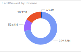
i have another type of release on the donut, yes, its very very small(i see it on bubble chart for example) next to the other legends but why i can't see the label? i understand i can't see the color because of the size, but i think i do should see the label. i think this is a bug, what do you think?
thanks a lot
- Mark as New
- Bookmark
- Subscribe
- Mute
- Subscribe to RSS Feed
- Permalink
- Report Inappropriate Content
Hi Guys, Maybe you have found a fix or not but when I expanded the donut chart, I could see all the labels so I would advise reducing the font of the labels for it to fit properly into your dashboard 🙂
- Mark as New
- Bookmark
- Subscribe
- Mute
- Subscribe to RSS Feed
- Permalink
- Report Inappropriate Content
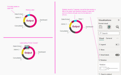
I found this solution when I ran into this problem. It's a "space" issue. Labels seem to be restricted to a specific area based on where the color bar is for that category. Sometimes you need to rotate the chart to move the color bar to a different orientation, and then it'll populate the label in the free space in that area when it's not crowded with labels in the previous area. If you have a ton of small slices together, that may not work. Another option I've used to fix this is to change the position of the labels to "prefer outside" instead of just "outside". The missing label will then show on top of the donut chart. Not as pretty but at least it works.
- Mark as New
- Bookmark
- Subscribe
- Mute
- Subscribe to RSS Feed
- Permalink
- Report Inappropriate Content
Hi, i had the same problem and changing the rotation helped me, but i have another problem that occured only on the server dashboard.
It doesn't show me the values in the right place.
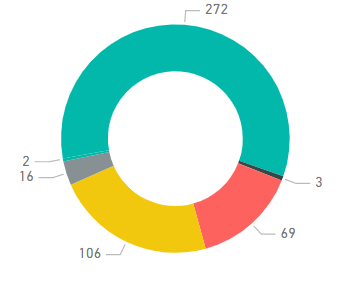
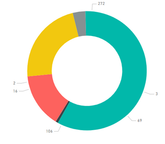
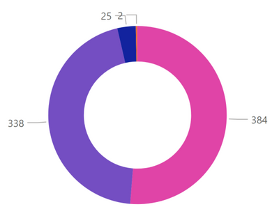
As shown in the picture, the value 2 is not at the place of its slice.
At the desktop and on the server report the donut chart look as it supposed to be, only on the dashboard it is changing and doesn't look the way it should be.
at the desktop/server report:
at the dashboard:
I would appreciate some help regarding this issue
- Mark as New
- Bookmark
- Subscribe
- Mute
- Subscribe to RSS Feed
- Permalink
- Report Inappropriate Content
Is there an open idea or bug for this issue? I'm having the same problem. The best I could get is shown below but I feel like there should be a way to at least flip the 2 label to the right side, there's so much open space on the right side, why are they overlapping on the left?
- Mark as New
- Bookmark
- Subscribe
- Mute
- Subscribe to RSS Feed
- Permalink
- Report Inappropriate Content
Issue was reported as early as 2016 and yet unresolved {wow}.
Any ETA on this?
Fellow community members, any workaround on this?
- Mark as New
- Bookmark
- Subscribe
- Mute
- Subscribe to RSS Feed
- Permalink
- Report Inappropriate Content
Another few hours tyring to find a solution to a 6 year challenge. It would be very helpful if this was addressed in a montly update.
- Mark as New
- Bookmark
- Subscribe
- Mute
- Subscribe to RSS Feed
- Permalink
- Report Inappropriate Content
@MP_123, I can reproduce your issue that donut chart doesn't show all labels, I will report it internally and will post back once I get any updates. Thanks for reporting it.
- Mark as New
- Bookmark
- Subscribe
- Mute
- Subscribe to RSS Feed
- Permalink
- Report Inappropriate Content
Has this issue been resolved? I have a simple donut chart and the labels always drop off at least one category. Frustrating to have such an amazing dashboard and then something like this happens making you look like a total rookie. Thanks!
- Mark as New
- Bookmark
- Subscribe
- Mute
- Subscribe to RSS Feed
- Permalink
- Report Inappropriate Content
Joining @Anita75 's frustration. I can't seem to figure out the reason for this. I tried playing with the size of the chart, but still at least one category is dropped from the labels.
- Mark as New
- Bookmark
- Subscribe
- Mute
- Subscribe to RSS Feed
- Permalink
- Report Inappropriate Content
I have a same issue, resizing doesn't help. The label for value = 2 doesn't show, unless it constitutes a larger part, so if the total is 8 the value = 2 will be showed with label, if total is 60 it will not. Frustrating like hell!
- Mark as New
- Bookmark
- Subscribe
- Mute
- Subscribe to RSS Feed
- Permalink
- Report Inappropriate Content
@MP_123, the issue you reported is confirmed as by design by product group: If a value is much smaller than the other values, it will not show within the donut or pie charts.
- Mark as New
- Bookmark
- Subscribe
- Mute
- Subscribe to RSS Feed
- Permalink
- Report Inappropriate Content
Hi @Vicky_Song,
As you have mentioned I can understand the category label and value not shown when the value is too small. But is there any logic that is followed? e.g. the smallest values are not show.
Because I cannot figure out why sometimes labels for the smaller values are shown and labels for larger values are not shown.
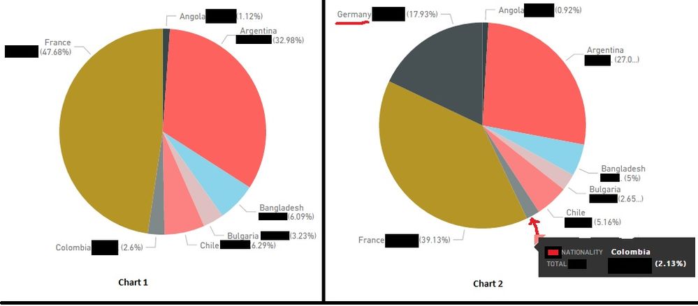
e.g. in the below charts example Chart 1 all values are shown. Chart 2 I have added Germany. But the label for Columbia (2.13%) is not shown but smaller value Angola (0.92%) is shown.
- Mark as New
- Bookmark
- Subscribe
- Mute
- Subscribe to RSS Feed
- Permalink
- Report Inappropriate Content
@Vicky_Song Is there a solution to this existing problem ? You have confirmed in earlier posts that if the values are small , those are not shown in Pie or Donut charts. Do we have any fix for this ?
Lot of users have already complained about it . Does PBI product team is planning something on this ?
Venks
- Mark as New
- Bookmark
- Subscribe
- Mute
- Subscribe to RSS Feed
- Permalink
- Report Inappropriate Content
Hi together, the problem is not solved yet (2020). Is there still no solution?
Why doesn't the ability to set overlapping labels work at this point?
How can this problem be moved to a developer?
Kind regards,
Tober
- Mark as New
- Bookmark
- Subscribe
- Mute
- Subscribe to RSS Feed
- Permalink
- Report Inappropriate Content
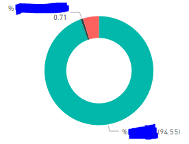
Hi. This seems to be slightly different. If I have 3 categories, I seem to have the callout showing the big values and the small values, but not the intermediate. Here for example is my data:
% AAAA,% BBBB,% CCCC
94.55,0.71,4.75
Also. Does anyone have an idea why on the visual one % is surrounded by parethesies and the other isn't?
- Mark as New
- Bookmark
- Subscribe
- Mute
- Subscribe to RSS Feed
- Permalink
- Report Inappropriate Content
I have this same issue also using Power Bi on the web..
- Mark as New
- Bookmark
- Subscribe
- Mute
- Subscribe to RSS Feed
- Permalink
- Report Inappropriate Content
@AECourtneyhas given a simple solution in another thread - Figured out how to show percentages on pie charts.
When you choose the values to use, if you open the drop down and select quick calc and where it says 'Show Values as' select % of Grand Total, it'll use the % of the total as the value, and if you choose to show value as the data label, it'll show the percent.
Also @HeroPost has added - In addition, if you drop the value field in the tool tips of the chart, it will show the actual value as well.
I have not tried this is Power BI web service though. But definitely works in Power BI desktop.
- Mark as New
- Bookmark
- Subscribe
- Mute
- Subscribe to RSS Feed
- Permalink
- Report Inappropriate Content
I have the same issue. Anyone who knows how to solve this?
- Mark as New
- Bookmark
- Subscribe
- Mute
- Subscribe to RSS Feed
- Permalink
- Report Inappropriate Content
Dears
Following forum's rules, I tried to find a similar post before creating a new one.
I found this one, it is not directly related, but I hope you may help me out.
Following with the matter I was thinking about how to show percentages labels all time. As you know, Donut and Pie chart includes the feature of showing the value, the tooltips measures you add, and the percentage of the total (%) when you roll-up/mouse-over a section of those graphs.
My problem comes when I want to show all the time (without rolling over) those %. You can select (As someone said above) "Both", in the graph's parameters, but this would show up the Measure Name and Measure Value, not the %. However, this is something you can do in Excel graphs, but it seems you can't in Powerbi.
Any ID of how solve this problem?, maybe adding a variable in % format instead of Decimal???....
I'm lost on this.![]()
Thanks in advance for the support 🙂
- Mark as New
- Bookmark
- Subscribe
- Mute
- Subscribe to RSS Feed
- Permalink
- Report Inappropriate Content
I got the answer myself!
Just select "As percentage of grand total" in "quick calculation", (right mouse click over the variable itself) and problem solved.
Thanks anyway for the help.
Helpful resources

Join us at the Microsoft Fabric Community Conference
March 31 - April 2, 2025, in Las Vegas, Nevada. Use code MSCUST for a $150 discount!

Microsoft Fabric Community Conference 2025
Arun Ulag shares exciting details about the Microsoft Fabric Conference 2025, which will be held in Las Vegas, NV.

| User | Count |
|---|---|
| 121 | |
| 77 | |
| 60 | |
| 54 | |
| 40 |
| User | Count |
|---|---|
| 193 | |
| 106 | |
| 88 | |
| 62 | |
| 51 |
