Join us at FabCon Vienna from September 15-18, 2025
The ultimate Fabric, Power BI, SQL, and AI community-led learning event. Save €200 with code FABCOMM.
Get registered- Power BI forums
- Get Help with Power BI
- Desktop
- Service
- Report Server
- Power Query
- Mobile Apps
- Developer
- DAX Commands and Tips
- Custom Visuals Development Discussion
- Health and Life Sciences
- Power BI Spanish forums
- Translated Spanish Desktop
- Training and Consulting
- Instructor Led Training
- Dashboard in a Day for Women, by Women
- Galleries
- Data Stories Gallery
- Themes Gallery
- Contests Gallery
- Quick Measures Gallery
- Notebook Gallery
- Translytical Task Flow Gallery
- TMDL Gallery
- R Script Showcase
- Webinars and Video Gallery
- Ideas
- Custom Visuals Ideas (read-only)
- Issues
- Issues
- Events
- Upcoming Events
Enhance your career with this limited time 50% discount on Fabric and Power BI exams. Ends August 31st. Request your voucher.
- Power BI forums
- Forums
- Get Help with Power BI
- Desktop
- convert columns to rows for a bar chart
- Subscribe to RSS Feed
- Mark Topic as New
- Mark Topic as Read
- Float this Topic for Current User
- Bookmark
- Subscribe
- Printer Friendly Page
- Mark as New
- Bookmark
- Subscribe
- Mute
- Subscribe to RSS Feed
- Permalink
- Report Inappropriate Content
convert columns to rows for a bar chart
Hi everyone,
I have a data set in the following format:
Main Equipment | Sub Equipment | Sub-Sub Equipment |
E1 | S1 | SS1 |
E1 | S1 | SS1 |
E2 | S2 | SS2 |
E2 | S3 | SS4 |
I want to convert it to the following format and make a bar chart for it.
Equipment Level | Count |
Main Equipment | 2 |
Sub Equipment | 3 |
Sub-Sub Equipment | 3 |
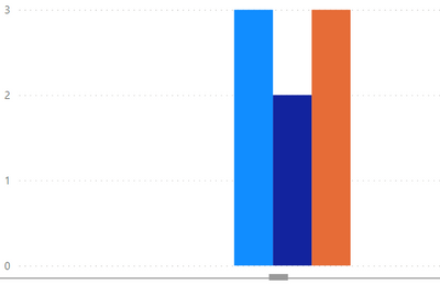
If I use matrix and transpose the rows and then, use count(distinct), I can make the following plot. The issue is that it doesn't show the name of equipment level on X-xis:
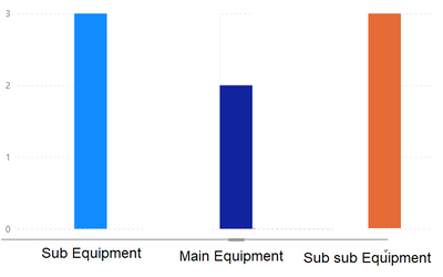
Following imaginary output is what I look for:
Please consider that there are other visuals build based on this data set and I can't change the format of the data set in the Power Query.
Thanks.
Solved! Go to Solution.
- Mark as New
- Bookmark
- Subscribe
- Mute
- Subscribe to RSS Feed
- Permalink
- Report Inappropriate Content
Hi @Anonymous ,
You can just duplicate your data source and transform the data like how @HashamNiaz said.
Then use this new dataset for your visual.
As you are dupicating the dataset, you will have it dynamic as well as you don't have to hard code.
As the dataset is the duplicte of the original dataset, once the orginal dataset updates, this too gets refreshed with the latest data
Hope this helps!!
- Mark as New
- Bookmark
- Subscribe
- Mute
- Subscribe to RSS Feed
- Permalink
- Report Inappropriate Content
Hi @Jihwan_Kim
I can't do it. It's a sort of hard coding:)
We can't create one table per each request as these tables will be added to our model and it's not a best practice to do so. More importantly, I want to use this visualisation as the first level of a drill-down scenario, so it should be related to other dimensions which I have.
- Mark as New
- Bookmark
- Subscribe
- Mute
- Subscribe to RSS Feed
- Permalink
- Report Inappropriate Content
Hi @Anonymous !
You can simply go to Power Query editor (Transform Data), select the all 3 column and perform Unpivot Transformation.
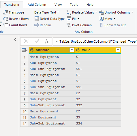
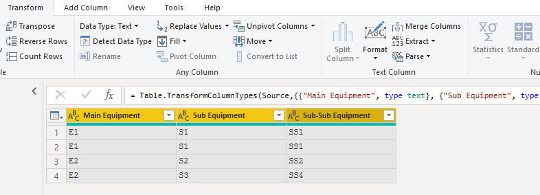
Relabel the column name, now in your report simply plot the chart against your category & distinct count.
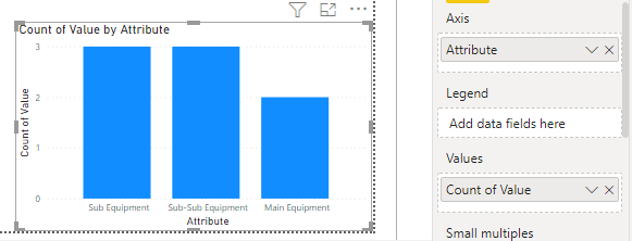
Regards,
Hasham
- Mark as New
- Bookmark
- Subscribe
- Mute
- Subscribe to RSS Feed
- Permalink
- Report Inappropriate Content
Thanks for your reply but I can't reshape the data set format for this request. There are other visuals using this data set in the original format.
- Mark as New
- Bookmark
- Subscribe
- Mute
- Subscribe to RSS Feed
- Permalink
- Report Inappropriate Content
Hi, @Anonymous
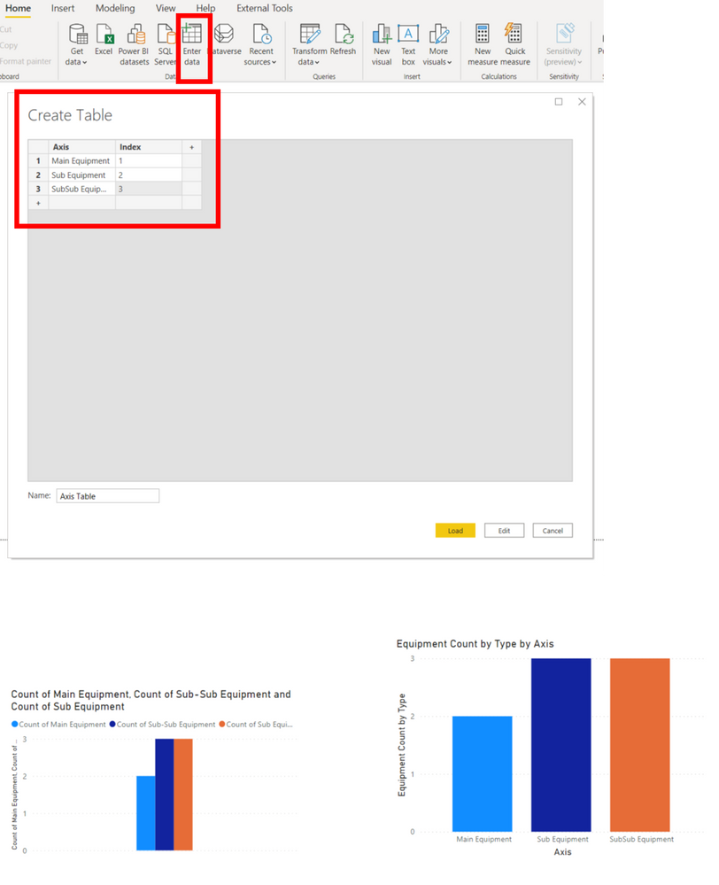
I assume you can manually create one more axis table inside Power BI like below.
Please check the below picture and the sample pbix file's link down below.
all measures are in the sample pbix file.
In this case, I used explicit measures, not implicit measures.
https://www.dropbox.com/s/3nzqvl9ggjagz96/tooba.pbix?dl=0
Hi, My name is Jihwan Kim.
If this post helps, then please consider accept it as the solution to help other members find it faster, and give a big thumbs up.
Linkedin: linkedin.com/in/jihwankim1975/
Twitter: twitter.com/Jihwan_JHKIM
If this post helps, then please consider accepting it as the solution to help other members find it faster, and give a big thumbs up.
Click here to visit my LinkedIn page
Click here to schedule a short Teams meeting to discuss your question.
