Join us at FabCon Vienna from September 15-18, 2025
The ultimate Fabric, Power BI, SQL, and AI community-led learning event. Save €200 with code FABCOMM.
Get registered- Power BI forums
- Get Help with Power BI
- Desktop
- Service
- Report Server
- Power Query
- Mobile Apps
- Developer
- DAX Commands and Tips
- Custom Visuals Development Discussion
- Health and Life Sciences
- Power BI Spanish forums
- Translated Spanish Desktop
- Training and Consulting
- Instructor Led Training
- Dashboard in a Day for Women, by Women
- Galleries
- Data Stories Gallery
- Themes Gallery
- Contests Gallery
- Quick Measures Gallery
- Notebook Gallery
- Translytical Task Flow Gallery
- TMDL Gallery
- R Script Showcase
- Webinars and Video Gallery
- Ideas
- Custom Visuals Ideas (read-only)
- Issues
- Issues
- Events
- Upcoming Events
Compete to become Power BI Data Viz World Champion! First round ends August 18th. Get started.
- Power BI forums
- Forums
- Get Help with Power BI
- Desktop
- conditional format x-axis and data labels color by...
- Subscribe to RSS Feed
- Mark Topic as New
- Mark Topic as Read
- Float this Topic for Current User
- Bookmark
- Subscribe
- Printer Friendly Page
- Mark as New
- Bookmark
- Subscribe
- Mute
- Subscribe to RSS Feed
- Permalink
- Report Inappropriate Content
conditional format x-axis and data labels color by the selected date
Hi all,
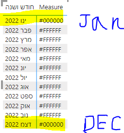
I am trying to conditional format the color of my x-axis labels and data labels. My target is only show an axis label and data label for the min and max selected date (there is a date slicer)
I thought about creating a measure that will color the min and max date to black and all other selected dates to white
My date table has a column for the date (date format) which is filtered by the user, and a column for the month-year combination (text format)
I use the month-year column in my x-axis label and some measure for the y-axis
the measure I wrote is:

I don't use my date column in the graph because the measure doesn't work with date hierarchy and because I want to show a short month-year format in a uinque way
Help will be appreciated
- Mark as New
- Bookmark
- Subscribe
- Mute
- Subscribe to RSS Feed
- Permalink
- Report Inappropriate Content
@MichaelStrauss , Try a measure like
Measure =
var _max = maxx(allselected(Date),Date[Date])
var _min = minx(allselected(Date),Date[Date])
return
if(Max(Date[Date]) = _max || Min(Date[Date]) =_min, "#000000","#FFFFFF")
- Mark as New
- Bookmark
- Subscribe
- Mute
- Subscribe to RSS Feed
- Permalink
- Report Inappropriate Content
Hi @amitchandak
Thank you for your answer. Unfortunately the measure does not work, all labels returned black (#000000)


