FabCon is coming to Atlanta
Join us at FabCon Atlanta from March 16 - 20, 2026, for the ultimate Fabric, Power BI, AI and SQL community-led event. Save $200 with code FABCOMM.
Register now!- Power BI forums
- Get Help with Power BI
- Desktop
- Service
- Report Server
- Power Query
- Mobile Apps
- Developer
- DAX Commands and Tips
- Custom Visuals Development Discussion
- Health and Life Sciences
- Power BI Spanish forums
- Translated Spanish Desktop
- Training and Consulting
- Instructor Led Training
- Dashboard in a Day for Women, by Women
- Galleries
- Data Stories Gallery
- Themes Gallery
- Contests Gallery
- Quick Measures Gallery
- Notebook Gallery
- Translytical Task Flow Gallery
- TMDL Gallery
- R Script Showcase
- Webinars and Video Gallery
- Ideas
- Custom Visuals Ideas (read-only)
- Issues
- Issues
- Events
- Upcoming Events
Join the Fabric FabCon Global Hackathon—running virtually through Nov 3. Open to all skill levels. $10,000 in prizes! Register now.
- Power BI forums
- Forums
- Get Help with Power BI
- Desktop
- conditional format horizontal bar chart with one d...
- Subscribe to RSS Feed
- Mark Topic as New
- Mark Topic as Read
- Float this Topic for Current User
- Bookmark
- Subscribe
- Printer Friendly Page
- Mark as New
- Bookmark
- Subscribe
- Mute
- Subscribe to RSS Feed
- Permalink
- Report Inappropriate Content
conditional format horizontal bar chart with one data point (no y-axis)
Good Afternoon,
I am using a horizontal bar chart visual with one data point that displays a Measure in Minutes.
Hoping someone can advise how I can conditionally format the color of the bar. Less than 30 = green, 30 - 45 = yellow, etc..
It seems I can only get the conditional format option when I enter a field into the y-axis. But this measure does not have an applicable axis. What am I missing?
Thanks and regards,
- Mark as New
- Bookmark
- Subscribe
- Mute
- Subscribe to RSS Feed
- Permalink
- Report Inappropriate Content
Here is one (laborious...) way:
In the following example, I have set the low limit at 100 and the medium limit at 200:
For a simple sum, I created the following measures:
1) Low threshold:
Low =
VAR  low = 100
RETURN
IF([Sum Value] > low, low, [Sum Value])
2) medium threshold
Medium =
VAR Med = 200
RETURN
SWITCH(TRUE(),
[Sum Value] > [Low] && [Sum Value] < Med, [Sum Value] - [Low],
[Sum Value] >= Med, 100 )
3) High Threshold
High =
IF([Sum Value] > 200, [Sum Value] -200)
The I add these three measures to a stacked bar chart, where you can set the colour for each measure, to get this
Add the measure as a tooltip:
Did I answer your question? Mark my post as a solution!
In doing so, you are also helping me. Thank you!
Proud to be a Super User!
Paul on Linkedin.
- Mark as New
- Bookmark
- Subscribe
- Mute
- Subscribe to RSS Feed
- Permalink
- Report Inappropriate Content
Hello @PaulDBrown ,
Does sound like a very laborious way to accomplish this. I will try to give it a shot to see if this will work for me and my user group. Appreciate the detailed response.
Thanks kindly,
- Mark as New
- Bookmark
- Subscribe
- Mute
- Subscribe to RSS Feed
- Permalink
- Report Inappropriate Content
Apologies..there is a mistake in the Medium threshold measure. It should be:
Medium =
VAR Med = 200
RETURN
SWITCH(TRUE(),
[Sum Value] > [Low] && [Sum Value] < Med, [Sum Value] - [Low],
[Sum Value] >= Med, 100 )
(otherwise, since it is stacked, it adds 200 to the bar, when low + Med = 200)
I've corrected it in the original reply for the benefit of others.
Did I answer your question? Mark my post as a solution!
In doing so, you are also helping me. Thank you!
Proud to be a Super User!
Paul on Linkedin.
- Mark as New
- Bookmark
- Subscribe
- Mute
- Subscribe to RSS Feed
- Permalink
- Report Inappropriate Content
- Mark as New
- Bookmark
- Subscribe
- Mute
- Subscribe to RSS Feed
- Permalink
- Report Inappropriate Content
Hi @Anonymous, Appreciate the prompt response.
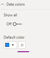
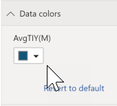
The fx is not available when I have only one data point. This is what is causing me much grief!
Is there a workaround to this? Or am I totally missing something?


