Fabric Data Days starts November 4th!
Advance your Data & AI career with 50 days of live learning, dataviz contests, hands-on challenges, study groups & certifications and more!
Get registered- Power BI forums
- Get Help with Power BI
- Desktop
- Service
- Report Server
- Power Query
- Mobile Apps
- Developer
- DAX Commands and Tips
- Custom Visuals Development Discussion
- Health and Life Sciences
- Power BI Spanish forums
- Translated Spanish Desktop
- Training and Consulting
- Instructor Led Training
- Dashboard in a Day for Women, by Women
- Galleries
- Data Stories Gallery
- Themes Gallery
- Contests Gallery
- QuickViz Gallery
- Quick Measures Gallery
- Visual Calculations Gallery
- Notebook Gallery
- Translytical Task Flow Gallery
- TMDL Gallery
- R Script Showcase
- Webinars and Video Gallery
- Ideas
- Custom Visuals Ideas (read-only)
- Issues
- Issues
- Events
- Upcoming Events
Get Fabric Certified for FREE during Fabric Data Days. Don't miss your chance! Request now
- Power BI forums
- Forums
- Get Help with Power BI
- Desktop
- clustered column charts that change values when fi...
- Subscribe to RSS Feed
- Mark Topic as New
- Mark Topic as Read
- Float this Topic for Current User
- Bookmark
- Subscribe
- Printer Friendly Page
- Mark as New
- Bookmark
- Subscribe
- Mute
- Subscribe to RSS Feed
- Permalink
- Report Inappropriate Content
clustered column charts that change values when filters are selected
Good morning
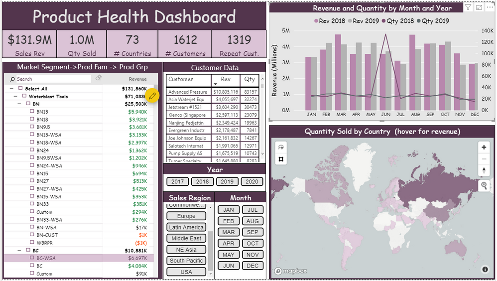
I need to make a clustered column chart that re-calibrates the axis and the the columns when filters are selected on the dashboard. Right now, the clustered column chart shades the total column the amount represented by the filters. When the shaded amount is much less than the total, you cannot really see the values. Why cant clustered column charts just show the values for the selected filters instead of shading it as part of the total.
For example, here is picture of my dashboard with no filters selected
Note the clustered column chart in the top right
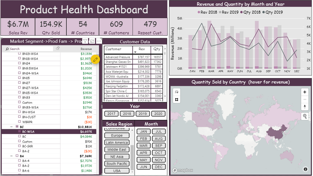
Now, here is a picture with a product selected in the dashboard
As you can see, the clustered column chart is shaded with the filtered values and it is very difficult to see the actual revenue values and the trend of these shaded values over time. How can I set the clustered column chart to just show the values for the product selected (with new y axis values) instead of showing it as a shaded percentage of the total revenue from all parts?
Solved! Go to Solution.
- Mark as New
- Bookmark
- Subscribe
- Mute
- Subscribe to RSS Feed
- Permalink
- Report Inappropriate Content
I just figured out the solution so Ill post it for others..
Click on Edit interactions under Visual Tools-> Format. Then click on the visual that is doing the filtering. In the top right, select filter (instead of highlight). It is the left most choice of the 3 that you are given
Now it will dynamically change the Y axis to be the correct range for whatever filter is chosen
Helpful resources

Fabric Data Days
Advance your Data & AI career with 50 days of live learning, contests, hands-on challenges, study groups & certifications and more!

Power BI Monthly Update - October 2025
Check out the October 2025 Power BI update to learn about new features.


