- Subscribe to RSS Feed
- Mark Topic as New
- Mark Topic as Read
- Float this Topic for Current User
- Bookmark
- Subscribe
- Printer Friendly Page
- Mark as New
- Bookmark
- Subscribe
- Mute
- Subscribe to RSS Feed
- Permalink
- Report Inappropriate Content
change color of most recent bar only
Hello,
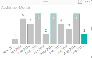
Is there a way to show the most recent bar in a different color?
Graphy is dynamic in a way that it keeps expanding and most recent bar is updated frequently.
Image is photoshoped to illustrate the idea.
thank you
J
Solved! Go to Solution.
- Mark as New
- Bookmark
- Subscribe
- Mute
- Subscribe to RSS Feed
- Permalink
- Report Inappropriate Content
Hi @jagostinhoCT,
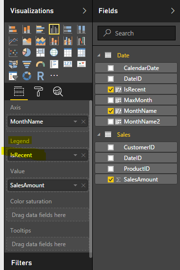
Create 3 calculated column.
MonthName2 = FORMAT('Date'[CalendarDate],"YYYYMM")
MaxMonth = MAX('Date'[MonthName2])
IsRecent = IF('Date'[MonthName2]='Date'[MaxMonth],"Y","N")
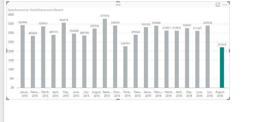
Then drag IsRecent column to Legend, then you can get the expected result.
Regards,
Charlie Liao
- Mark as New
- Bookmark
- Subscribe
- Mute
- Subscribe to RSS Feed
- Permalink
- Report Inappropriate Content
@Habib is right that there is no native way to do this, i.e., through a setting on your chart. However, you can still make it happen. Let's say you have a Month column in your data, which I'm assuming you're using for your X axis. For my example, I'm using a date for Start of Month, formatted as Mmmm, YYYY. Add a new column like:
isMostRecentMonth = TableName[StartOfMonth] = MAX(TableName[StartOfMonth])
That will give you a True/False amount in your table, which you can use in your measures. So for your audits situation, you'd need three measures:
Audits = SUM(TableName[AuditCount])

Audits Prior Months = CALCULATE([Audits], NOT(TableName[isMostRecentMonth]))

Audits Current Month = CALCULATE([Audits], TableName[isMostRecentMonth])
Put the second and third measures on your chart values, and specify colors for each one. When you bring in data for the next month, everything will shift automatically.
- Mark as New
- Bookmark
- Subscribe
- Mute
- Subscribe to RSS Feed
- Permalink
- Report Inappropriate Content
Hi @KGrice
Thanks for sharing this way to handle the scenario but it will not help in longer run because, you will have two different measures for same measure and it will confuse users when they will be using tooltip or any other feature.
- Mark as New
- Bookmark
- Subscribe
- Mute
- Subscribe to RSS Feed
- Permalink
- Report Inappropriate Content
@Habib. The possibility for user confusion is worth noting, but whether or not the solution would work depends on who's using the report and if the reason for the separate measures is communicated. If my CEO wants a dashboard that highlights the most recent month, I can tell him it's not possible, or I can tell him it's possible but the tooltip will be dependent on which column he hovers over. With well-named measures, it shouldn't be that big of a deal.
I think that what you've brought up is a good approach to follow for some general guidelines:
1. Is it possible to do?
2. Does it make sense to do it?
The great thing about Excel was that it was almost always possible to do something, even if it doesn't make sense for whatever reason. It's good to see that Power BI will hopefully follow that mentality as more features are added. Give us the tools and let the users decide what makes sense!
- Mark as New
- Bookmark
- Subscribe
- Mute
- Subscribe to RSS Feed
- Permalink
- Report Inappropriate Content
In current release its not possible. You have only two options, either go with default option or set category color explicitly. In that case for new category again default color will be added.
Helpful resources

Join us at the Microsoft Fabric Community Conference
March 31 - April 2, 2025, in Las Vegas, Nevada. Use code MSCUST for a $150 discount!

Power BI Monthly Update - February 2025
Check out the February 2025 Power BI update to learn about new features.

| Subject | Author | Posted | |
|---|---|---|---|
| 10-23-2024 07:18 AM | |||
| 12-10-2024 12:28 AM | |||
| 12-19-2024 07:55 AM | |||
| 01-19-2025 07:15 AM | |||
| 09-25-2024 01:56 PM |
| User | Count |
|---|---|
| 87 | |
| 81 | |
| 53 | |
| 38 | |
| 35 |


