FabCon is coming to Atlanta
Join us at FabCon Atlanta from March 16 - 20, 2026, for the ultimate Fabric, Power BI, AI and SQL community-led event. Save $200 with code FABCOMM.
Register now!- Power BI forums
- Get Help with Power BI
- Desktop
- Service
- Report Server
- Power Query
- Mobile Apps
- Developer
- DAX Commands and Tips
- Custom Visuals Development Discussion
- Health and Life Sciences
- Power BI Spanish forums
- Translated Spanish Desktop
- Training and Consulting
- Instructor Led Training
- Dashboard in a Day for Women, by Women
- Galleries
- Data Stories Gallery
- Themes Gallery
- Contests Gallery
- QuickViz Gallery
- Quick Measures Gallery
- Visual Calculations Gallery
- Notebook Gallery
- Translytical Task Flow Gallery
- TMDL Gallery
- R Script Showcase
- Webinars and Video Gallery
- Ideas
- Custom Visuals Ideas (read-only)
- Issues
- Issues
- Events
- Upcoming Events
Get Fabric Certified for FREE during Fabric Data Days. Don't miss your chance! Request now
- Power BI forums
- Forums
- Get Help with Power BI
- Desktop
- benchmark vs selected value from slicer
- Subscribe to RSS Feed
- Mark Topic as New
- Mark Topic as Read
- Float this Topic for Current User
- Bookmark
- Subscribe
- Printer Friendly Page
- Mark as New
- Bookmark
- Subscribe
- Mute
- Subscribe to RSS Feed
- Permalink
- Report Inappropriate Content
benchmark vs selected value from slicer
Dear fellow PowerBI'ers
I would like to see a visual with a benchmark and my selected department (from a slicer). Obviously if none is selected i would like to see all departments and the benchmark in the visual.
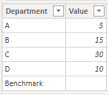
So my data looks like this. we added an extra row with the department 'benchmark' and an empty value.
| Department | Value |
| A | 5 |
| B | 15 |
| C | 30 |
| D | 10 |
| Benchmark |
We calculate the result in a measure as follows:
if(
department = "Benchmark", calculate(sum(Value),All(department)),
calculate(sum(value))
so with the result we have this:
| Department | Value | Result |
| A | 5 | 5 |
| B | 15 | 15 |
| C | 30 | 30 |
| D | 10 | 10 |
| Benchmark | 60 |
now I have a slicer with all the 'departments' (and the benchmark). I would like to have a visual where i always see the benchmark, regardless of the selected value in the slicer and (if one selected) the department.
so with the following case:
Solved! Go to Solution.
- Mark as New
- Bookmark
- Subscribe
- Mute
- Subscribe to RSS Feed
- Permalink
- Report Inappropriate Content
@Anonymous
Here is one way of doing this.
The initial dataset I'm building on is:
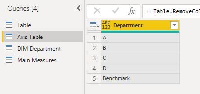
1) In Power Query (to ensure it updates) create a new table with the unique values for department and a new row for Benchmark
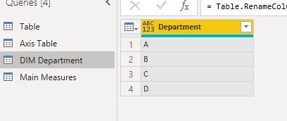
2) Create a Department Dimension table by referencing a new table to the Department Field in your main table
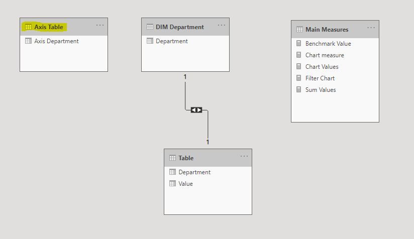
3) Load into the model, and create a relationship between the fact table and the dimension table. The Axis Table should remain unrelated to any other tables:
4) Create the measures for the visual:
Sum Values = SUM('Table'[Value])Benchmark Value = CALCULATE([Sum Values],
ALL('DIM Department'[Department]))Chart Values = CALCULATE([Sum Values],
TREATAS(VALUES('Axis Table'[Axis Department]), 'DIM Department'[Department]))Chart measure = IF(SELECTEDVALUE('Axis Table'[Axis Department]) = "Benchmark",
[Benchmark Value],
[Chart Values])
5) Create a measure to filter the visual based on the slicer selection:
Filter Chart =
VAR Dep = VALUES('DIM Department'[Department])
VAR BENCH = {"Benchmark"}
VAR NewT = UNION(Dep, Bench)
VAR CHART = VALUES('Axis Table'[Axis Department])
RETURN
COUNTROWS(
    INTERSECT(NewT, CHART))
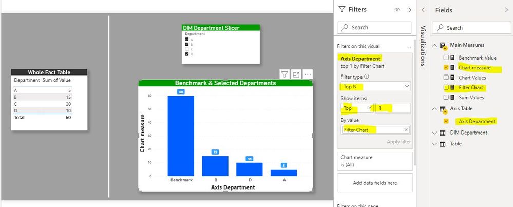
6) Build your visual using the axis table department field as the x-axis & the [chart measure]. Add the slicer from the DIM department. Finally, in the filter pane, in filters for this visual, add the [Filter Chart] measure to the Axis department, select TopN and set the value to 1:
I've attached the sample file for your reference
Did I answer your question? Mark my post as a solution!
In doing so, you are also helping me. Thank you!
Proud to be a Super User!
Paul on Linkedin.
- Mark as New
- Bookmark
- Subscribe
- Mute
- Subscribe to RSS Feed
- Permalink
- Report Inappropriate Content
Hi, @Anonymous
Based on your description, I created data to reproduce your scenario. The pbix file is attached in the end.
Table:
Department(a calculated table):
Department =
FILTER(
    DISTINCT('Table'[Department]),
    [Department]<>"Benchmark"
)
You may create a measure as below.
Result =
var d = MAX('Table'[Department])
return
IF(
        d<>"Benchmark",
        IF(
            d in DISTINCT(Department[Department]),
            SUM('Table'[Value])
        ),
        CALCULATE(
            SUM('Table'[Value]),
            FILTER(
                ALL('Table'),
                [Department] in DISTINCT(Department[Department])
            )
        )
)
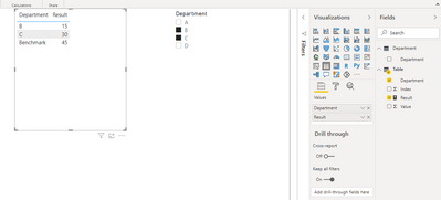
Then you need to make the option 'Show items with no data' unchecked and use 'Department' column from 'Department' table to filter the result.
Result:
Best Regards
Allan
If this post helps, then please consider Accept it as the solution to help the other members find it more quickly.
- Mark as New
- Bookmark
- Subscribe
- Mute
- Subscribe to RSS Feed
- Permalink
- Report Inappropriate Content
@Anonymous
Here is one way of doing this.
The initial dataset I'm building on is:
1) In Power Query (to ensure it updates) create a new table with the unique values for department and a new row for Benchmark
2) Create a Department Dimension table by referencing a new table to the Department Field in your main table
3) Load into the model, and create a relationship between the fact table and the dimension table. The Axis Table should remain unrelated to any other tables:
4) Create the measures for the visual:
Sum Values = SUM('Table'[Value])Benchmark Value = CALCULATE([Sum Values],
ALL('DIM Department'[Department]))Chart Values = CALCULATE([Sum Values],
TREATAS(VALUES('Axis Table'[Axis Department]), 'DIM Department'[Department]))Chart measure = IF(SELECTEDVALUE('Axis Table'[Axis Department]) = "Benchmark",
[Benchmark Value],
[Chart Values])
5) Create a measure to filter the visual based on the slicer selection:
Filter Chart =
VAR Dep = VALUES('DIM Department'[Department])
VAR BENCH = {"Benchmark"}
VAR NewT = UNION(Dep, Bench)
VAR CHART = VALUES('Axis Table'[Axis Department])
RETURN
COUNTROWS(
    INTERSECT(NewT, CHART))
6) Build your visual using the axis table department field as the x-axis & the [chart measure]. Add the slicer from the DIM department. Finally, in the filter pane, in filters for this visual, add the [Filter Chart] measure to the Axis department, select TopN and set the value to 1:
I've attached the sample file for your reference
Did I answer your question? Mark my post as a solution!
In doing so, you are also helping me. Thank you!
Proud to be a Super User!
Paul on Linkedin.
Helpful resources

Power BI Monthly Update - November 2025
Check out the November 2025 Power BI update to learn about new features.

Fabric Data Days
Advance your Data & AI career with 50 days of live learning, contests, hands-on challenges, study groups & certifications and more!


