cancel
Showing results for 
Search instead for 
Did you mean: 

July 28 - August 9 | Final Round of the Power BI Dataviz World Championships. This is your chance. Learn more

Reply
Anonymous
Not applicable

a true dot plot please !


When I start analyzing a one-dimensional set of data, the first thing I do is always to look at ALL THE DOTS of the population.

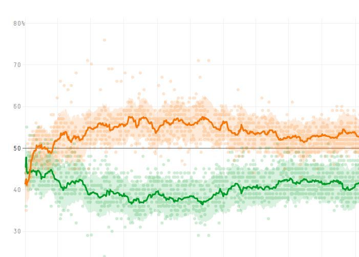
And if I want to analyze time variation I want to see all the dots with date on the X-axis and measured value on the Y-axis

This dot plot with individual values is the most basic graph in excel, and the most usual graph in media, see for instance below, an example of poll results over time, with all the polls as individual dots and moving average as a continuous line


How can this basic of the basics not be available in PowerBI ?

we have zillions of fancy graphs with more or less usefull features at hand, and not the one everybody should start with

what is wrong in developing this diagram ?


poll.jpg

3 REPLIES 3
Greg_Deckler
Community Champion
Community Champion

You mean the Scatter plot chart?


Follow on LinkedIn
@ me in replies or I'll lose your thread!!!
Instead of a Kudo, please vote for this idea
Become an expert!: Enterprise DNA
External Tools: MSHGQM
YouTube Channel!: Microsoft Hates Greg
Latest book!:
DAX For Humans

DAX is easy, CALCULATE makes DAX hard...
Anonymous
Not applicable

Yes, the correct english wording is probably scatter chart. I may have been misled by the french designation "nuage de points"

However, the key point is that all engineers all taught to first look at their data, and start plotting the individual values to vizualize the population. Then they add some lines characterizing variation, such as in the classical control charts of SPC.

This is really a big, big, lack in the default visuals of Power BI. Customers from the engineering community will want to see SPC charts, in particular because the quality system asks for it.

Regards

TomMartens
Super User
Super User

Hey,


unfortunately, this is not possible using the default visuals, if you are familiar with R this link might be helpful:

http://library.open.oregonstate.edu/computationalbiology/chapter/plotting-data-and-ggplot2/ 


If you are more on the python side, then this maybe helpful: https://python-graph-gallery.com/scatter-plot/


Be aware that not all python packages that you are used to use are also supported in combination with Power BI service, this link lists the currently supported python packages (since the February 2019 release).


Hopefully, this helps a little,


Regards,

Tom


Did I answer your question? Mark my post as a solution, this will help others!

Proud to be a Super User!
I accept Kudos 😉
Hamburg, Germany

Helpful resources

Announcements
FabCon and SQLCon Barcelona 2026

FabCon & SQLCon – Barcelona 2026

Join us in Barcelona for FabCon and SQLCon, the Fabric, Power BI, SQL, and AI community event. Save €200 with code FABCMTY200.

Fabric Community Sticker Design Challenge Barcelona Carousel

Fabric Community Sticker Challenge - Barcelona 2026

If you love stickers, then you will definitely want to check out our community sticker challenge, Barcelona edition!

July Power BI Update Carousel

Power BI Monthly Update - July 2026

Check out the July 2026 Power BI update to learn about new features.

Power BI DataViz World Championships carousel

Power BI DataViz World Championships - June 2026

A new Power BI DataViz World Championship is coming this June! Don't miss out on submitting your entry.

Top Solution Authors