FabCon is coming to Atlanta
Join us at FabCon Atlanta from March 16 - 20, 2026, for the ultimate Fabric, Power BI, AI and SQL community-led event. Save $200 with code FABCOMM.
Register now!- Power BI forums
- Get Help with Power BI
- Desktop
- Service
- Report Server
- Power Query
- Mobile Apps
- Developer
- DAX Commands and Tips
- Custom Visuals Development Discussion
- Health and Life Sciences
- Power BI Spanish forums
- Translated Spanish Desktop
- Training and Consulting
- Instructor Led Training
- Dashboard in a Day for Women, by Women
- Galleries
- Data Stories Gallery
- Themes Gallery
- Contests Gallery
- QuickViz Gallery
- Quick Measures Gallery
- Visual Calculations Gallery
- Notebook Gallery
- Translytical Task Flow Gallery
- TMDL Gallery
- R Script Showcase
- Webinars and Video Gallery
- Ideas
- Custom Visuals Ideas (read-only)
- Issues
- Issues
- Events
- Upcoming Events
The Power BI Data Visualization World Championships is back! Get ahead of the game and start preparing now! Learn more
- Power BI forums
- Forums
- Get Help with Power BI
- Desktop
- Y-Axis Alignment Problem with Combined Column and ...
- Subscribe to RSS Feed
- Mark Topic as New
- Mark Topic as Read
- Float this Topic for Current User
- Bookmark
- Subscribe
- Printer Friendly Page
- Mark as New
- Bookmark
- Subscribe
- Mute
- Subscribe to RSS Feed
- Permalink
- Report Inappropriate Content
Y-Axis Alignment Problem with Combined Column and Line Chart
Description:
I am currently working on a Power BI project where I have encountered an issue with combining a column chart and a line chart in the same visual. Let me describe the scenario and the problem in detail:
Scenario:
I have two measures in my Power BI report:
- Inventory Days
- Market Inventory Days
On the X-axis, I am displaying "Month Year."
On the Y-axis, I am showing "Market Inventory Days" in a column chart.
Desired Visualization:
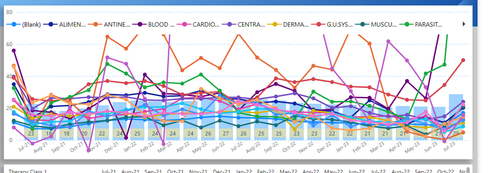
- In addition to the column chart, I want to include a line representation of my product brands' performance over the same X-axis (Month Year). (Something as below.)
Current Setup:
- To achieve this, I have used two separate visuals: a column chart for "Market Inventory Days" and a line chart for the product brands.
- However, the problem I'm facing is that the Y-axis scaling does not match between these two visuals.
What I've Tried:
- I have attempted adjusting the Y-axis settings in both visuals to ensure alignment, but the issue persists.
Request you to kindly help me with some workaround with this or suggest any custom visual.
- Mark as New
- Bookmark
- Subscribe
- Mute
- Subscribe to RSS Feed
- Permalink
- Report Inappropriate Content
- Mark as New
- Bookmark
- Subscribe
- Mute
- Subscribe to RSS Feed
- Permalink
- Report Inappropriate Content
I have attempted to utilize the provided visualization tool, but the issue I encountered is that it does not support legends for lines; it only allows legends to be applied to columns. Please see the screenshot.
- Mark as New
- Bookmark
- Subscribe
- Mute
- Subscribe to RSS Feed
- Permalink
- Report Inappropriate Content
Hi @Shahabh786
There is a Bar & Line Chart visual that you could use. It will mean both measures can be used in one Visual.
Joe
- Mark as New
- Bookmark
- Subscribe
- Mute
- Subscribe to RSS Feed
- Permalink
- Report Inappropriate Content
I have attempted to utilize the provided visualization tool, but the issue I encountered is that it does not support legends for lines; it only allows legends to be applied to columns. Please see the screenshot.
- Mark as New
- Bookmark
- Subscribe
- Mute
- Subscribe to RSS Feed
- Permalink
- Report Inappropriate Content
This isn't an ideal work around, but you could try the following if the line legend won't change or is a single value.
Remove all value fields except for the Line. This should provide a legend. Take a screenshot of the legend and then import the screenshot as a visual. Set up the Visual with the Column legend and then layer the picture beside the other legends. open the selection part and make sure that the visual is lower in the list than the screenshot.
Helpful resources

Power BI Dataviz World Championships
The Power BI Data Visualization World Championships is back! Get ahead of the game and start preparing now!

| User | Count |
|---|---|
| 40 | |
| 35 | |
| 34 | |
| 31 | |
| 28 |
| User | Count |
|---|---|
| 136 | |
| 102 | |
| 68 | |
| 66 | |
| 58 |


