Join us at the 2025 Microsoft Fabric Community Conference
Microsoft Fabric Community Conference 2025, March 31 - April 2, Las Vegas, Nevada. Use code MSCUST for a $150 discount.
Register now- Power BI forums
- Get Help with Power BI
- Desktop
- Service
- Report Server
- Power Query
- Mobile Apps
- Developer
- DAX Commands and Tips
- Custom Visuals Development Discussion
- Health and Life Sciences
- Power BI Spanish forums
- Translated Spanish Desktop
- Training and Consulting
- Instructor Led Training
- Dashboard in a Day for Women, by Women
- Galleries
- Webinars and Video Gallery
- Data Stories Gallery
- Themes Gallery
- Power BI DataViz World Championships Gallery
- Quick Measures Gallery
- R Script Showcase
- COVID-19 Data Stories Gallery
- Community Connections & How-To Videos
- 2021 MSBizAppsSummit Gallery
- 2020 MSBizAppsSummit Gallery
- 2019 MSBizAppsSummit Gallery
- Events
- Ideas
- Custom Visuals Ideas
- Issues
- Issues
- Events
- Upcoming Events
The Power BI DataViz World Championships are on! With four chances to enter, you could win a spot in the LIVE Grand Finale in Las Vegas. Show off your skills.
- Power BI forums
- Forums
- Get Help with Power BI
- Desktop
- Re: Why is my line flat, on bar and line graph?
- Subscribe to RSS Feed
- Mark Topic as New
- Mark Topic as Read
- Float this Topic for Current User
- Bookmark
- Subscribe
- Printer Friendly Page
- Mark as New
- Bookmark
- Subscribe
- Mute
- Subscribe to RSS Feed
- Permalink
- Report Inappropriate Content
Why is my line flat, on bar and line graph?
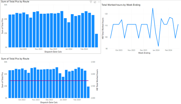
Help please! Why can I get this data (relating to producted delivered (bars) and hours worked (lines) sucessfully on separate graphs, but when I try to put them onto one visualisation together, the line goes flat?
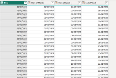
Both data tables are linked to a rolling calendar table...
I just can't figure it out!
Thanks
Solved! Go to Solution.
- Mark as New
- Bookmark
- Subscribe
- Mute
- Subscribe to RSS Feed
- Permalink
- Report Inappropriate Content
I am suspecting the dates used are from where the columns are from instead of from the connecting date table.
Did I answer your question? Mark my post as a solution!
Proud to be a Super User!
"Tell me and I’ll forget; show me and I may remember; involve me and I’ll understand."
Need Power BI consultation, get in touch with me on LinkedIn or hire me on UpWork.
Learn with me on YouTube @DAXJutsu or follow my page on Facebook @DAXJutsuPBI.
- Mark as New
- Bookmark
- Subscribe
- Mute
- Subscribe to RSS Feed
- Permalink
- Report Inappropriate Content
Yes it likely has to do with the relationship between data tables and calendar table or 'Dispatch Date Calc' which i see in the bar charts but not line chart. Where does that field come from?
- Mark as New
- Bookmark
- Subscribe
- Mute
- Subscribe to RSS Feed
- Permalink
- Report Inappropriate Content
I am suspecting the dates used are from where the columns are from instead of from the connecting date table.
Did I answer your question? Mark my post as a solution!
Proud to be a Super User!
"Tell me and I’ll forget; show me and I may remember; involve me and I’ll understand."
Need Power BI consultation, get in touch with me on LinkedIn or hire me on UpWork.
Learn with me on YouTube @DAXJutsu or follow my page on Facebook @DAXJutsuPBI.
- Mark as New
- Bookmark
- Subscribe
- Mute
- Subscribe to RSS Feed
- Permalink
- Report Inappropriate Content
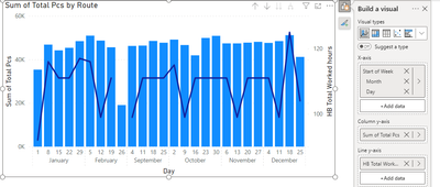
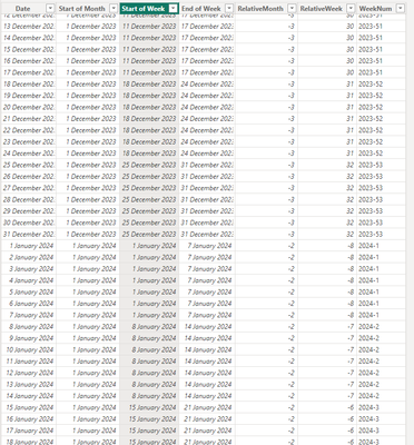
Except now I'm struggling to get the chart in date order, by week... any advice?
I've tried adding a couple of different columns to my rolling calendar then sorting the "Start of Week" field by that column, but I obviously haven't hit the right code...
- Mark as New
- Bookmark
- Subscribe
- Mute
- Subscribe to RSS Feed
- Permalink
- Report Inappropriate Content
Except now I'm struggling to get the chart in date order, by week... any advice? - The dates look in order to me.
Did I answer your question? Mark my post as a solution!
Proud to be a Super User!
"Tell me and I’ll forget; show me and I may remember; involve me and I’ll understand."
Need Power BI consultation, get in touch with me on LinkedIn or hire me on UpWork.
Learn with me on YouTube @DAXJutsu or follow my page on Facebook @DAXJutsuPBI.
- Mark as New
- Bookmark
- Subscribe
- Mute
- Subscribe to RSS Feed
- Permalink
- Report Inappropriate Content
So simple, that fixed it, thank you so much!
Helpful resources

Join us at the Microsoft Fabric Community Conference
March 31 - April 2, 2025, in Las Vegas, Nevada. Use code MSCUST for a $150 discount!

Join our Community Sticker Challenge 2025
If you love stickers, then you will definitely want to check out our Community Sticker Challenge!

| User | Count |
|---|---|
| 104 | |
| 70 | |
| 66 | |
| 55 | |
| 43 |
| User | Count |
|---|---|
| 157 | |
| 82 | |
| 65 | |
| 64 | |
| 61 |


