- Power BI forums
- Updates
- News & Announcements
- Get Help with Power BI
- Desktop
- Service
- Report Server
- Power Query
- Mobile Apps
- Developer
- DAX Commands and Tips
- Custom Visuals Development Discussion
- Health and Life Sciences
- Power BI Spanish forums
- Translated Spanish Desktop
- Power Platform Integration - Better Together!
- Power Platform Integrations (Read-only)
- Power Platform and Dynamics 365 Integrations (Read-only)
- Training and Consulting
- Instructor Led Training
- Dashboard in a Day for Women, by Women
- Galleries
- Community Connections & How-To Videos
- COVID-19 Data Stories Gallery
- Themes Gallery
- Data Stories Gallery
- R Script Showcase
- Webinars and Video Gallery
- Quick Measures Gallery
- 2021 MSBizAppsSummit Gallery
- 2020 MSBizAppsSummit Gallery
- 2019 MSBizAppsSummit Gallery
- Events
- Ideas
- Custom Visuals Ideas
- Issues
- Issues
- Events
- Upcoming Events
- Community Blog
- Power BI Community Blog
- Custom Visuals Community Blog
- Community Support
- Community Accounts & Registration
- Using the Community
- Community Feedback
Earn a 50% discount on the DP-600 certification exam by completing the Fabric 30 Days to Learn It challenge.
- Power BI forums
- Forums
- Get Help with Power BI
- Desktop
- Re: Which visual is best- graphing times of day ov...
- Subscribe to RSS Feed
- Mark Topic as New
- Mark Topic as Read
- Float this Topic for Current User
- Bookmark
- Subscribe
- Printer Friendly Page
- Mark as New
- Bookmark
- Subscribe
- Mute
- Subscribe to RSS Feed
- Permalink
- Report Inappropriate Content
Which visual is best- graphing times of day over time for trends>daily,weekly,monthly,yearly?
Anyone done this and have a preferred way or visual?
We need to plot a time of day for several variables each day over time, by day, week, month, year
Data looks like this
Variable 1 Variable 2 Variable 3
02/15/2018 3:05 PM 02/15/2018 4:09 PM etc.
02/16/2018 6:24 PM 02/6/2018 9:43 AM
Solved! Go to Solution.
- Mark as New
- Bookmark
- Subscribe
- Mute
- Subscribe to RSS Feed
- Permalink
- Report Inappropriate Content
HI @PbiConsult1,
I'd like to suggest you enter to query editor and use unpivot column feature to format your records.
Reference:
Pivot and Unpivot with Power BI
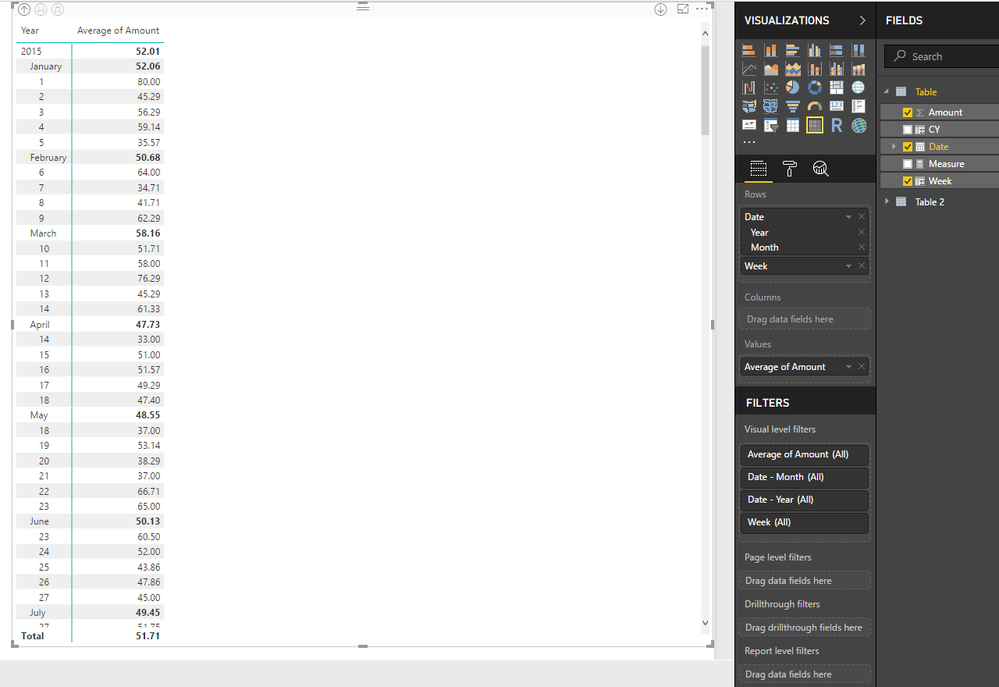
>>We need to plot a time of day for several variables each day over time, by day, week, month, year
I think matrix visual will be suitable, if you drag date column to row field, it will auto summary with each data hierarchy level.
Sample:
Week = WEEKNUM([Date],1)
Regards,
Xiaoxin Sheng
If this post helps, please consider accept as solution to help other members find it more quickly.
- Mark as New
- Bookmark
- Subscribe
- Mute
- Subscribe to RSS Feed
- Permalink
- Report Inappropriate Content
We need to do a graph with an X and Y access or something very similar.
Appreciate you taking the time to post to help!
Helpful resources
| User | Count |
|---|---|
| 98 | |
| 91 | |
| 84 | |
| 72 | |
| 67 |
| User | Count |
|---|---|
| 114 | |
| 103 | |
| 100 | |
| 72 | |
| 64 |


