FabCon is coming to Atlanta
Join us at FabCon Atlanta from March 16 - 20, 2026, for the ultimate Fabric, Power BI, AI and SQL community-led event. Save $200 with code FABCOMM.
Register now!- Power BI forums
- Get Help with Power BI
- Desktop
- Service
- Report Server
- Power Query
- Mobile Apps
- Developer
- DAX Commands and Tips
- Custom Visuals Development Discussion
- Health and Life Sciences
- Power BI Spanish forums
- Translated Spanish Desktop
- Training and Consulting
- Instructor Led Training
- Dashboard in a Day for Women, by Women
- Galleries
- Data Stories Gallery
- Themes Gallery
- Contests Gallery
- QuickViz Gallery
- Quick Measures Gallery
- Visual Calculations Gallery
- Notebook Gallery
- Translytical Task Flow Gallery
- TMDL Gallery
- R Script Showcase
- Webinars and Video Gallery
- Ideas
- Custom Visuals Ideas (read-only)
- Issues
- Issues
- Events
- Upcoming Events
The Power BI Data Visualization World Championships is back! Get ahead of the game and start preparing now! Learn more
- Power BI forums
- Forums
- Get Help with Power BI
- Desktop
- Waterfall chart issue
- Subscribe to RSS Feed
- Mark Topic as New
- Mark Topic as Read
- Float this Topic for Current User
- Bookmark
- Subscribe
- Printer Friendly Page
- Mark as New
- Bookmark
- Subscribe
- Mute
- Subscribe to RSS Feed
- Permalink
- Report Inappropriate Content
Waterfall chart issue
Hi Everyone!
I wouldlike to create waterfall chart, but with quite different data.
Please find screenshot below - this chart was done in the excel and I would like to move it to powerBi, but I am really struggling.
Total 3 should be $8,4, not $8.6 😉
Basicaly I would like to start with fix amount - total 1 ($10) after that I have category 1 =0, next category 2 = -2$, next is total 2 = total 1 + (category 1 + category 2), next is category 3 = +0.5$ and category 4 = +0.1$ and total 3 = total 2 + (category 3 + category4).
The problem is that all my categories are different, so when I use breakdown in PowerBI I have total 1 bar with -> category 1, category, 2, category3, category 4, then total 2 bar with- > category 1, category, 2, category3, category 4 and total 3 as a sum of everything....
Are you able to let me know how to achieve it ? Is it possible to have it done in PowerBi ?
Hope it make sense...
Thank you!
Monika
Solved! Go to Solution.
- Mark as New
- Bookmark
- Subscribe
- Mute
- Subscribe to RSS Feed
- Permalink
- Report Inappropriate Content
Hi Monica,
According to my test, the breakdown in the Power BI Waterfall chart exists in all milestones. Please check out the demo in the attachment. So the data could be like below.
Name Category Value
| m1 | start | 10 |
| m2 | start | 10 |
| m2 | Category 2 | -2.13 |
| m3 | start | 10 |
| m3 | Category 2 | -2.13 |
| m3 | Category 3 | 0.6 |
| m3 | Category 4 | 0.2 |
| m4 | start | 10 |
| m4 | Category 2 | -2.13 |
| m4 | Category 3 | 0.6 |
| m4 | Category 4 | 0.2 |
| m4 | Category 8 | 3.6 |
Best Regards,
Dale
If this post helps, then please consider Accept it as the solution to help the other members find it more quickly.
- Mark as New
- Bookmark
- Subscribe
- Mute
- Subscribe to RSS Feed
- Permalink
- Report Inappropriate Content
Hi Monika,
Please share a dummy sample. That would help us to find out where went wrong.
Best Regards,
Dale
If this post helps, then please consider Accept it as the solution to help the other members find it more quickly.
- Mark as New
- Bookmark
- Subscribe
- Mute
- Subscribe to RSS Feed
- Permalink
- Report Inappropriate Content
Good Morning,
Please find sample data below (sorry I have no idea how to attach excel)
| Name | Category | Value |
| Start | 10 | |
| Category 1 | 0 | |
| Category 2 | -2 | |
| Total 2 | 8 | |
| Category 3 | 0.5 | |
| Category 4 | 0.1 | |
| Total 3 | 8.6 |
I have tried to set it up in few different ways, but it did not work.
Will appreciate any help!
Thank you,
Monika
- Mark as New
- Bookmark
- Subscribe
- Mute
- Subscribe to RSS Feed
- Permalink
- Report Inappropriate Content
Hi All,
Sorry, sample data are like that (without total 3 since it's auto-calculated) :
| Name | Category | Value |
| Start | 10 | |
| Category 1 | 0 | |
| Category 2 | -2 | |
| Total 2 | 8 | |
| Category 3 | 0.5 | |
| Category 4 | 0.1 |
Thanks!
- Mark as New
- Bookmark
- Subscribe
- Mute
- Subscribe to RSS Feed
- Permalink
- Report Inappropriate Content
Hi @Kopek,
Is this the original data? Seems it shouldn't be like this.
Best Regards,
Dale
If this post helps, then please consider Accept it as the solution to help the other members find it more quickly.
- Mark as New
- Bookmark
- Subscribe
- Mute
- Subscribe to RSS Feed
- Permalink
- Report Inappropriate Content
Hi Dale,
so maybe the problem is that i set up data wrongly.
Could you please advise me how it should be set up ?
I use PowerBI for some time, but i have never used waterfall chart unfortunately.
Thanks!
Monika
- Mark as New
- Bookmark
- Subscribe
- Mute
- Subscribe to RSS Feed
- Permalink
- Report Inappropriate Content
Basically, my data has some strating point let's say 10 and after that I have categories listed.
In between of categories I would like to see some milestones (totals) - that's why i set it up in this way.
- Mark as New
- Bookmark
- Subscribe
- Mute
- Subscribe to RSS Feed
- Permalink
- Report Inappropriate Content
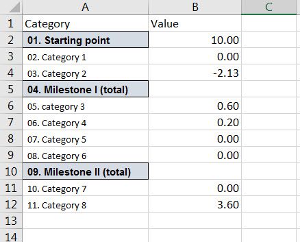
All, sorry for spamming - but I did one more thign to make it more clear (?)
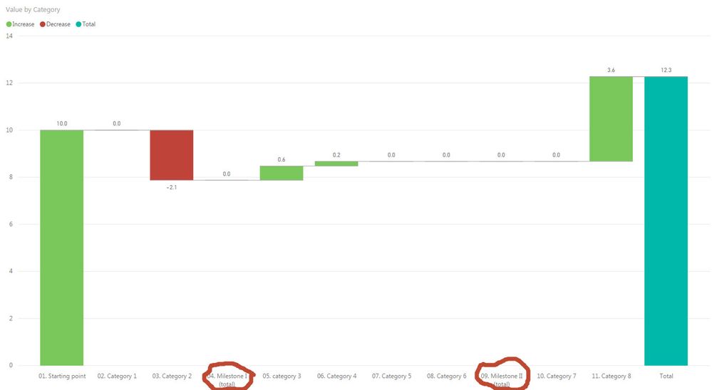
Below is one of set up of data I have prepared to build the waterfall chart. And the end result is almost ok.
The problem is that milestone I and milestone II are shown as 0, whereas I would like to have it shown as total of previous bars. So Milestone I (total) should show 7.87 and milestone II (total) should be 8.67 and should have the same colour as total bar. Also starting point should have the sae colour as total bar.
I assume the problem is with the formatting source data, but I have no idea how to change it. I tried several different ways of formatting it, but nothing really works...
Will be really grateful if anyone can help me.
Thanks,
Monika
- Mark as New
- Bookmark
- Subscribe
- Mute
- Subscribe to RSS Feed
- Permalink
- Report Inappropriate Content
Hi Monica,
According to my test, the breakdown in the Power BI Waterfall chart exists in all milestones. Please check out the demo in the attachment. So the data could be like below.
Name Category Value
| m1 | start | 10 |
| m2 | start | 10 |
| m2 | Category 2 | -2.13 |
| m3 | start | 10 |
| m3 | Category 2 | -2.13 |
| m3 | Category 3 | 0.6 |
| m3 | Category 4 | 0.2 |
| m4 | start | 10 |
| m4 | Category 2 | -2.13 |
| m4 | Category 3 | 0.6 |
| m4 | Category 4 | 0.2 |
| m4 | Category 8 | 3.6 |
Best Regards,
Dale
If this post helps, then please consider Accept it as the solution to help the other members find it more quickly.
- Mark as New
- Bookmark
- Subscribe
- Mute
- Subscribe to RSS Feed
- Permalink
- Report Inappropriate Content
@v-jiascu-msft Hi Dale,
I think I understood how waterfall charts works, and it simply won't work for our needs.
We'd rather use one of bar chart.
But anyway, I am very grateful for your help.
Thanks a lot!
Monika
Helpful resources

Power BI Dataviz World Championships
The Power BI Data Visualization World Championships is back! Get ahead of the game and start preparing now!

| User | Count |
|---|---|
| 39 | |
| 37 | |
| 33 | |
| 33 | |
| 29 |
| User | Count |
|---|---|
| 132 | |
| 90 | |
| 78 | |
| 66 | |
| 65 |


